The muHVT package is a collection of R functions for vector quantization and construction of hierarchical voronoi tessellations as a data visualization tool to visualize cells using quantization. The hierarchical cells are computed using Hierarchical K-means where a quantization threshold governs the levels in the hierarchy for a set k parameter (the maximum number of cells at each level). The package is particularly helpful to visualize rich mutlivariate data.
This package additionally provides functions for computing the Sammon’s projection and plotting the heat map of the variables on the tiles of the tessellations.
This package performs vector quantization using the following algorithm -
- Hierarchical Vector Quantization using k − means
install.packages("muHVT")A Voronoi diagram is a way of dividing space into a number of regions. A set of points (called seeds, sites, or generators) is specified beforehand and for each seed there will be a corresponding region consisting of all points closer to that seed than to any other. The regions are called Voronoi cells. It is dual to the Delaunay triangulation.
Sammon projection is an algorithm that maps a high-dimensional space to a space of lower dimensionality by trying to preserve the structure of inter-point distances in high-dimensional space in the lower-dimension projection. It is particularly suited for use in exploratory data analysis. It is considered a non-linear approach as the mapping cannot be represented as a linear combination of the original variables. The centroids are plotted in 2D after performing Sammon’s projection at every level of the tessellation.
Denote the distance between it**h and jt**h objects in the original space by di**j*, and the distance between their projections by di**j. Sammon’s mapping aims to minimize the following error function, which is often referred to as Sammon’s stress or Sammon’s error.
The minimization can be performed either by gradient descent, as proposed initially, or by other means, usually involving iterative methods. The number of iterations need to be experimentally determined and convergent solutions are not always guaranteed. Many implementations prefer to use the first Principal Components as a starting configuration.
In this package, we use sammons from the package MASS to project higher dimensional data to 2D space. The function hvq called inside from function HVT returns hierarchical quantized data which will be the input for construction tesselations. The data is then represented in 2d coordinates and the tessellations are plotted using these coordinates as centroids. We use the package deldir for this purpose. The deldir package computes the Delaunay triangulation (and hence the Dirichlet or Voronoi tesselation) of a planar point set according to the second (iterative) algorithm of Lee and Schacter.For subsequent levels, transformation is performed on the 2d coordinates to get all the points within its parent tile. Tessellations are plotted using these transformed points as centroids. The lines in the tessellations are chopped in places so that they do not protrude outside the parent polygon. This is done for all the subsequent levels.
In this section, we will use the Prices of Personal Computers dataset. This dataset contains 6259 observations and 10 features. The dataset observes the price from 1993 to 1995 of 486 personal computers in the US. The variables are price,speed,ram,screen,cd,etc. The dataset can be downloaded from here
In this example, we will compress this dataset by using hierarhical VQ using k-means and visualize the Voronoi tesselation plots using Sammons projection. Later on, we will overlay price,speed and screen variable as heatmap to generate further insights.
Here, we load the data and store into a variable computers.
set.seed(240)
# Load data from csv files
computers <- read.csv("https://raw.githubusercontent.com/SangeetM/dataset/master/Computers.csv")
Let's have a look at sample of the data
# Quick peek
Table(head(computers))| X | price | speed | hd | ram | screen | cd | multi | premium | ads | trend |
|---|---|---|---|---|---|---|---|---|---|---|
| 1 | 1499 | 25 | 80 | 4 | 14 | no | no | yes | 94 | 1 |
| 2 | 1795 | 33 | 85 | 2 | 14 | no | no | yes | 94 | 1 |
| 3 | 1595 | 25 | 170 | 4 | 15 | no | no | yes | 94 | 1 |
| 4 | 1849 | 25 | 170 | 8 | 14 | no | no | no | 94 | 1 |
| 5 | 3295 | 33 | 340 | 16 | 14 | no | no | yes | 94 | 1 |
| 6 | 3695 | 66 | 340 | 16 | 14 | no | no | yes | 94 | 1 |
str(computers)
#> 'data.frame':    6259 obs. of  11 variables:
#>  $ X      : int  1 2 3 4 5 6 7 8 9 10 ...
#>  $ price  : int  1499 1795 1595 1849 3295 3695 1720 1995 2225 2575 ...
#>  $ speed  : int  25 33 25 25 33 66 25 50 50 50 ...
#>  $ hd     : int  80 85 170 170 340 340 170 85 210 210 ...
#>  $ ram    : int  4 2 4 8 16 16 4 2 8 4 ...
#>  $ screen : int  14 14 15 14 14 14 14 14 14 15 ...
#>  $ cd     : Factor w/ 2 levels "no","yes": 1 1 1 1 1 1 2 1 1 1 ...
#>  $ multi  : Factor w/ 2 levels "no","yes": 1 1 1 1 1 1 1 1 1 1 ...
#>  $ premium: Factor w/ 2 levels "no","yes": 2 2 2 1 2 2 2 2 2 2 ...
#>  $ ads    : int  94 94 94 94 94 94 94 94 94 94 ...
#>  $ trend  : int  1 1 1 1 1 1 1 1 1 1 ...
Let's get a summary of the data
summary(computers)
#>        X            price          speed              hd
#>  Min.   :   1   Min.   : 949   Min.   : 25.00   Min.   :  80.0
#>  1st Qu.:1566   1st Qu.:1794   1st Qu.: 33.00   1st Qu.: 214.0
#>  Median :3130   Median :2144   Median : 50.00   Median : 340.0
#>  Mean   :3130   Mean   :2220   Mean   : 52.01   Mean   : 416.6
#>  3rd Qu.:4694   3rd Qu.:2595   3rd Qu.: 66.00   3rd Qu.: 528.0
#>  Max.   :6259   Max.   :5399   Max.   :100.00   Max.   :2100.0
#>       ram             screen        cd       multi      premium
#>  Min.   : 2.000   Min.   :14.00   no :3351   no :5386   no : 612
#>  1st Qu.: 4.000   1st Qu.:14.00   yes:2908   yes: 873   yes:5647
#>  Median : 8.000   Median :14.00
#>  Mean   : 8.287   Mean   :14.61
#>  3rd Qu.: 8.000   3rd Qu.:15.00
#>  Max.   :32.000   Max.   :17.00
#>       ads            trend
#>  Min.   : 39.0   Min.   : 1.00
#>  1st Qu.:162.5   1st Qu.:10.00
#>  Median :246.0   Median :16.00
#>  Mean   :221.3   Mean   :15.93
#>  3rd Qu.:275.0   3rd Qu.:21.50
#>  Max.   :339.0   Max.   :35.00
Let us first split the data into train and test. We will use 80% of the data as train and remaining as test.
noOfPoints <- dim(computers)[1]
trainLength <- as.integer(noOfPoints * 0.8)

trainComputers <- computers[1:trainLength,]
testComputers <- computers[(trainLength+1):noOfPoints,]
K-means in not suitable for factor variables as the sample space for factor variables is discrete. A Euclidean distance function on such a space isn't really meaningful. Hence we will delete the factor variables in our dataset.
Here we keep the original trainComputers and testComputers as we will use price variable from this dataset to overlay as heatmap and generate some insights.
trainComputers <- trainComputers %>% dplyr::select(-c(X,cd,multi,premium,trend))
testComputers <- testComputers %>% dplyr::select(-c(X,cd,multi,premium,trend))
Let us try to understand HVT function first.
HVT(dataset, nclust, depth, quant.err, projection.scale, normalize = T, distance_metric = c("L1_Norm","L2_Norm"), error_metric = c("mean","max"))Following are all the parameters explained in detail
-
dataset- Dataframe. A dataframe with numeric columns -
nlcust- Numeric. An integer indicating the number of cells per hierarchy (level) -
depth- An integer indicating the number of levels. (1 = No hierarchy, 2 = 2 levels, etc ...) -
quant.error- A number indicating the quantization error threshold. A cell will only breakdown into further cells only if the quantization error of the cell is above quantization error threshold. -
projection.scale- A number indicating the scale factor for the tesselations so as to visualize the sub-tesselations well enough. -
normalize- A logical value indicating if the columns in your dataset should be normalized. Default value is TRUE. The algorithm supports Z-score normalization. -
distance_metric- The distance metric can beL1_NormorL2_Norm.L1_Normis selected by default. The distance metric is used to calculate the distance between andimensional point and centroid. The user can also pass a custom function to calculate the distance. -
error_metric- The error metric can bemeanormax.maxis selected by default.Themaxwill return the max ofmvalues. Themeanwill take mean ofmvalues where each value is a distance between a point and centroid of the cell. Moreover, the user can also pass a custom function to calculate the error metric.
First we will perform hierarchical vector quantization at level 1 by setting the parameter depth to 1. Here level 1 signifies no hierarchy. Let's keep the no of cells as 15.
set.seed(240)
hvt.results <- list()
hvt.results <- muHVT::HVT(trainComputers,
                          nclust = 15,
                          depth = 1,
                          quant.err = 0.2,
                          projection.scale = 10,
                          normalize = T)
Now let's try to understand plotHVT function along with the input parameters
plotHVT(hvt.results, line.width, color.vec, pch1 = 21, centroid.size = 3, title = NULL)-
hvt.results- A list containing the ouput of HVT function which has the details of the tessellations to be plotted -
line.width- A vector indicating the line widths of the tessellation boundaries for each level -
color.vec- A vector indicating the colors of the boundaries of the tessellations at each level -
pch1- Symbol type of the centroids of the tessellations (parent levels). Refer points. (default = 21) -
centroid.size- Size of centroids of first level tessellations. (default = 3) -
title- Set a title for the plot. (default = NULL)
Let's plot the voronoi tesselation
# Voronoi tesselation plot for level one
plotHVT(hvt.results,
        line.width = c(1.2),
        color.vec = c("#141B41"))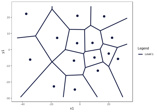
Figure 2: The Voronoi tessellation for level 1 shown for the 15 cells in the dataset ’computers’
As per the manual, hvt.results[[3]] gives us detailed information about the hierarchical vector quantized data
hvt.results[[3]][['summary']] gives a nice tabular data containing no of points, quantization error and the codebook.
Now let us understand what each column in the summary table means
-
Segment Level- Level of the cell. In this case, we have performed vector quantization for depth 1. Hence Segment Level is 1 -
Segment Parent- Parent Segment of the cell -
Segment Child- The children of a particular cell. In this case, first level has 15 cells Hence, we can see Segment Child 1,2,3,4,5 ,..,15. -
n- No of points in each cell -
Quant.Error- Quantization error for each cell
All the columns after this will contains centroids for each cell for all the variables. They can be also called as codebook as is the collection of centroids for all cells (codewords)
summaryTable(hvt.results[[3]][['summary']])| Segment.Level | Segment.Parent | Segment.Child | n | Quant.Error | price | speed | hd | ram | screen | ads |
|---|---|---|---|---|---|---|---|---|---|---|
| 1 | 1 | 1 | 557 | 2.58 | 0.88 | -0.01 | 0.83 | 1.63 | -0.10 | 0.25 |
| 1 | 1 | 2 | 465 | 1.64 | -0.17 | -0.78 | 0.33 | -0.01 | -0.35 | 0.44 |
| 1 | 1 | 3 | 562 | 1.4 | -1.25 | -0.93 | -0.84 | -0.80 | -0.51 | 0.65 |
| 1 | 1 | 4 | 480 | 2.3 | 0.71 | 0.69 | 0.24 | -0.02 | 0.06 | 0.56 |
| 1 | 1 | 5 | 384 | 3.33 | 0.80 | 0.17 | 0.03 | 0.09 | 2.88 | 0.11 |
| 1 | 1 | 6 | 139 | 2.38 | 0.22 | 2.67 | 0.09 | -0.21 | -0.15 | 0.76 |
| 1 | 1 | 7 | 302 | 2.09 | -0.32 | -0.54 | -0.80 | -0.50 | -0.43 | -2.15 |
| 1 | 1 | 8 | 248 | 2.21 | -0.37 | 0.67 | 0.84 | 0.04 | -0.13 | -0.59 |
| 1 | 1 | 9 | 397 | 2.05 | -0.52 | 0.57 | -0.62 | -0.75 | -0.32 | 0.78 |
| 1 | 1 | 10 | 230 | 3.16 | 1.10 | 0.34 | -0.16 | 0.35 | -0.14 | -1.93 |
| 1 | 1 | 11 | 423 | 1.5 | -0.49 | -0.86 | -0.74 | -0.67 | -0.28 | 0.36 |
| 1 | 1 | 12 | 294 | 1.69 | -1.14 | -0.79 | -0.58 | -0.70 | -0.39 | -0.78 |
| 1 | 1 | 13 | 169 | 3.82 | 1.58 | 0.00 | 3.29 | 2.64 | 0.28 | -0.25 |
| 1 | 1 | 14 | 87 | 3.43 | 1.59 | 2.67 | 1.62 | 1.70 | 0.13 | 0.32 |
| 1 | 1 | 15 | 270 | 1.94 | -0.40 | 0.66 | -0.66 | -0.72 | -0.40 | -0.38 |
Let's have a look at Quant.Error variable in the above table. It seems that none of the cells have hit the quantization threshold error.
Now let's check the compression summary. The table below shows no of cells, no of cells having quantization error below threshold and percentage of cells having quantization error below threshold for each level.
compressionSummaryTable(hvt.results[[3]]$compression_summary)| segmentLevel | noOfCells | noOfCellsBelowQuantizationError | percentOfCellsBelowQuantizationErrorThreshold |
|---|---|---|---|
| 1 | 15 | 0 | 0 |
As it can be seen in the table above, percentage of cells in level1 having quantization error below threshold is 0%. Hence we can go one level deeper and try to compress it further.
We will now overlay the Quant.Error variable as heatmap over the voronoi tesselation plot to visualize the quantization error better.
Let's have look at the function hvtHmap which we will use to overlay a variable as heatmap.
hvtHmap(hvt.results, dataset, child.level, hmap.cols, color.vec ,line.width, palette.color = 6)-
hvt.results- A list of hvt.results obtained from the HVT function. -
dataset- A dataframe containing the variables that you want to overlay as heatmap. The user can pass an external dataset or the dataset that was used to perform hierarchical vector quantization. The dataset should have same number of points as the dataset used to perform hierarchical vector quantization in the HVT function -
child.level- A number indicating the level for which the heat map is to be plotted. -
hmap.cols- The column number of column name from the dataset indicating the variables for which the heat map is to be plotted. To plot the quantization error as heatmap, pass'quant_error'. Similary to plot the no of points in each cell as heatmap, pass'no_of_points'as a parameter -
color.vec- A color vector such that length(color.vec) = child.level (default = NULL) -
line.width- A line width vector such that length(line.width) = child.level. (default = NULL) -
palette.color- A number indicating the heat map color palette. 1 - rainbow, 2 - heat.colors, 3 - terrain.colors, 4 - topo.colors, 5 - cm.colors, 6 - BlCyGrYlRd (Blue,Cyan,Green,Yellow,Red) color. (default = 6) -
show.points- A boolean indicating if the centroids should be plotted on the tesselations. (default = FALSE)
Now let's plot the quantization error for each cell at level one as heatmap.
hvtHmap(hvt.results,
        trainComputers,
        child.level = 1,
        hmap.cols = "quant_error",
        line.width = c(0.2),
        color.vec = c("#141B41"),
        palette.color = 6,
        centroid.size = 3,
        show.points = T)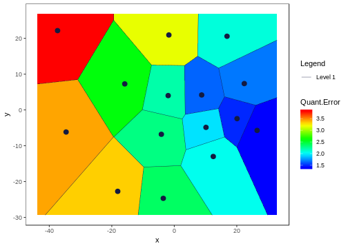
Figure 3: The Voronoi tessellation with the heat map overlaid for variable ’quant\_error’ in the ’computers’ dataset
Now let's go one level deeper and perform hierarchical vector quantization.
set.seed(240)
hvt.results2 <- list()
# depth=2 is used for level2 in the hierarchy
hvt.results2 <- muHVT::HVT(trainComputers,
                           nclust = 15,
                           depth = 2,
                           quant.err = 0.2,
                           projection.scale = 10,
                           normalize = T)
To plot the voronoi tesselation for both the levels.
# Voronoi tesselation plot for level two
plotHVT(hvt.results2,
        line.width = c(1.2, 0.8),
        color.vec = c("#141B41","#0582CA"))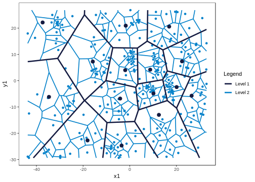
Figure 4: The Voronoi tessellation for level 2 shown for the 225 cells in the dataset ’computers’
In the table below, Segment Level signifies the depth.
Level 1 has 15 cells
Level 2 has 225 cells .i.e. each cell in level1 is divided into 225 cells
Let's analyze the summary table again for Quant.Error and see if any of the cells in the 2nd level have quantization error below quantization error threshold. In the table below, the values for Quant.Error of the cells which have hit the quantization error threshold are shown in red. Here we are showing just top 50 rows for the sake of brevity.
summaryTable(hvt.results2[[3]][['summary']],limit = 10)| Segment.Level | Segment.Parent | Segment.Child | n | Quant.Error | price | speed | hd | ram | screen | ads |
|---|---|---|---|---|---|---|---|---|---|---|
| 1 | 1 | 1 | 557 | 2.58 | 0.88 | -0.01 | 0.83 | 1.63 | -0.10 | 0.25 |
| 1 | 1 | 2 | 465 | 1.64 | -0.17 | -0.78 | 0.33 | -0.01 | -0.35 | 0.44 |
| 1 | 1 | 3 | 562 | 1.4 | -1.25 | -0.93 | -0.84 | -0.80 | -0.51 | 0.65 |
| 1 | 1 | 4 | 480 | 2.3 | 0.71 | 0.69 | 0.24 | -0.02 | 0.06 | 0.56 |
| 1 | 1 | 5 | 384 | 3.33 | 0.80 | 0.17 | 0.03 | 0.09 | 2.88 | 0.11 |
| 1 | 1 | 6 | 139 | 2.38 | 0.22 | 2.67 | 0.09 | -0.21 | -0.15 | 0.76 |
| 1 | 1 | 7 | 302 | 2.09 | -0.32 | -0.54 | -0.80 | -0.50 | -0.43 | -2.15 |
| 1 | 1 | 8 | 248 | 2.21 | -0.37 | 0.67 | 0.84 | 0.04 | -0.13 | -0.59 |
| 1 | 1 | 9 | 397 | 2.05 | -0.52 | 0.57 | -0.62 | -0.75 | -0.32 | 0.78 |
| 1 | 1 | 10 | 230 | 3.16 | 1.10 | 0.34 | -0.16 | 0.35 | -0.14 | -1.93 |
The users can look at the compression summary to get a quick summary on the compression as it becomes quite cumbersome to look at the summary table above as we go deeper.
compressionSummaryTable(hvt.results2[[3]]$compression_summary)| segmentLevel | noOfCells | noOfCellsBelowQuantizationError | percentOfCellsBelowQuantizationErrorThreshold |
|---|---|---|---|
| 1 | 15 | 0 | 0 |
| 2 | 225 | 11 | 0.05 |
As it can be seen in the table above, only 5% cells in the 2nd level have quantization error below threshold. Therefore, we can go one more level deeper and try to compress the data further.
We will look at the heatmap for quantization error for level 2.
hvtHmap(hvt.results2,
        trainComputers,
        child.level = 2,
        hmap.cols = "quant_error",
        line.width = c(0.8,0.2),
        color.vec = c("#141B41","#0582CA"),
        palette.color = 6,
        centroid.size = 2,
        show.points = T)
Figure 5: The Voronoi tessellation with the heat map overlaid for variable ’quant\_error’ in the ’computers’ dataset
Now once we have built the model, let us try to predict using our test dataset which cell and which level each point belongs to.
Let us see predictHVT function.
predictHVT(data,hvt.results,hmap.cols = NULL,child.level = 1,...)Important parameters for the function predictHVT
-
data- A dataframe containing test dataset. The dataframe should have atleast one variable used while training. The variables from this dataset can also be used to overlay as heatmap. -
hvt.results- A list of hvt.results obtained from HVT function while performing hierarchical vector quantization on train data -
hmap.cols- The column number of column name from the dataset indicating the variables for which the heat map is to be plotted.(Default = NULL). A heatmap won't be plotted if NULL is passed -
child.level-A number indicating the level for which the heat map is to be plotted.(Only used if hmap.cols is not NULL) -
...- color.vec and line.width can be passed from here
set.seed(240)
predictions <- muHVT::predictHVT(testComputers,
                                 hvt.results3,
                                 hmap.cols = NULL,
child.level = 3)The prediction algorithm recursively calculates the distance between each point in the test dataset and the cell centroids for each level. The following steps explain the prediction method for a single point in test dataset :-
- Calculate the distance between the point and the centroid of all the cells in the first level.
- Find the cell whose centroid has minimum distance to the point.
- Check if the cell drills down further to form more cells.
- If it doesn't, return the path. Or else repeat the steps 1 to 4 till we reach to the level at which the cell doesn't drill down further.
Let's see what cell and which level do each point belongs to. For the sake of brevity, we will
Table(predictions$predictions,scroll = T,limit = 10)| price | speed | hd | ram | screen | ads | cell\_path | |
|---|---|---|---|---|---|---|---|
| 5008 | 1540 | 33 | 214 | 4 | 15 | 191 | 12->15->14 |
| 5009 | 3094 | 50 | 1000 | 24 | 15 | 191 | 13->14->4 |
| 5010 | 1794 | 50 | 214 | 4 | 14 | 191 | 15->11->12 |
| 5011 | 2408 | 100 | 270 | 4 | 14 | 191 | 6->9 |
| 5012 | 2454 | 66 | 720 | 16 | 15 | 191 | 1->9->15 |
| 5013 | 1969 | 66 | 1000 | 8 | 14 | 191 | 8->4->9 |
| 5014 | 2904 | 50 | 1000 | 24 | 15 | 191 | 13->14->1 |
| 5015 | 1545 | 66 | 340 | 8 | 14 | 191 | 8->1->7 |
| 5016 | 1718 | 66 | 340 | 4 | 14 | 191 | 15->12 |
| 5017 | 1604 | 33 | 214 | 4 | 14 | 191 | 12->12->11 |
We can see the predictions for some of the points in the table above. The variable cell_path shows us the level and the cell that each point is mapped to. The centroid of the cell that the point is mapped to is the codeword (predictor) for that cell.
The prediction algorithm will work even if some of the variables used to perform quantization are missing. Let's try it out. In the test dataset, we will remove screen and ads.
set.seed(240)
testComputers <- testComputers %>% dplyr::select(-c(screen,ads))
predictions <- muHVT::predictHVT(testComputers,
                                 hvt.results3,
                                 hmap.cols = NULL,
                                 child.level = 3)
Table(predictions$predictions,scroll = T,limit = 10)| price | speed | hd | ram | cell\_path | |
|---|---|---|---|---|---|
| 5008 | 1540 | 33 | 214 | 4 | 12->12->3 |
| 5009 | 3094 | 50 | 1000 | 24 | 13->14->5 |
| 5010 | 1794 | 50 | 214 | 4 | 9->13->13 |
| 5011 | 2408 | 100 | 270 | 4 | 6->12 |
| 5012 | 2454 | 66 | 720 | 16 | 1->9->9 |
| 5013 | 1969 | 66 | 1000 | 8 | 8->4->4 |
| 5014 | 2904 | 50 | 1000 | 24 | 13->14->1 |
| 5015 | 1545 | 66 | 340 | 8 | 9->4->14 |
| 5016 | 1718 | 66 | 340 | 4 | 9->9->2 |
| 5017 | 1604 | 33 | 214 | 4 | 12->15->14 |
-
Pricing Segmentation - The package can be used to discover groups of similar customers based on the customer spend pattern and understand price sensitivity of customers.
-
Market Segmentation - The package can be helpful in market segmentation where we have to identify micro and macro segments. The method used in this package can do both kinds of segmentation in one go.
-
Anomaly detection - This method can help us categorize system behaviour over time and help us find anomaly when there are changes in the system. For e.g. Finding fraudulent claims in healthcare insurance.
-
The package can help us understand the underlying structure of the data. Suppose we want to analyze a curved surface such as sphere or vase, we can approximate it by a lot of small low-order polygons in the form of tesselations using this package.
-
In biology, Voronoi diagrams are used to model a number of different biological structures, including cells and bone microarchitecture.
-
Vector Quantization : https://ocw.mit.edu/courses/electrical-engineering-and-computer-science/6-450-principles-of-digital-communications-i-fall-2006/lecture-notes/book_3.pdf
-
Sammon’s Projection : http://en.wikipedia.org/wiki/Sammon_mapping
-
Voronoi Tessellations : http://en.wikipedia.org/wiki/Centroidal_Voronoi_tessellation
For more detailed examples of diffrent usage to construct voronoi tesselations for 3D sphere and torus can be found here at the vignettes directory inside the project repo
For any queries related to bugs or feedback, feel free to raise the issue in github issues page