This repository is for demonstration purposes of how it can be implemented in Angular and is not maintaned. Please fork and maintain your own version of this repository.
Simple popover control for your angular2 applications using bootstrap3. Does not depend of jquery. If you don't want to use it without bootstrap - simply create proper css classes. Please star a project if you liked it, or create an issue if you have problems with it.
see DEMO.
-
Install npm module:
npm install ngx-popover --save -
If you are using system.js you may want to add this into
mapandpackageconfig:{ "map": { "ngx-popover": "node_modules/ngx-popover" }, "packages": { "ngx-popover": { "main": "index.js", "defaultExtension": "js" } } }
Import PopoverModule in your app and start using a component:
<div popover="content to be shown in the popover"
     popoverTitle="Popover header"
     popoverPlacement="top"
     [popoverOnHover]="false"
     [popoverCloseOnClickOutside]="true"
     [popoverCloseOnMouseOutside]="false"
     [popoverDisabled]="false"
     [popoverAnimation]="true"
     [popoverDismissTimeout]="1000">
    element on which this popover is applied.
</div>
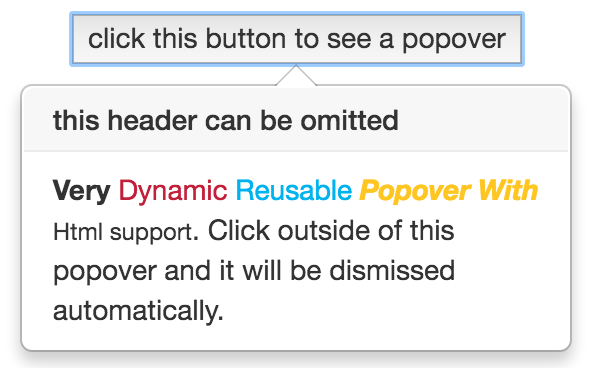
Example of usage with dynamic html content:
<popover-content #myPopover
                title="Popover title"
                placement="left"
                [animation]="true"
                [closeOnClickOutside]="true" >
    <b>Very</b> <span style="color: #C21F39">Dynamic</span> <span style="color: #00b3ee">Reusable</span>
    <b><i><span style="color: #ffc520">Popover With</span></i></b> <small>Html support</small>.
</popover-content>

<button [popover]="myPopover">element on which this popover is applied.</button>
<div popover>:popover="string"The message to be shown in the popover.popoverTitle="string"Popover title text.popoverPlacement="top|bottom|left|right|auto|auto top|auto bottom|auto left|auto right"Indicates where the popover should be placed. When using "auto" modifier, will show in opposite direction if not enough room. Default is "bottom".[popoverDisabled]="true|false"Indicates if popover should be disabled. If popover is disabled then it will not be shown. Default is false[popoverAnimation]="true|false"Indicates if all popover should be shown with animation or not. Default is true.[popoverOnHover]="true|false"If set to true then popover will open on mouse over instead of mouse click. Default is false.[popoverCloseOnMouseOutside]="true|false"Indicates if popover should be closed when user mouse outside of it. Default is false.[popoverCloseOnClickOutside]="true|false"Indicates if popover should be closed when user click outside of it. Default is false.[popoverDismissTimeout]="number"Used to automatically dismiss popover after given amount of time. Default is 0, means disabled.
<popover-content>:placement="top|bottom|left|right|auto|auto top|auto bottom|auto left|auto right"Indicates where the popover should be placed. When using "auto" modifier, will show in opposite direction if not enough room. Default is "bottom".[animation]="true|false"Indicates if all popover should be shown with animation or not. Default is true.[closeOnMouseOutside]="true|false"Indicates if popover should be closed when user mouse outside of it. Default is false.[closeOnClickOutside]="true|false"Indicates if popover should be closed when you click outside of it. Default is false.
import {Component} from "@angular/core";
import {PopoverModule} from "ngx-popover";

@Component({
    selector: "app",
    template: `
<div class="container">

    <!-- regular popover -->
    <p>
        It is a long established <span popover="Hello fact!" popoverTitle="Fact #1"><b>click this fact</b></span> that a reader will be distracted by the readable content of a page when looking at its layout.
        The point of using Lorem Ipsum is that it has a more-or-less normal distribution of letters, as opposed to using 'Content here, content here', making it look like readable English.
        <span popover="many, but not all" popoverPlacement="left"><b>Many desktop</b></span> publishing packages and web page editors now use Lorem Ipsum as their default model text, and a search for 'lorem ipsum' will uncover many web sites still in their infancy.
        <span popover="various, but not all" popoverPlacement="right"><b>Various versions</b></span> have evolved over the years, sometimes by accident, <span popover="another hint" popoverPlacement="top"><b>sometimes on purpose</b></span> (injected humour and the like)
    </p>

    <br/>
    <button popover="Hello popover. Now click outside." [popoverCloseOnClickOutside]="true">
        click to open popover that will be closed when you click outside of it.
    </button>

    <!-- popover with dynamic html content -->
    <br/><br/>
    <div>
        <popover-content #myPopover
            title="this header can be omitted"
            [closeOnClickOutside]="true">
            <b>Very</b> <span style="color: #C21F39">Dynamic</span> <span style="color: #00b3ee">Reusable</span>
            <b><i><span style="color: #ffc520">Popover With</span></i></b> <small>Html support</small>.
            Click outside of this popover and it will be dismissed automatically.
        </popover-content>

        <button [popover]="myPopover">click this button to see a popover</button>
    </div>

    <!-- popover show on hover -->
    <br/>
    <div>
        <button popover="Hello popover" [popoverOnHover]="true">hover this button to see a popover</button>
    </div>

    <!-- popover show on hover and hide only when mouse over outside of the popover -->
    <br/>
    <div>
        <button popover="Hello popover"
                popoverPlacement="right"
                [popoverOnHover]="true"
                [popoverCloseOnMouseOutside]="true">
            hover this button to see a popover, allows to create interactive popovers
        </button>
    </div>

    <!-- popover show on hover -->
    <br/>
    <div>
        <button popover="Hello dismissible popover" [popoverDismissTimeout]="2000">click to see this popover. This popover will be dismissed in two seconds</button>
    </div>

</div>
`
})
export class App {

}

@NgModule({
    imports: [
        // ...
        PopoverModule
    ],
    declarations: [
        App
    ],
    bootstrap: [
        App
    ]
})
export class AppModule {

}
Take a look on samples in ./sample for more examples of usages.
