- Table of Contents
- Design
- Stack Overview
- Structure
- Components Overview
- App State
- Final Thoughts & Possible Enhancements
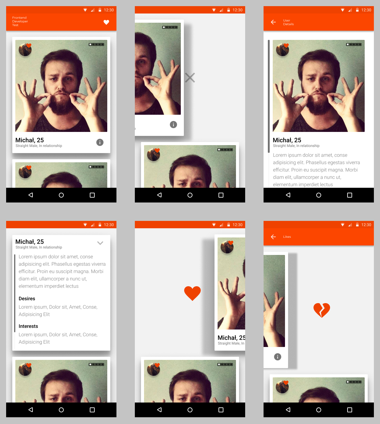
I have reviewed several dating apps to find inspiration for UI, mainly focusing on users list as this is what the test task is about. Here are some features I liked.
-
Tinder
- Swiping mechanism for user like/dislike. At this point it is very natural for dating apps because of Tinder's success and it makes browsing and interacting with user list very dynamic and quick.
- Browsing user photos by clicking on part of an image
-
Happn
- This one has a vertical list, if you want to skip user just swipe down as you do on social apps when not interested in content
I have merged some properties of reviewed apps that I liked and came up with original design with FeelD brand colors.
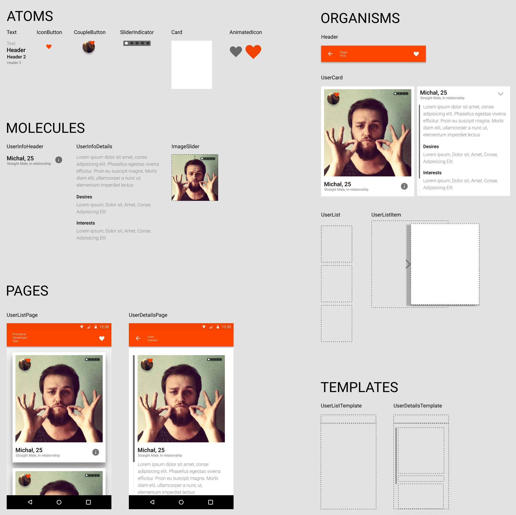
I have decided to use atomic design for components structure as I find it understandable and clear. It is also a good bridge between designing and developing React apps.
I have picked dependencies that fit project's need and I'm familiar to. Below is an overview of why I choose these packages.
-
Styled Components - css-in-js library that supports React Native.
- styled components provides RN primitives and lets you style them using css syntax in a very clean way.
- supports global themes and injecting style depending on props.
-
Redux - library for state management.
- components can be completely independent of application state, therefore can focus strictly on user interface. This keeps the code clean but also makes testing UI much simpler as there is much less need for mocking.
- it also makes it easier to understand the state and debug it through reducers.
- redux structure allows executing synchronous and asynchronous code undistinguishable for components layer which makes it easy to work with.
-
React Navigation - navigation library
- supports Android/iOs navigation properties
- makes passing props between screens easier
- handles header configuration
-
redux-api-middleware - redux middleware
- middleware for redux with easily declarable REST API calls
- handles requests/response states
-
react-native-expo-image-cache - cache library
- takes care of image caching
-
expo-react-native-shadow - UI library
- provides cross-platform, configurable shadow view based on SVG
- unifies working with shadows as iOs/Android have separate ways to deal with it that feel differently
-
Expo - tool-chain for React Native development.
- expo is a public app for iOs/Android that can receive js code directly from local packager.
- saves a lot of time and pain related to native code setup, builds, deploy and allows publishing updates very effectively.
- it isn't perfect as you can only use native functionalities that are already supported by expo but will completely work for this project.
-
TypeScript - typed superset of JS that compiles to JS
- type checking speeds up development because of IDE support hints
- makes it possible to view library contents without reaching to docs
- compiles to optimized JS code
- makes you find out your bugs in early stage of development
- excludes possibility of making type mistake that would result with an error
- is much faster than Flow solution
-
Babel - JS compiler
- in this solution it compiles TypeScript generated JS
- provides easy way to include plugins, presets
-
TSLint - linter for TypeScript
- checks code for readability, maintainability and functionality errors
- makes you catch a bug in early stage
- this project is using airbnb preset as I find it a clean and vast set of rules
-
Prettier - code formatter
- works with TSLint
- set of code styling rules that allows whole team working on same conditions
- makes git commits much cleaner as you don't commit extra lines, unordered imports, etc.
-
Jest - testing platform
- fast, parallel tests execution
- includes mocking functionality
- simple configuration
- provides tests coverage
-
Enzyme - testing utility
- makes it easier to assert, manipulate components output
- is very fast, especially when rendering shallow components
-
sinon - testing utility
- allows spying on component functions to make sure they are triggered properly
-
Storybook - development environment for UI components
- provides living documentation
- simplifies components development as you can run, style, test in isolated environment without app-specific dependencies
- provides addons like knobs/actions and many more tools to keep all of your component knowledge and testing/viewing in one place.
- components - this directory contains all application components in atomic structure (atoms, molecules, organisms, pages)
- resources - this directory contains resource files on style, theme, application routes, model and config data
- store - this directory contains all redux related code - actions, reducers, middleware related code
- storybook - this directory contains storybook configuration files
- utils - utilities used across the application
Every component is contained in separate folder with following structure:
- index.ts file - this file organizes exports for component implementation, usually exports only fully connected component as a default
- Component.tsx - main file for component implementation
- Component.test.tsx - unit tests for component
- Component.story.tsx - this file is recognized from storybook and contains information on how to display stories related to this component
- styled.ts - this file only occurs if main component file has many styled subcomponents and contains them for code-clarity
- SubComponent.tsx - structure includes subcomponents that are only valid in context on main component so they cannot be reusable
Unit tests for component are divided for 5 sections
- Props - tests that verify default props being set properly
- State - tests that verify default state being set properly
- Render - tests that verify render function of the component, if all the props in subcomponents are set properly regarding main component state & props
- Interaction - tests that verify component state, props callbacks on user interaction or lifecycle methods occurrence
- Style - tests that verify if specific style properties are connected to related global style object
Displays circular icon button with associated icon placed on the border
Displays image with URI for given url, size of the image is determined by viewSize.
Additional url - nextUrl is displayed in hidden mode so it is actually loaded but not visible to the user
On props change images are switched.
This action allows next image to render more smoothly and avoids android-specific image flickering on load
Props:
- viewSize: number
- url: string
- nextUrl: string
Displays clickable icon form MatterialCommunityIcons set.
Provides props to set name, color & padding of the icon.
Triggers onClick when icon is pressed
Props:
- iconName: string
- iconColor: string - optional
- padding: number - optional
- onClick: function - optional
Renders styled container with count number of points.
Point on index index is styled to indicate current element
Props:
- index: number
- count: number
Displays text for given text variant.
Styles for specific variants are defined in styles resource
Provides props to pass custom style, id of Text component and numberOfLines property
Props:
- variant: "default" | "h1" | "h2" | "h3" - optional (default: "default")
- children: string
- style: string - optional
- id: string - optional
- numberOfLines: number - optional
Renders touchable CachingImage for given images array and SliderIndicator for current state index.
On being clicked increases index (or sets to 0 on making full circle) and displays next image from images array.
If images array is empty, renders placeholder view with viewSize hegiht & width
Props:
- images: IImage[]
- viewSize: number
Renders headers and text for userInfo sections.
Desires section is only rendered if userInfo has defined desires.
Interests section is only rendered if userInfo has defined interests.
If showPartialAbout is true, about text is cut to 7 lines.
Props:
- userInfo: IUserInfo
- showPartialAbout: boolean - optional
Renders header for given user.
Header text contains userInfo's name, age, sexuality, gender & type
Header text is clickable and navigates to DetailsPage.
If icon is specified clickable icon renders to the side and triggers onIconClick if pressed.
Props:
- user: IUser
- icon: string - optional
- onIconClick: function - optional
Displays ImageSlider with user photos and userInfo in UserInfoHeader & UserInfoDetails components
If user has defined associated user, displays AssociatedButton.
Implements custom animation to view UserInfoDetails that is triggered by UserInfoHeader icon.
Animation takes effect on userInfo components and AssociatedButton if present
Props:
- user: IUser
Displays ImageSlider with user photos and userInfo in UserInfoHeader & UserInfoDetails components
If user has defined associated user, displays AssociatedButton.
Whole content is contained in ScrollView.
Props:
- user: IUser
Optimized FlatList for UserListItems.
Scroll action deceleration rate is very low to make user snap into current item.
Snap event occurs when user releases scroll touch to the list
Component is registering current items viewability and makes decision to snap to next item if it already visible enough.
Renders custom Footer and Header items
Props:
- users: IUser[]
This component renders animated UserCard with custom shadow for given user
Component recognizes user gestures and captures horizontal gestures if these have small enough change on y axis to consider them side swiping.
On touch animates UserCard position to follow the touch.
On certain treshold releases the gesture and animates item away and back to the screen.
In the same time status icon is displayed over card.
Status icon is dependend on gesture direction, right - like, left - reject
Props:
- user: IUser
Application state is controlled by redux. In this case this comes down to fetching user data from single endpoint.
I'm using redux-api-middleware to provide REQUEST, RECEIVE & FAILURE actions that are consumed by MainPage
-
I was mainly developing & testing this application for Android devices. I did some adjustments to make it work for iOs as well but it should perform better on Android.
-
I have mainly focused on application UI for this task. Main challenges were to make FlatList and ListItem animations smooth. I think there is still room for optimization.
-
ListItem animation could be dealt with inside UserList component and have animation view displayed only for current item. That would decrease the weight of single ListItem and speed up the render. And wouldn't be painful for the user as List already focuses him on single item to interact with at the time.
-
UserList for iOs doesn't snap to item.
-
List could fetch more data from the server on reaching list end. Endpoint returns 20 random users out of 100 so it would required filtration of received data and in result wouldn't result in gaining 20 users on every poll.
-
Application doesn't save likes/rejects state, every time you start app you get fresh instance. If I had more time I would reuse UserList to create LikesPage with stored likes (via AsyncStorage) and possibility to alter their status
-
I was creating AssociatedButton with idea that API is returning associated field with User like data, it supossed to be displaying user photo inside but I have integrated the API were late into development so it became just an icon. It could be enhanced to show animated view with associated person data.
-
CacheManager from "react-native-expo-image-cache" could prefetch couple first images when getting the data from server to make it faster to load
-
ImageSlider could support left/right side clicks to iterate forward/backward through images
-
UserDetails could implement another version of ImageSlider where images would be displayed in full width/height, similar to FeelD app
-
Application is structured in such a way to provide possibility for defining theme within styles resource, so with a low cost app could implement multiple themes.
-
If had more time it would be great to write some E2E test specs and run them on several devices as the experience tend to change on different devices.