In previous lessons we have utilized the provided Superstore Sales dataset to learn about the Tableau environment interface, including the Start page, Data Source page, and Workspace/Worksheets. Then, we explored the useful visualizations that can be created in Tableau Public. Finally, we discussed how we can combine the vizualizations in our workbooks to create dashboards to communicate our insights. Now it's your turn to apply your skills in Tableau.
In this exercise, you will use knowledge of the Tableau interface and data visualizations to create the Super Store Sales dashboard. Refer to previous lessons and labs if needed!
To create the dashboard, follow the instructions below. When you are finished, save and publish your completed dashboard to your Tableau Public account.
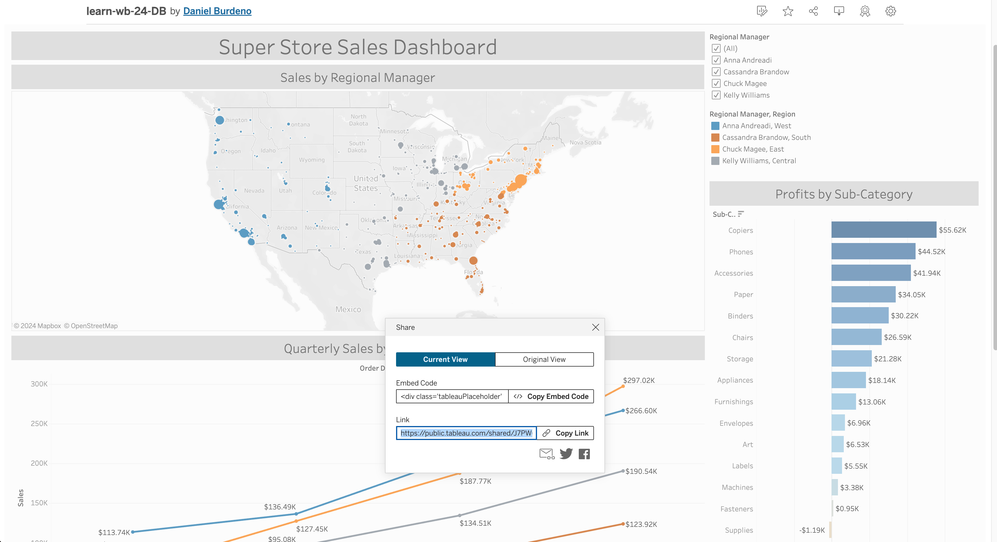
The final product should look like this:
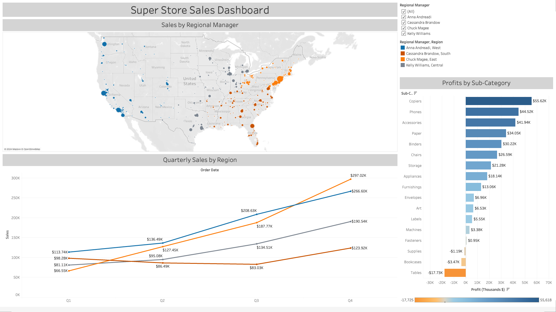
|
- Launch Tableau Public and from the Start page, use the Connect pane to open the SuperStore Sales dataset. It can be found in this repo or it can also be downloaded directly from Tableau Public.
- On the Data Source page, populate the page with the
Orderstable and thePeopletable. Remember that Tableau will automatically form a relationship if/when possible.
Note: This data file is updated periodically by Tableau, newer versions might display different names/infomation then shown below.
For Part B, use lessons "Tableau Visualizations: Visualization Basics" and "Tableau Visualizations: Visualization Basics Lab" as a reference.
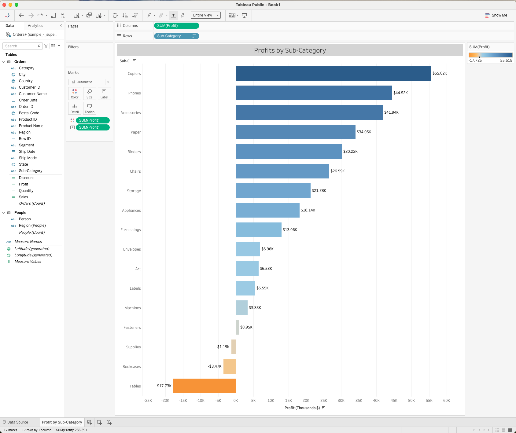
- Create a new worksheet - title it "Profits by Sub-Category"
- Drag the
Profitspill to the Columns shelf from the Data Pane. - Drag the
Sub-Categorypill to the Rows shelf from the Data Pane. - Edit the title to be centered and have font size 16. Format the title background/shading to be light gray. Format Title > Shading dropdown.
- Order the bars in descending order.
- Next, drag the
Profitspill from the Data pane to the Marks card, and use the Marks card to change the color of the bars to "Orange-Blue Diverging". - Next use the Marks card to add labels that indicate the sum of the profits for each of the bars by dragging another
Profitspill from the Data pane and using the label mark. Format the labels using "Currency (Custom)" under the Numbers formatting option. Display the amount in thousands with the dollar sign symbol. Bonus: Change the axis label to include "Thousands" - Fit the visualization to "Entire View".
|
For Part C, use lessons "Tableau Visualizations: Visualization Basics" and "Tableau Visualizations: Visualization Basics Lab" as a reference.
- Create a new worksheet - title it "Sales By Regional Manager". Change the font size to 16, center the title, and change the background to light gray again.
- Drag the
LongitudeandLatitudeto the Columns shelf and the Rows shelf respectively. - Add
Salesto the Marks card, and select the Size attribute. Then, addPostal Codeto the Marks card and select the Detail attribute. This will populate the map with sales by postal code. Using the Show Me dropdown, select symbol map if Tableau did not default to the map view. - Rename
Personpill to beRegional Managerby right clicking > Rename. - Drag the "new"
Regional Managerpill to the Marks card and select the Color attribute. - Also drag the
Regionpill into the Marks card without selecting a specfic mark. Then left click and change it to color. This should get you both the name and the region as one color label. - Then, click the Color icon and select Edit Color. Using the Color Blind pallete, assign the following colors to each Regional Manager, Region:
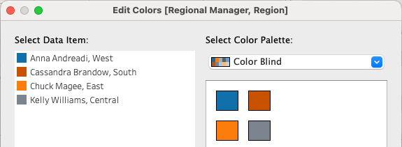
|
- Next, drag
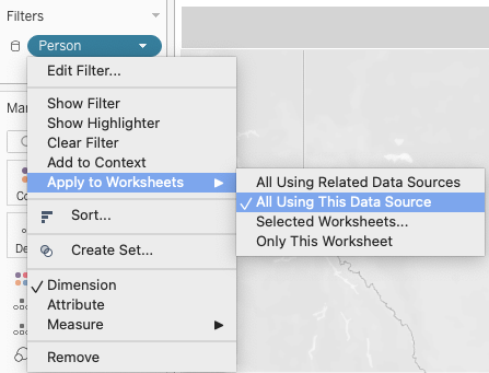
Profitto the Marks card and add the Detail attribute. This will allow users to view the profits in conjunction with sales (because high sales does not always mean high profits). - Then, drag
Regional Managerto the Filter shelf. Click the dropdown arrow on the new filter and select Apply to Worksheets > All Using This Data Source. This will allow the filter to work across the dashboard.
|

|
For Part D, use lessons "Tableau Visualizations: Visualization Basics" and "Tableau Visualizations: Visualization Basics Lab" as a reference.
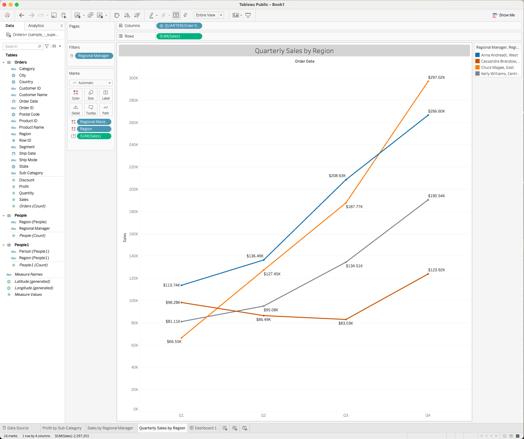
- Create a new worksheet - title it "Quarterly Sales by Region". Change the title to size 16, center it, and color the background light gray as before.
- Drag the
SalesandOrder Datepills from the Data pane to the Row shelf and the Column shelf respectively. You will notice thatSalesbecomesSUM(Sales)and thatOrder DatebecomesYEAR(Order Date). On theYEAR(Order Date)pill, click the arrow directly to the right of the text on theYEAR(Order Date)pill. This will reveal a drop down menu. Select Quarter from the dropdown, which will changeYEAR(Order Date)toQuarter(Order Date). - Add
Regional Managerto the Marks card, and select the Color attribute. In the same manner as the previous figure, also addRegionto the Marks card without choosing a mark and then change it to color. - Confirm that your colors match. Tableau should default to the existing colors you used previously but you should double check to confirm they match!
- Drag the
Salespill to the Marks card and choose Label, format the amounts appropriately. - Finally, drag the
Profitpill to the Marks card and select Tooltip.
|
For Part E, use lessons "Tableau Dashboards: Introduction", "Tableau Dashboards: Dashboard Basics" and "Tableau Dashboards: Dashboard Basics Lab" as a reference.
- Create a new dasboard - title it "Super Store Sales Dashboard"
- Create the Desktop layout by right clicking Default > Add Desktop Layout. Select Fit Width and set Height to 1060px. Then, select Custom and Tiled from the layout card.
- Check Show Dashboard Title. Change the font size to 26. Center the title and change the background to light gray. When the title is selected, select the Layout tab on the left bar menu, then choose Background.
- Add a Horizontal Container under the dashboard title and set the layout to Tiled.
- Using two Vertical Containers, position the charts and legends in the layout displayed below. Remember that you need to add worksheets to the default layout before you can access them in the Desktop layout
|
|
-
Save and publish to Tableau Public as
learn-wb-MM-DD-YY-XXwhereXXis your initials andMMDDYYrefers to the current month, date, and year. -
Locate the share link on your Tableau Public site and submit your dashboard link to canvas. Congratulations you have now published a successful Tableau Public dashboard. Keep exploring this one or dive into some of the other datasets Tableau provides for some more practice creating visuals! Take a look at Tableau Public for some example ideas.
|
In Tableau you can set advance filters and highlighters across multiple worksheets via the Actions panel
- On any worksheet (not dashboard) go the Worksheet dropdown > Actions
- From here you can add any number of action rules including filtering and highlighting
- Here are some quick filters to explore for this dashboard.
- Filter by Sub-Category
- Source Sheets: Orders+ > Profit by Sub-Category
- Target Sheets: Dashboard > All three
- Choose to run on select and to show all values when clearing
- Filter > Selected fields > Sub-Category
- Filter by Regional Manager - for Sub-Categories
- Source Sheets: Orders+ > Sales by Regional Manager
- Target Sheets: Dashboard > All three
- Choose to run on select and to show all values when clearing
- Filter > Selected fields > Regional Manager
- Filter by Manager and Quarter - for Sub-Categories
- Source Sheets: Orders+ > Quarterly Sales by Region
- Target Sheets: Dashboard > All three
- Choose to run on select and to show all values when clearing
- Filter > Selected fields > Regional Manager followed by # QUARTER(ORDER Date)
- Filter by Sub-Category
- Check out how all these filters interact on the final dashboard!