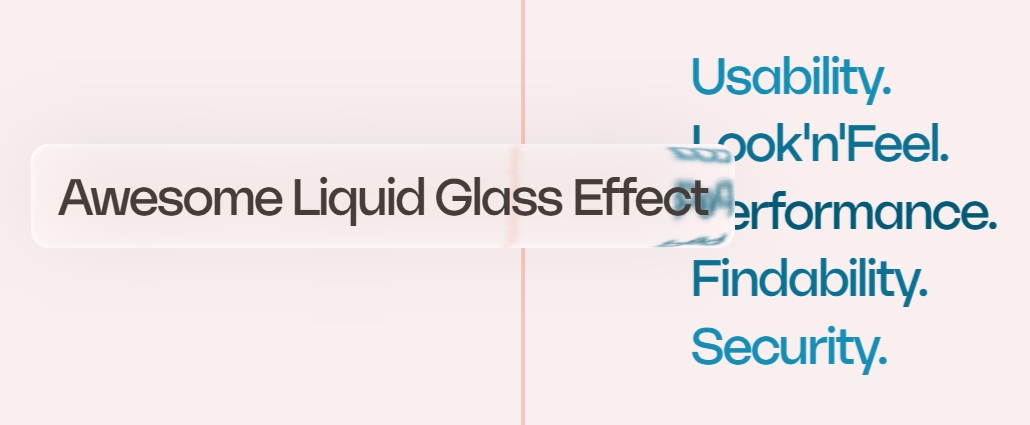
A liquid glass effect card built using only CSS by the power of svg filters. Simple and easy to use, minimal code weight and type safe.
If the browser does not support svg filters, it will gracefully degrade to a simple card with a default blurry background color.
- Install the npm package
npm install react-liquid-glass-card- Use it inside of any react component. Works right out of the box with Next.js (SSR and CSR), Create React App, ViteJs and more.
import { LiquidGlassCard } from "react-liquid-glass-card";

<LiquidGlassCard>
  <div>Your content here</div>
</LiquidGlassCard>;- Customize the card by passing the following props.
<LiquidGlassCard
  padding="2rem 1rem"
  borderRadius="1rem"
  brightness={1.2}
  blur={10}
  backgroundColor="rgba(255, 255, 255, 0.5)"
>
  <div>Your content here</div>
</LiquidGlassCard>