Titanium Android library that provides access to HITGIF awesome TextFieldBoxes. A new Material Design text field that comes in a box, based on Google Material Design guidelines.
View the Using Titanium Modules document for instructions on getting started with using this module in your application.
- Titanium SDK 7.0.0+
Download the Ti.Android.TextFieldBoxes module here.
- Basic
- Enable / Disable
- Helper Text & Error Text
- Prefix & Suffix
- Max & Min Characters
- Icon Signifier
- End Icon
- Clear Button
- Custom Colors
- Dense Spacing
- Always Show Hint
- Text Change Watcher
- Dark Theme
- Masks
Add TextFieldBoxes that contains a ExtendedEditText to your layout:
...
var TextFieldBoxes = require('ti.android.textfieldboxes');
var TFBoxes = TextFieldBoxes.createView({
top : 16,
left : 16,
right : 16,
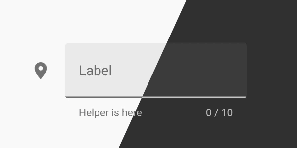
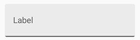
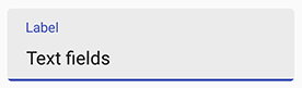
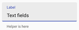
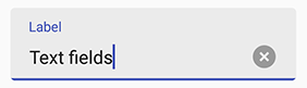
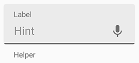
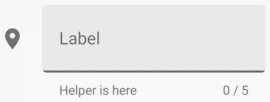
hintText : "Label"
});
masterView.add(TFBoxes);
...*NOTE that hintText is optional
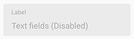
enabled on creation or setEnabled(boolean enabled)
var TFBoxes = TextFieldBoxes.createView({
    ...
    enabled : false
});
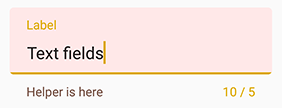
NOTE: setting helper or error text to anything not empty will make the bottom view (which contains the helper label) visible and increase the height of the TextFieldBoxes. So if you want to always keep the bottom view visible (height increased), set the helper text to " " when there should be nothing.
helper text: helperText on creation or setHelperText(String helperText)
var TFBoxes = TextFieldBoxes.createView({
    ...
    helperText : "Helper is here"
});
error text: setError(String errorText, boolean giveFocus)
Param giveFocus determines whether the field will gain focus when set error on. If true, the field gains focus immediately.
NOTE: Error will be removed when the text changes (input or delete).
TFBoxes.setError("Error message", true);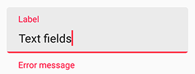
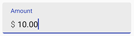
Use prefix on creation or setPrefix(String prefix) to set the unselectable prefix text at the start of the field.
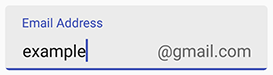
Use suffix in on creation or setSuffix(String suffix) to set the unselectable suffix text at the end of the field.
var TFBoxes = TextFieldBoxes.createView({
    ...
    prefix : "$ "
});
var TFBoxes = TextFieldBoxes.createView({
    ...
    suffix : "@gmail.com"
});
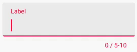
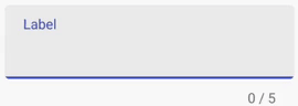
NOTE: setting max or min character will make the bottom view (which contains the counter label) visible and increase the height of the TextFieldBoxes.
Use maxCharacters on creation or setMaxCharacters(int maxCharacters) to set the max characters count. Use removeMaxCharacters() to remove the limit.
Use minCharacters on creation or setMinCharacters(int minCharacters) to set the min characters count. Use removeMinCharacters() to remove the limit.
The color of the bottom line will turn to errorColor (red by default) when exceeding max or min characters limit. 0, as default, means no max or min characters limit.
NOTE: Space and line feed will NOT count.
var TFBoxes = TextFieldBoxes.createView({
    ...
    maxCharacters : 10,
    minCharacters : 5
});
var TFBoxes = TextFieldBoxes.createView({
    ...
    maxCharacters : 5
});
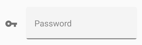
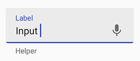
Use iconSignifier on creation or setIconSignifier(String resourceName) to set the icon that is shown in front of the TextFieldBoxes if you want there to be one.
NOTE that the image resources should be in /platform/android/res/drawable-{density} folders
You can useisResponsiveIconColor on creation or setIsResponsiveIconColor(boolean isResponsiveIconColor) in Java code to set whether the icon will change its color when gaining or losing focus as the label text and the bottomLine do.
NOTE that if true, the icon's color will always be HighlightColor (the same as the bottomLine) that will turn gray when losing focus. If false, the icon will always be in primaryColor.
var TFBoxes = TextFieldBoxes.createView({
    ...
    iconSignifier : "baseline_vpn_key_black_24dp"
});

You can create the TextFieldBoxes.END_ICON_CLICK event to define what will happen when it's clicked.
TFBoxes.addEventListener(TextFieldBoxes.ICON_IMAGE_CLICK, function(e){
    // What you want to do when it's clicked
});Use endIcon in xml or setEndIcon(String resourceName) to set the icon of the ImageButton that is shown at the end of the field if you want there to be one.
NOTE that the image resources should be in /platform/android/res/drawable-{density} folders
var TFBoxes = TextFieldBoxes.createView({
    ...
    endIcon : "ic_mic_black_24dp"
});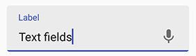
To make it useful (trigger voice input, dropdown event), you would like to add the TextFieldBoxes.END_ICON_CLICK event to set, for example, what will happen when it's clicked, or anything else you want.
TFBoxes.addEventListener(TextFieldBoxes.END_ICON_CLICK, function(e){
    // What you want to do when it's clicked
});Use hasClearButton on creation or setHasClearButton(boolean hasClearButton) to set whether to show the clear button.
If true, a clear button will be shown at the end when there are characters (ANY character) entered in the field.
var TFBoxes = TextFieldBoxes.createView({
    ...
    hasClearButton : true
});
Primary Color will be used for the color of the underline, the floating label text and the icon signifier when HAVING focus. You can use primaryColor on creation or setPrimaryColor(String color). It is set #673AB7 by default.
Secondary Color will be used for the color of the underline, the floating label text and the icon signifier when NOT HAVING focus. You can use secondaryColor on creation or setSecondaryColor(String color). It is set #B39DDB by default.
Error Color will be used for the color that indicates error (e.g. exceeding max characters, setError()). You can use errorColor on creation or setErrorColor(String color). It is set #F44336 by default.
Helper Text Color will be used for the color of the helper text. You can use helperTextColor in xml or setHelperTextColor(String color) . It is set #757575 by default.
Panel Background Color will be used for the color of panel at the back. You can use panelBackgroundColor on creation or setPanelBackgroundColor(String color). It is set #E0E0E0 by default.
var TFBoxes = TextFieldBoxes.createView({
    ...
    primaryColor : "#1B5E20",
    errorColor : "#ddaa00",
    helperTextColor : "#795548",
    panelBackgroundColor : "#ffe8e8"
});
You can make the layout compact by using a dense verticle spacing to improve user experience in some cases.
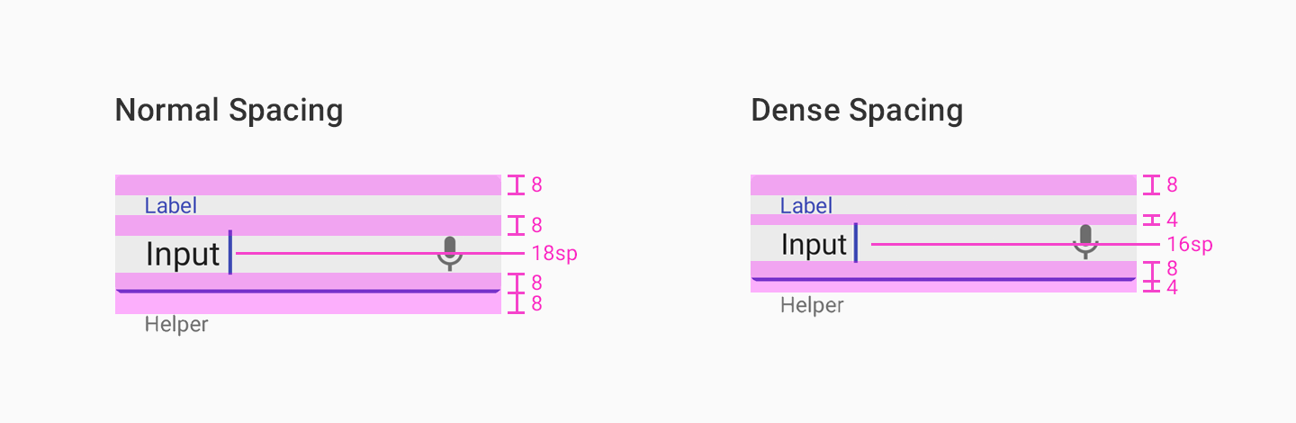
Use app:useDenseSpacing in xml or setUseDenseSpacing(boolean useDenseSpacing) to set whether the field uses a dense spacing between its elements.
var TFBoxes = TextFieldBoxes.createView({
    ...
    useDenseSpacing : true
});
Sometimes you may want the label and the hint to show different messages, but need the hint to always be shown (instead being blocked by the label when losing focus).
Use alwaysShowHint on creation or setAlwaysShowHint(boolean alwaysShowHint) to set whether the label is fixed at top when there's a hint in the EditText.
var TFBoxes = TextFieldBoxes.createView({
    ...
    alwaysShowHint : true
});
Another event you can monitor is the ON_TEXT_CHANGE. This is good event to apply masks, for example: Money, ZIP code and phone numbers.
TFBoxes.addEventListener(TextFieldBoxes.ON_TEXT_CHANGE, function(e){
    // What you want to do when it's clicked
});TextFieldBoxes use the color attributes within the current theme, but you can also choose if you want LIGHT_THEME or DARK_THEME.
var TFBoxes = TextFieldBoxes.createView({
    ...
    theme : TextFieldBoxes.LIGHT_THEME
});
var TFBoxes = TextFieldBoxes.createView({
    ...
    theme : TextFieldBoxes.DARK_THEME
});
| Attribute | Description |
|---|---|
text |
The value of the text input |
hintText |
Floating label text at the top |
helperText |
Helper text at the bottom |
prefix |
Prefix Text |
suffix |
Suffix Text |
| Attribute | Description | Default |
|---|---|---|
helperTextColor |
Helper text color | #757575 |
counterTextColor |
Counter text color | #424242 |
errorColor |
The color that is used to indicate error (e.g. exceeding max characters, setError()) |
#F44336 |
primaryColor |
The color for the underline, the floating label text and the icon signifier when HAVING FOCUS | #673AB7 |
secondaryColor |
The color for the underline, the floating label text and the icon signifier when NOT HAVING FOCUS | #B39DDB |
panelBackgroundColor |
The color for the panel at the back | #E0E0E0 |
prefixTextColor |
Prefix text color | #757575 |
suffixTextColor |
Suffix text color | #757575 |
NOTE that the image resources should be in /platform/android/res/drawable-{density} folders
| Attribute | Description | Default |
|---|---|---|
iconSignifier |
The string ID of the icon before the TextFieldBoxes | 0 |
endIcon |
The string ID of the icon at the end of the field | 0 |
isResponsiveIconColor |
whether the icon signifier will change its color when gaining or losing focus as the label and the bottomLine do | True |
| Attribute | Description | Default |
|---|---|---|
maxCharacters |
Max characters count limit. 0 means no limit |
0 |
minCharacters |
Min characters count limit. 0 means no limit |
0 |
| Attribute | Description | Default |
|---|---|---|
enabled |
Whether the text field is enabled | True |
hasClearButton |
Whether to show the clear button at the end of the EditText | False |
hasFocus |
Whether the EditText is having the focus | False |
alwaysShowHint |
Whether the label is fixed at top when there's a hint in the EditText | False |
useDenseSpacing |
Whether the field uses a dense spacing between its elements | False |
manualValidateError |
Whether to validate error state only when validate() is called |
False |
keyboardType |
The type of Keyboard you want the view to use | Titanium.UI.KEYBOARD_TYPE_DEFAULT |
You can apply masks to your code in javascript like this:
var TFBoxes = TextFieldBoxes.createView({
    ...
});

TFBoxes.addEventListener(TextFieldBoxes.ON_TEXT_CHANGE, function(e){
    TFBoxes.setText(MaskCpf(e.text));
});

var MaskCpf = function(v){
    v=v.replace(/\D/g,"");
    v=v.replace(/(\d{3})(\d)/,"$1.$2");
    v=v.replace(/(\d{3})(\d)/,"$1.$2");
    v=v.replace(/(\d{3})(\d{1,2})$/,"$1-$2");
    return v;
};
You can find more masks here