-
Notifications
You must be signed in to change notification settings - Fork 511
New issue
Have a question about this project? Sign up for a free GitHub account to open an issue and contact its maintainers and the community.
By clicking “Sign up for GitHub”, you agree to our terms of service and privacy statement. We’ll occasionally send you account related emails.
Already on GitHub? Sign in to your account
Update news 2023 - Mar 2024 #10691
Update news 2023 - Mar 2024 #10691
Conversation
There was a problem hiding this comment.
Choose a reason for hiding this comment
The reason will be displayed to describe this comment to others. Learn more.
Added a few small comments but overall looks great!
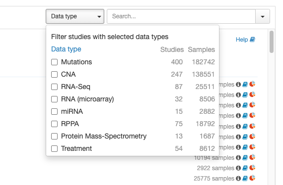
| * **New feature**: Filter by data types on the homepage: | ||
|  |
There was a problem hiding this comment.
Choose a reason for hiding this comment
The reason will be displayed to describe this comment to others. Learn more.
I'm not sure if this is specific to how I'm previewing it, but the image is showing up next to the text rather than under, which makes the vertical spacing funky. Can you make the image go under the text?
| ## Oct 17, 2023 | ||
| * **New feature**: Survival charts with landmark events and hazard ratios: | ||
| [Example: TP53 in Lung Cancer Cases in MSK-IMPACT Clinical Sequencing Cohort](https://bit.ly/48QktxS) | ||
| <img src="https://github.com/cBioPortal/cbioportal/assets/1334004/dc97c3ae-ebd7-4cd3-bb76-165517c9d2ba" width="700" /> |
There was a problem hiding this comment.
Choose a reason for hiding this comment
The reason will be displayed to describe this comment to others. Learn more.
Same thing, the preview is showing "Sequencing Cohort" as a second line of text along with the image, which means there's lots of vertical space between the first & second lines of text. Can you make the image go below all the text?
|
Thanks for reviewing @tmazor ! I made the text suggestions! for the image positioning it's a little tricky. They do show up under the text for me but we'll have to see what it looks like on docs.cbioportal.org. We don't have a good preview instance for that atm, thinking I'll merge it and fix it if it doesn't look good there afterward |
|
@tmazor I added a few more items from 2024, should be complete now |
|
There was a problem hiding this comment.
Choose a reason for hiding this comment
The reason will be displayed to describe this comment to others. Learn more.
looks good!


Fix #10651