Document
- checkbox
- async loading
- drag and drop
- context menu
- button
- customizable appearance
npm
npm install @tinywisp/vue-tree --save
import the library
import VueTree from '@tinywisp/vue-tree'
usage
<template>
 <div id="app">
   <vue-tree :tree="tree" ref="tree" class="tree" />
 </div>
</template>

<script>
import VueTree from '@tinywisp/vue-tree'

export default {
 name: 'App',
 components: {
   VueTree
 },
 data() {
   return {
     tree: [
       {
         id: 1,
         title: 'ROOT',
         hasChild: true,
         children: [
           {
             id: 2,
             title: 'child 1',
           },
           {
             id: 3,
             title: 'child 2',
             hasChild: true,
             children: [
               {
                 id: 4,
                 title: 'child 2-1'
               },
               {
                 id: 5,
                 title: 'child 2-2'
               },
               {
                 id: 6,
                 title: 'child 2-3'
               }
             ],
           },
           {
             id: 7,
             title: 'child 3'
           },
           {
             id: 8,
             title: 'child 4'
           }
         ]
       }
     ]
   }
 }
}
</script>

<style scoped>
.tree {
 width: 200px;
 height: 300px;
}
</style>click here for vue2 support
| Property | Type | Default | Description |
|---|---|---|---|
| tree | Array | [] | an array of nestable nodes which forms the tree |
| defaultAttrs | Object | {} | default attributes of all nodes |
| checkboxLinkage | Boolean | true | affect its parent and child nodes when user check/uncheck a node's checkbox |
| autoReload | Boolean | true | watch the tree property and reload automatically when it is mutated |
| dragImageOffsetX | String | 20px | the image's horizontal position relative to the mouse pointer while the user is dragging a node |
| dragImageOffsetY | String | 10px | the image's vertical position relative to the mouse pointer while the user is dragging a node |
| enableDragNodeOut | Boolean | false | whether it is able to drag a node out of the tree |
| enableDropExternalElement | Boolean | false | whether it is able to drop an outside element on the tree |
| enableTouchSupport | Boolean | false | weather it is able to do drag and drop on touch devices |
| dropToMove | Boolean | true | whether it is a move operation when a node is being dragged over the tree |
| treeId | String | when there are drag and drop operations between multiple trees, this property can be used to identify the dragged node. detail | |
| animationDuration | String | 0.5s | how long the animation should take. when set to 0, the animations will be disabled |
| multiSelect | Boolean | false | specifies whether the user is able to select multiple nodes |
| pressEnterToBlur | Boolean | true | whether to remove focus from the input box when the user pressed the enter key . |
| fnLoadData | Function(node) | null | a callback function for loading data. return an array of nodes or a promise which will resolve to an array of nodes |
| fnIsDroppable | Function(dragAndDrop) | null | a callback function used to check if it is allowed to drop the dragged node presently |
| fnBeforeDrag | Function(node) | null | returning false will cancel the action |
| fnBeforeCheck | Function(node) | null | returning false will cancel the action |
| fnBeforeUncheck | Function(node) | null | returning false will cancel the action |
| fnBeforeSelect | Function(node) | null | returning false will cancel the action |
| fnBeforeExpand | Function(node) | null | returning false will cancel the action |
| fnBeforeCollpase | Function(node) | null | returning false will cancel the action |
| fnBeforeContextMenu | Function(node, event) | null | returning false will cancel the action |
| fnBeforeDrop | Function(dragAndDrop) | null | returning false will cancel the action |
| fnAfterCalculate | Function(node) | null | a callback function, called when the component has finished calculating a node's properties, can be used to calculate properties of the node manually. |
| Event | Description |
|---|---|
| rename (node, node.title, title) | emitted when a node's title is changed |
| edit (node) | emitted when a node's title is switched to edit mode |
| quitedit (node) | emitted when a node's title quits edit mode |
| focus (node, event) | emitted when focus is given to an input box |
| blur (node, event) | emitted when an input box lose its focus |
| input (node, event) | emitted when an input box is inputted |
| keydown (node, event) | emitted when the user is pressing a key in an input box |
| keyup (node, event) | emitted when the user releases a key in an input box |
| keypress (node, event) | emitted when the user presses a key in an input box |
| deselect (node) | emitted when a node is deselected |
| select (node) | emitted when a node is selected |
| expand (node) | emitted when a directory node is expanded |
| collapsed (node) | emitted when a directory node is collapsed |
| click (node) | emitted when the user clicks on a node |
| create (node) | emitted when a node is added |
| remove (node) | emitted when a node is removed |
| move (node, fromParent, fromPos, toParent, toPos) | emitted when the user moves a node to another place |
| checkboxstatechange (node, oldState, state) | emitted when a node's checkbox state is changed |
| check (node) | emitted when the user check a node's checkbox |
| uncheck (node) | emitted when the user uncheck a node's checkbox |
| dragstart (dragAndDrop) | emitted when the user starts dragging a node |
| dragover (dragAndDrop) | emmited when a node is being dragged over a node |
| dragenter (dragAndDrop, node) | emmited when a dragged node enters a node |
| dragleave (dragAndDrop, node) | emmited when a dragged node leaves a node |
| dragend (dragAndDrop) | emmited when a drag operation ends |
| dragentertree (dragAndDrop) | emmited when a dragged element enters the tree |
| dragleavetree (dragAndDrop) | emmited when a dragged element leaves the tree |
| Method | Description |
|---|---|
| reload() | reload the component's tree property. if the tree property is mutated, you can use this method to update the component. however, instead of mutating the tree property, methods such as create, remove, move and setTitle are recommended. |
| traverse(fnDoSomething) | traverse all nodes. fnDoSomething(node) |
| getById(id) | get a node by its id |
| getNestedTree | return a nested tree |
| getFlatTree | return a flat tree, which is an array that inclues all the nodes |
| getSelected() | return an array of nodes that are selected |
| getSelectedOne() | return the first one if multiple nodes are selected |
| setAttr(node, key, val) setAttr(node, key, subKey, val) |
set an attribute of a node |
| getAttr(node, key) getAttr(node, key, subKey) |
get an attribute of a node |
| setTitle(node, title) | set the title of a node |
| edit(node) | make a node's title editable |
| quitEdit(node) | make a node's title not editable |
| getTitleElement(node) | get a node's title element |
| focus(node) | give focus to a node's input box if its title is being editted |
| blur(node) | remove focus from a node's input box if its title is being editted |
| deselect(node) | deselect a node |
| select(node) | select a node |
| hideContextMenuOnDisplay() | hide the contextmenu |
| create(node, parentNode, pos) create(node, parentNode) |
add a child node to the parentNode detail |
| createAndEdit(node, parentNode, pos) createAndEdit(node, parentNode) |
add a child node to the parentNode and edit it detail |
| remove(node) | remove a node |
| move(node, toParent, toPos) move(node, toParent) |
move a node to a new place detail |
| search(keyword, fnMatch) search(keywrod) |
search all the nodes and return the nodes that match the keyword detail |
| sort(node, recursive, fnCompare) sort(node, recursive) |
sort a node's children detail |
| clearSearchResult() | clear all the search results |
| expand(node) | expand a node |
| expandAncestors(node) | expand a node's ancestors |
| collapse(node) | collapse a node |
| toggleDirectoryState(node) | expand or collapse a directory node according its state |
| getElement() | get the element of a node |
| getOffset(node) | get the node's offset position |
| setCheckboxState(node, state) | set the state of a checkbox |
| check(node) | check a node's checkbox |
| uncheck(node) | uncheck a node's checkbox |
| toggleCheckbox(node) | check or uncheck a node's checkbox according its state |
| getChecked() | get the checked nodes |
| getUndetermined() | get the undetermined nodes |
| getUnchecked() | get the unchecked nodes |
| isTheTouchOperationFromTheTree(event) | check if a touch operation started in the tree |
| getDragFrom() | get where the ongoing drag operation started, and return an object likes {treeId: 'leftTree', nodeId: 3} if it did start in a tree |
__.xxx, which are very useful sometimes, are generated and maintained by the component automatically, and you should avoid mutating them manually.
| Property | Type | Default | Description |
|---|---|---|---|
| id | any | unique identity | |
| title | String | title | |
| hasChild | Boolean | false | |
| children | Array | [] | |
| directoryState | String | expanded | the state of a directory node. alternative values:expanded, collapsed, loading |
| selected | Boolean | false | whether is selected |
| checkbox.show | Boolean | false | show a checkbox before the node |
| checkbox.disable | Boolean | false | disable the checkbox |
| checkbox.state | String | unchecked | the state of a checkbox. alternative values: checked, unchecked, undetermined |
| style.height | String | 2em | the height of the node |
| style.indent | String | 20px | the indent related to its parent node |
| style.fontSize | String | 12px | font size |
| style.hoverBgColor | String | #e7f4f9 | background color of the node when mouse is hovering on it |
| style.dragOverBgColor | String | #e7f4f9 | background color of the node when another node is being dragged over it |
| style.selectedBgColor | String | #bae7ff | background color of the node when it is selected |
| style.switcherMarginRight | String | 0.1em | right margin of the directory node's state icon |
| style.iconMarginRight | String | 0.5em | right margin of the node's icon |
| style.checkboxMarginRight | String | 0.1em | right margin of the node's checkbox |
| style.extraFloatRight | Boolean | false | whether the slot 'extra' float to right |
| style.extraAlwaysVisible | Boolean | false | whether the slot 'extra' is always visible, especially when the user's mouse is not over the node. |
| style.titleMaxWidth | String | none | set max width for the title element. detail |
| style.titleOverflow | String | clip | css text-overflow property for the title element |
| style.showIcon | Boolean | true | show the node's icon |
| style.showSwitcher | Boolean | true | show the directory expander/collapser |
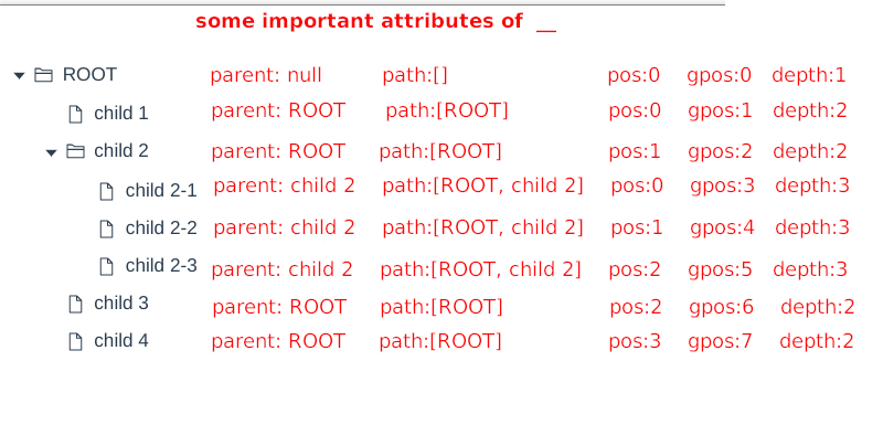
| __.parent | Object | parent node | |
| __.path | Array | an array of ancestor nodes | |
| __.depth | Number | depth | |
| __.pos | Number | position in its sibling nodes | |
| __.gpos | Number | global position | |
| __.dpos | Number | position in the displaying nodes. if a directory node collapsed, all its child nodes' property __.dpos are -1 |
|
| __.isVisible | Boolean | whether is visible | |
| __.isEditing | Boolean | false | whether the user is editing the title |
| __.isSearchResult | Boolean | false | whether the node matches the keyword |
| __.isDroppable | Boolean | true | whether the dragged node is is able to be dropped presently |
| __.dragOverArea | String | null | which area the mouse is over on the node. alternative values: prev, self, next, null |
| __.mousex | String | 0 | mouse's left position relative to the node element's position |
| __.mousey | String | 0 | mouse's top position relative to the node element's position |
| __.titleTip | String | the tooltip that will be shown if the mouse is over the title. it is empty usually, except when the title's width exceeds node.style.titleMaxWidth |
|
| __.titleMaxWidth | String | the title's max width, that is calculated based on node.style.titleMaxWidth | |
| __.customClasses | Array | [] | custom classes added to the node |
| Property | Type | Description |
|---|---|---|
| status | Number | 0: there is no drag and drop operation currently. 1: a node is being dragged outside the tree. 3: a node is being dragged over the tree. 3: an external element is being dragged over the tree. |
| dragNode | Object | the dragged node |
| overNode | Object | the node that mouse is over |
| overArea | String | which area the mouse is over on the node. alternative values: prev, self, next, null |
| isDroppable | Boolean | wether it is droppable |
| isTouch | Boolean | wether it is a touch operation |
| from | Object | supposing that there are two trees in the page: tree A and tree B, the user drags a node from tree A into tree B, and then the dragAndDrop.from of tree B is an object likes {treeId: 'A', nodeId: 6}, which indicates the source of the node being dragged. |
| Name | Bound Variables | Description |
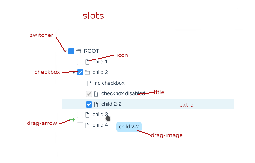
|---|---|---|
| switcher | node | |
| icon | node | |
| checkbox | node | |
| title | node | |
| input | node | the input box |
| extra | node | extra content. can be used to show buttons |
| contextmenu | node | |
| drag-image | dnd | |
| drag-arrow | dnd |
Prototype: create(node, parentNode, pos), create(node, parentNode)
Description: add a child node to the parentNode.
Parameters:
| Name | Type | Description |
|---|---|---|
| node | Object | |
| parentNode | Object|null | |
| pos | Number | optional. the position to insert at. if not provided, the node will be added at the end of the list of the parentNode's child nodes. |
Prototype: move(node, toParent, toPos), move(node, toParent)
Description: move the node to a new place.
Parameters:
| Name | Type | Description |
|---|---|---|
| node | Object | |
| toParent | Object|null | the new parent. |
| toPos | Number | optional. the new position to insert at. if not provided, the node will be added at the end of the list of the toParent's child nodes. |
Prototype: search(keyword, fnMatch), search(keyword)
Description: search the tree and return the matched nodes.
Parameters:
| Name | Type | Description |
|---|---|---|
| keyword | any | |
| fnMatch | Function(node, keyword) | optional. it is a function that checks if a node matches the keyword, and it must return true or false. if it is not provided and keyword is a string, the method will search the tree by nodes' titles. |
Prototype: sort(node, recursive, fnCompare), sort(node, recursive)
Description: sort a node's children using a user-defined comparison function.
Parameters:
| Name | Type | Description |
|---|---|---|
| node | Object|null | if it is null, the method will sort the top level nodes. |
| recursive | Boolean | |
| fnCompare | Function(node1, node2) | optional. it is the function that compares two nodes, and it must return an integer. return value meaning: <0, node1 will come first. >0, node2 will come first. =0, the two node's positions will be left unchanged. if it is not supplied, the method will sort the nodes by their titles. |
set max width for the title element. there are two kinds of values that can be assigned to this property.
- if titleMaxWidth is non-negative, such as "3px", "2em", "20%" and so on, it's the same as css max-width property.
- if titleMaxWidth is negative, such as "-3px", "-2em", "-20%" and so on, it specifies the distance between the boundary , which the title element cannot exceed, and the right edge of the tree container.
when there are drag and drop operations between multiple trees, this property can be used to identify the dragged node.
when a drag and drop operation begins, the vue-tree component will execute the below code:
event.dataTransfer.setData('vue-tree', data)
the data parameter is a json string like below:
{
  "treeId": "xxxxxx",
  "nodeId": "xxxxxx"
}
listen to the dragover/drop events, and then you can get the treeId and find out where the dragged node is from.
event.dataTransfer.getData('vue-tree')
use the defaultAttrs property. example:
<vue-tree :tree="tree" :defaultAttrs="{style:{titleMaxWidth: '3em'}}"></vue-tree>the style.titleMaxWidth property of all nodes is set to '3em'.
priority: properties of a node > defaultAttrs
in the following example, all the nodes' style.titleMaxWidth property is '3em', except the one, whose id is 5 and has the style.titleMaxWidth property assigned '5em'.
tree:
[
    {
        id: 1,
        title: 'ROOT',
        hasChild: true,
        children: [
        {
            id: 2,
            title: 'child 1',
        },
        {
            id: 3,
            title: 'child 2',
            hasChild: true,
            children: [
            {
                id: 4,
                title: 'child 2-1'
            },
            {
                id: 5,
                title: 'child 2-2',
                style: {
                    titleMaxWidth: '5em'
                }
            },
            {
                id: 6,
                title: 'child 2-3'
            }
            ],
        },
        {
            id: 7,
            title: 'child 3'
        },
        {
            id: 8,
            title: 'child 4'
        }
        ]
    }
]
template:
<vue-tree :tree="tree" :defaultAttrs="{style:{titleMaxWidth: '3em'}}"></vue-tree>- MIT
- It's free for commercial use.
Icons in vue-tree component and these demos are from: