[박세현] 멋쟁이 사자처럼 3번째 과제 제출 #5
Conversation
 pakxe
commented
pakxe
commented
May 14, 2022
pakxe
commented
|
. |
 devHudi
left a comment
devHudi
left a comment
devHudi
left a comment
There was a problem hiding this comment.
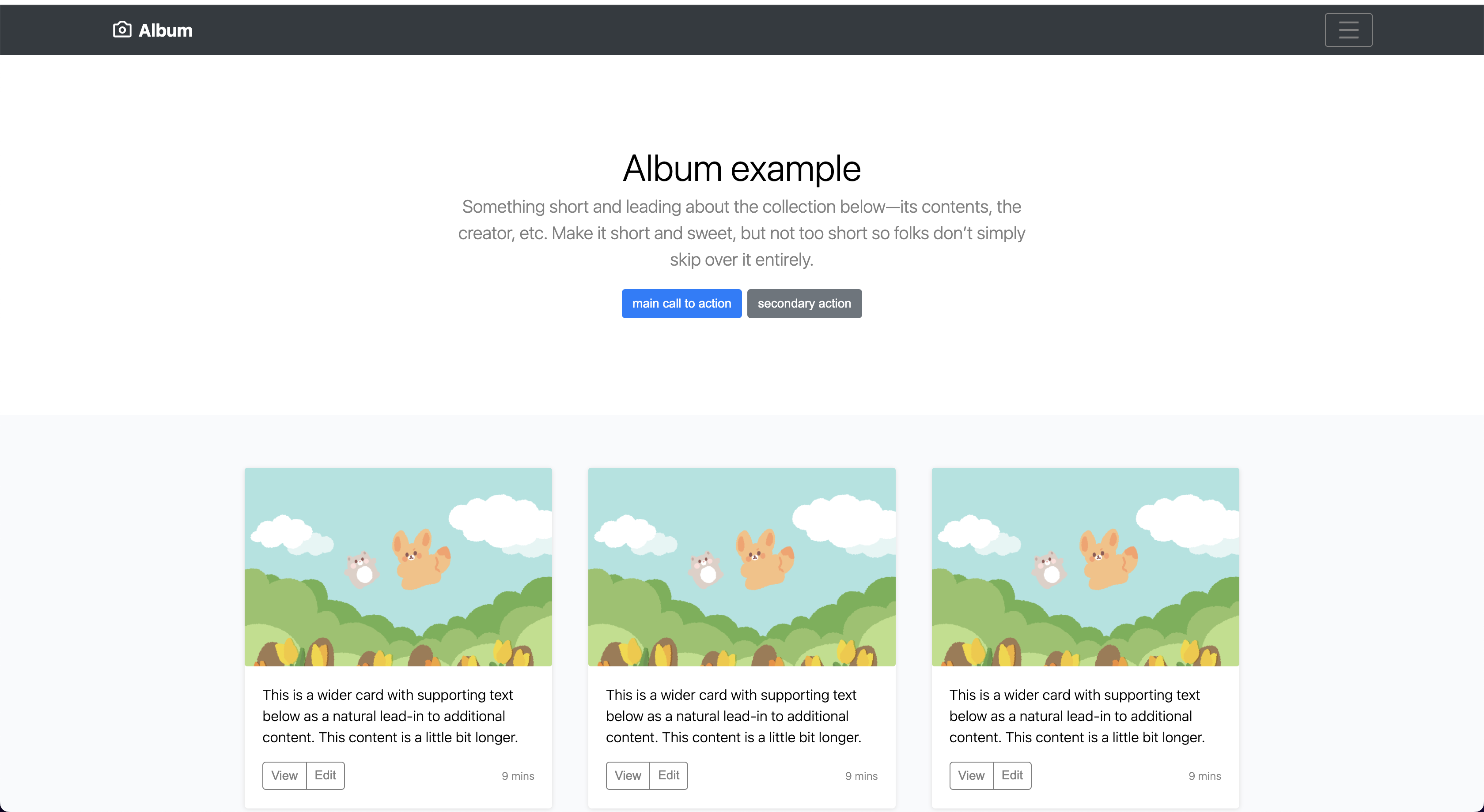
�앨범의 그림이 너무 귀엽네요!
지난주 과제 때 보다 훨씬 성장하신 것 같아요 👍
몇가지 수정하면 좋을 만한 점을 코멘트 달아드렸어요. 반영해주셔도 좋고, 참고만 해주셔도 좋습니다 😁
src/App.js
Outdated
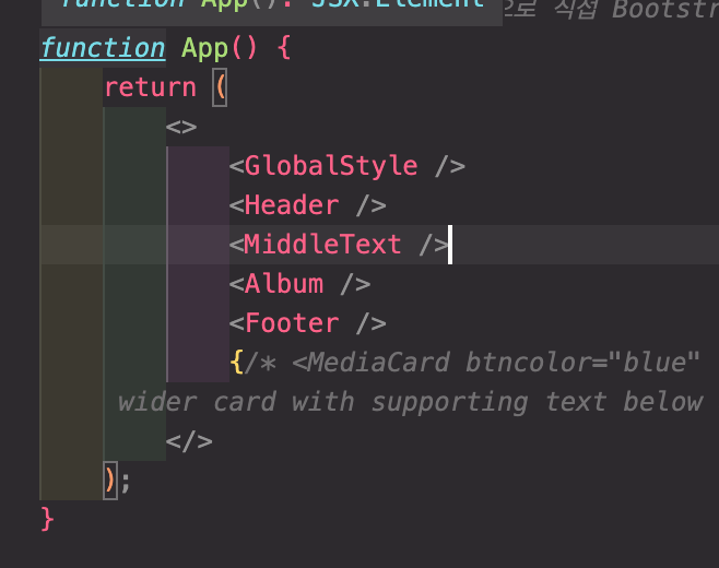
| <MiddleText></MiddleText> | ||
| <Album></Album> | ||
| <Footer></Footer> |
There was a problem hiding this comment.
| <MiddleText></MiddleText> | |
| <Album></Album> | |
| <Footer></Footer> | |
| <MiddleText/> | |
| <Album/> | |
| <Footer/> |
self-closing tag 로 축약해볼까요?
src/App.js
Outdated
| {/* <MediaCard btncolor="blue" src="img/hi.png" title="Heading" internal="This is a | ||
| wider card with supporting text below as a natural lead-in to additio'nal content. This content is a little bit longer."> </MediaCard> */} |
src/component/Album/index.js
Outdated
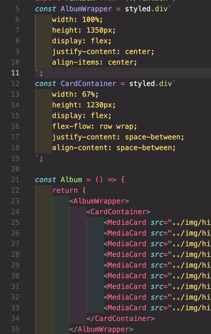
| const ALbumWrapper = styled.div` | ||
| width: 100%; | ||
| height: 1350px; | ||
| display: flex; | ||
| justify-content: center; | ||
| align-items: center; | ||
| `; |
There was a problem hiding this comment.
| const ALbumWrapper = styled.div` | |
| width: 100%; | |
| height: 1350px; | |
| display: flex; | |
| justify-content: center; | |
| align-items: center; | |
| `; | |
| const AlbumWrapper = styled.div` | |
| width: 100%; | |
| height: 1350px; | |
| display: flex; | |
| justify-content: center; | |
| align-items: center; | |
| `; |
오타가 있군요 🙂
src/component/Button/index.js
Outdated
| const StyledButton = styled.button` | ||
| padding: ${(props) => (props.paddingH ? props.paddingH : "6px")} | ||
| ${(props) => (props.paddingV ? props.paddingV : "12px")}; | ||
| margin: ${(props) => (props.margin ? props.margin : "2px")}; | ||
| height: ${(props) => (props.height ? props.height : "35px")}; | ||
| width: ${(props) => (props.width ? props.width : "none")}; | ||
| border: 1px solid | ||
| ${(props) => (props.borderColor ? props.borderColor : "black")}; | ||
| border-radius: ${(props) => (props.radiusV ? props.radiusV : "5px")} | ||
| ${(props) => (props.radiusH ? props.radiusH : "5px")}; | ||
| font-size: 14px; | ||
| background-color: ${(props) => | ||
| props.backgroundColor ? props.backgroundColor : "white"}; | ||
| color: ${(props) => (props.textColor ? props.textColor : "black")}; | ||
| `; | ||
|
|
||
| const Button = (props) => { | ||
| return ( | ||
| <StyledButton | ||
| margin={props.margin} | ||
| textAlign={props.textAlign} | ||
| borderColor={props.borderColor} | ||
| backgroundColor={props.backgroundColor} | ||
| textColor={props.textColor} | ||
| height={props.height} | ||
| width={props.width} | ||
| paddingH={props.paddingH} | ||
| paddingV={props.paddingV} | ||
| radiusH={props.radiusH} | ||
| radiusV={props.radiusV} | ||
| > | ||
| {props.children} | ||
| </StyledButton> | ||
| ); | ||
| }; | ||
|
|
||
| export default Button; |
There was a problem hiding this comment.
Button 컴포넌트는 현재 props 를 받아 그대로 StyledButton 에 전달하고 있는 역할만을 가지고 있는데요,
| const StyledButton = styled.button` | |
| padding: ${(props) => (props.paddingH ? props.paddingH : "6px")} | |
| ${(props) => (props.paddingV ? props.paddingV : "12px")}; | |
| margin: ${(props) => (props.margin ? props.margin : "2px")}; | |
| height: ${(props) => (props.height ? props.height : "35px")}; | |
| width: ${(props) => (props.width ? props.width : "none")}; | |
| border: 1px solid | |
| ${(props) => (props.borderColor ? props.borderColor : "black")}; | |
| border-radius: ${(props) => (props.radiusV ? props.radiusV : "5px")} | |
| ${(props) => (props.radiusH ? props.radiusH : "5px")}; | |
| font-size: 14px; | |
| background-color: ${(props) => | |
| props.backgroundColor ? props.backgroundColor : "white"}; | |
| color: ${(props) => (props.textColor ? props.textColor : "black")}; | |
| `; | |
| const Button = (props) => { | |
| return ( | |
| <StyledButton | |
| margin={props.margin} | |
| textAlign={props.textAlign} | |
| borderColor={props.borderColor} | |
| backgroundColor={props.backgroundColor} | |
| textColor={props.textColor} | |
| height={props.height} | |
| width={props.width} | |
| paddingH={props.paddingH} | |
| paddingV={props.paddingV} | |
| radiusH={props.radiusH} | |
| radiusV={props.radiusV} | |
| > | |
| {props.children} | |
| </StyledButton> | |
| ); | |
| }; | |
| export default Button; | |
| const Button = styled.button` | |
| padding: ${(props) => (props.paddingH ? props.paddingH : "6px")} | |
| ${(props) => (props.paddingV ? props.paddingV : "12px")}; | |
| margin: ${(props) => (props.margin ? props.margin : "2px")}; | |
| height: ${(props) => (props.height ? props.height : "35px")}; | |
| width: ${(props) => (props.width ? props.width : "none")}; | |
| border: 1px solid | |
| ${(props) => (props.borderColor ? props.borderColor : "black")}; | |
| border-radius: ${(props) => (props.radiusV ? props.radiusV : "5px")} | |
| ${(props) => (props.radiusH ? props.radiusH : "5px")}; | |
| font-size: 14px; | |
| background-color: ${(props) => | |
| props.backgroundColor ? props.backgroundColor : "white"}; | |
| color: ${(props) => (props.textColor ? props.textColor : "black")}; | |
| `; | |
| export default Button; |
위와 같이 수정하면 더 좋은 코드가 될 것 같아요. 😄
There was a problem hiding this comment.
매개변수 선언 부분이 없어도 argument를 받아올 수 있다는 것을 처음 알았습니다.. 단순한 역할만 하는 코드면 그냥 css처럼 만들면 되는 거였군요!!
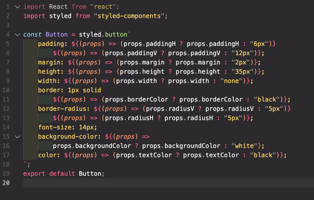
수정 완료 했습니다!
src/component/Footer/index.js
Outdated
| import Str from "../Str"; | ||
| import MyA from "../MyA"; |
There was a problem hiding this comment.
Str, MyA 컴포넌트의 이름만을 보고 다른 개발자가 어떤 컴포넌트인지 세현님의 의도대로 유추할 수 있을까요? 좋은 네이밍은 무엇일까요? 정답은 없습니다 😎
There was a problem hiding this comment.
button처럼 단순하게 꾸며진 a 태그의 역할뿐이므로, 간략하게 수정하였습니다.
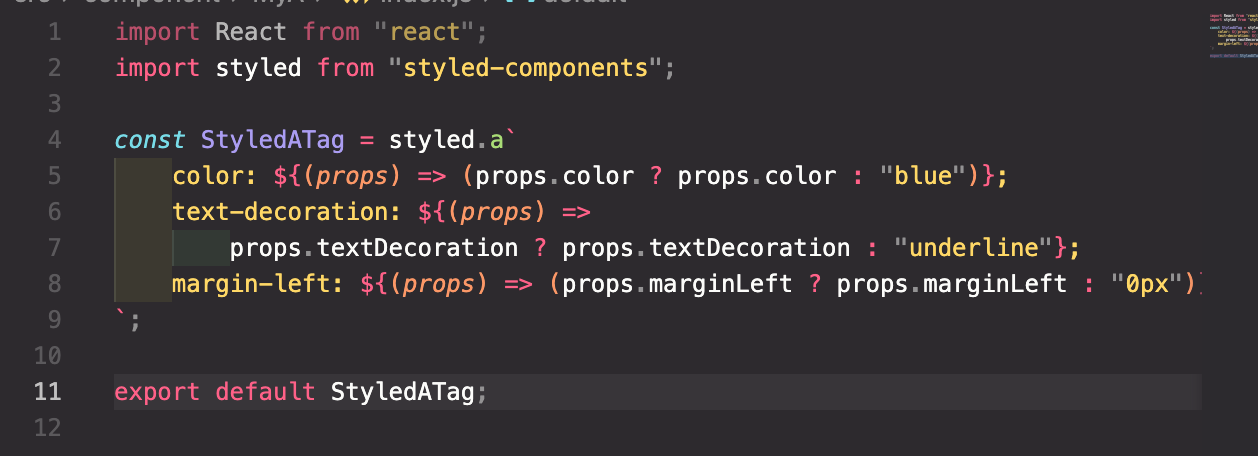
수정 완료 했습니다!
|
|
||
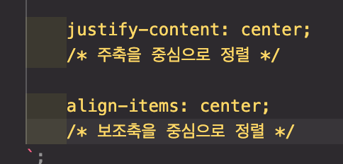
| justify-content: center; | ||
| // 주축을 중심으로 정렬 | ||
|
|
||
| align-items: center; | ||
| // 보조축을 중심으로 정렬 | ||
| `; |
There was a problem hiding this comment.
| justify-content: center; | |
| // 주축을 중심으로 정렬 | |
| align-items: center; | |
| // 보조축을 중심으로 정렬 | |
| `; | |
| justify-content: center; | |
| /* 주축을 중심으로 정렬 */ | |
| align-items: center; | |
| /* 보조축을 중심으로 정렬 */ | |
| `; |
CSS는 // 를 주석으로 인식하지 못해요. /* ~ */ 로 변경해볼까요?
| const MiddleTextWrapper = styled.div` | ||
| background-color: white; | ||
|
|
||
| width: 100%; |
There was a problem hiding this comment.
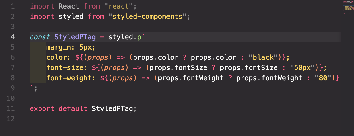
전체적으로 styled components 코드에서 의미없는 개행 혹은 // 이 반복적으로 등장하는 것 같아요! 제거해볼까요? 😁
src/component/Button/index.js
Outdated
| const StyledButton = styled.button` | ||
| padding: ${(props) => (props.paddingH ? props.paddingH : "6px")} | ||
| ${(props) => (props.paddingV ? props.paddingV : "12px")}; | ||
| margin: ${(props) => (props.margin ? props.margin : "2px")}; | ||
| height: ${(props) => (props.height ? props.height : "35px")}; | ||
| width: ${(props) => (props.width ? props.width : "none")}; | ||
| border: 1px solid | ||
| ${(props) => (props.borderColor ? props.borderColor : "black")}; | ||
| border-radius: ${(props) => (props.radiusV ? props.radiusV : "5px")} | ||
| ${(props) => (props.radiusH ? props.radiusH : "5px")}; | ||
| font-size: 14px; | ||
| background-color: ${(props) => | ||
| props.backgroundColor ? props.backgroundColor : "white"}; | ||
| color: ${(props) => (props.textColor ? props.textColor : "black")}; | ||
| `; |
There was a problem hiding this comment.
기본값을 위해 삼항연산자가 반복적으로 사용되고 있는데요, 아래와 같은 방법으로 코드를 좀 더 축약해볼 수 있을 것 같아요.
AS-IS
color: ${(props) => props.color ? props.color : "#212529"};TO-BE
color: ${(props) => props.color || "#212529"};이를 단축 평가 (Short circuit evaluation) 이라고 합니다. (참고: http://milooy.github.io/TIL/JavaScript/short-circuit.html#%E1%84%8B%E1%85%A8%E1%84%8C%E1%85%A6)
| import { BiCamera } from "react-icons/bi"; | ||
| import TextBox from "../TextBox"; | ||
| import { AiOutlineMenu } from "react-icons/ai"; | ||
| const HeaderWrapper = styled.div` |
There was a problem hiding this comment.
There was a problem hiding this comment.
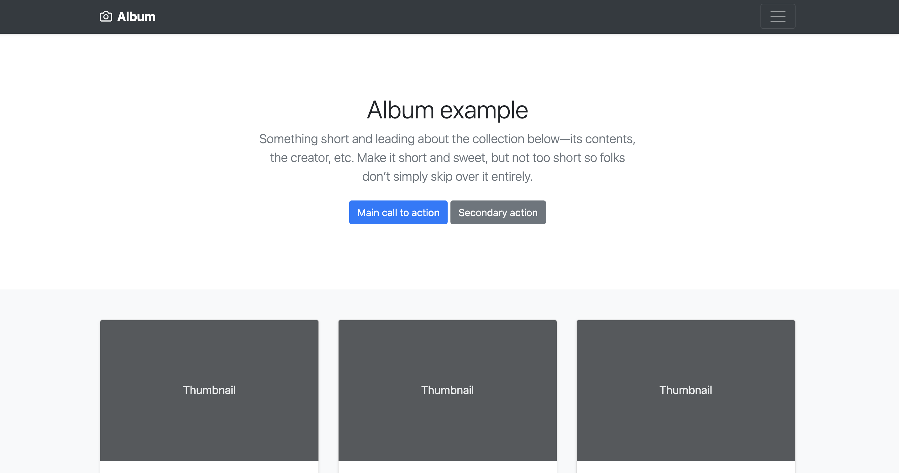
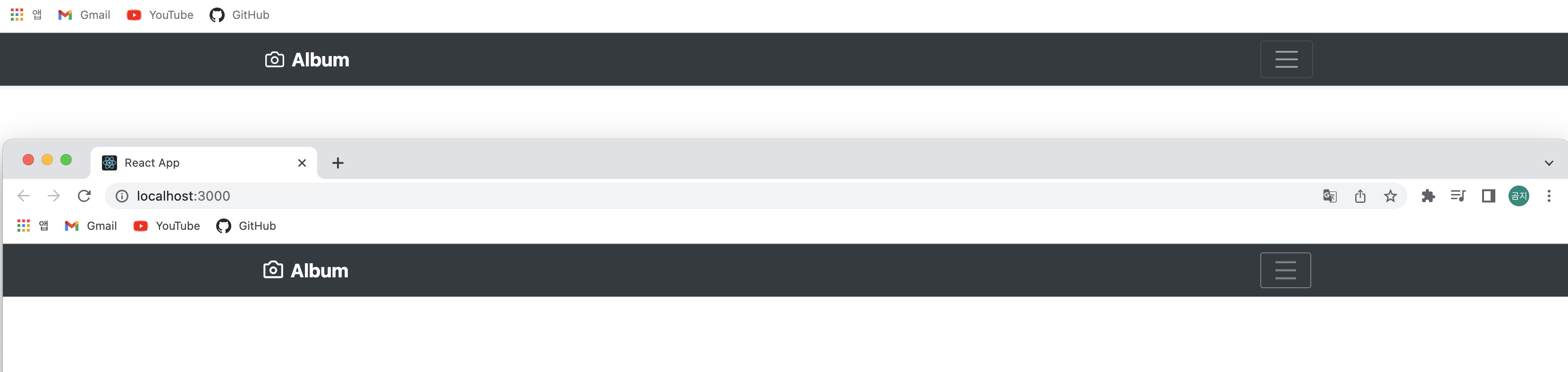
올려주신 헤더는 엘범의 양측과 맞지 않아요!
4 participants