Data Views
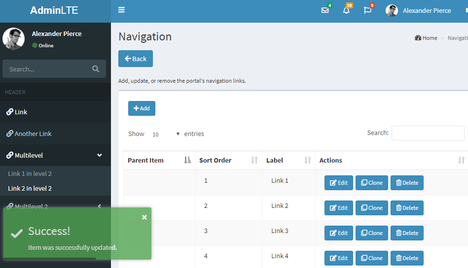
A Data View (or "dataview") is a web page that displays data from a database, generally in the form of a datatable.
- Feature-rich datatables: using datatables-net, bootstrap.
- Responsive table
- Sortable columns
- Quick search
- Pagination
- Fully customizable
- Editing, Adding, Cloning and Deleting rows is implemented using Bootstrap Modal dialogs.
- Data in the table is loaded asynchronously using jQuery.
- Data in the table can use placeholders to dynamically inject values from other columns.
- Notification messages are implemented using toastr notifications (an adorable pop-over)
When creating a dataview, you can set the following properties dynamically:
- Title - will be displayed at the top of the page.
- Description - a richly formatted free-text that will be displayed below the title.
- Data Source - select the relevant connection string from the list configured in the site's web.config file.
- Main table name - only one per dataview. Although, technically, you could also specify here a Database View to link several tables.
- Primary Key - must be a single, numeric column from the main table. This is what will be used for identifying specific rows when editing and deleting.
- Order By - you can set the column set used for the initial sorting of the datatable.
- Source Procedure - optionally, you can use a stored procedure instead of a table to display data.
- Modification Procedure - optionally, you can use a stored procedure for modifying rows, both adding and editing, instead of modifying the table directly.
- Deletion Procedure - optionally, you can use a stored procedure for deleting rows, instead of deleting directly from the table.
-
Properties - You can enable or disable the following flags for a dataview:
- Allow Edit
- Allow Add
- Allow Delete
- Allow Clone (same as Add except you pre-fill all the fields with the data of an existing item)
- Enable Form (sorry, I forgot why I wanted to make this a separate setting but I swear I had good reason)
- Enable Items List (configures whether to actually display the datatable or not)
- Enable Search
- Enable RTE (if you have Rich-Text dataview fields, you must enable this in order to load the needed js libraries)
- Enable Charts
- DataTable Row Button Style - Choose how the Edit / Add / Delete / Clone buttons would look like visually.
- DataTable Default Page Size - Choose the default number of rows per page.
- DataTable Paging Style - Choose the paging navigation style (First, Last, Next, Prev, Page numbers, etc.)
-
DataTable Options - You can enable or disable the following flags for the datatable:
- Show Info (show pagination and item count info text)
- Column Footers (show column headers at the table footer as well)
- Enable Quick-Search (allow quick free-text filtering of the table)
- Sortable Columns (visitors can choose which column to sort by)
- Pagination (split rows based on page size)
- Page Size Selection (visitors can choose how many rows per page)
- Client-Side State Save (saves a cookie in the visitor's browser, saving their paging, sorting and filter changes on the datatable, which would be automatically restored upon next visit)
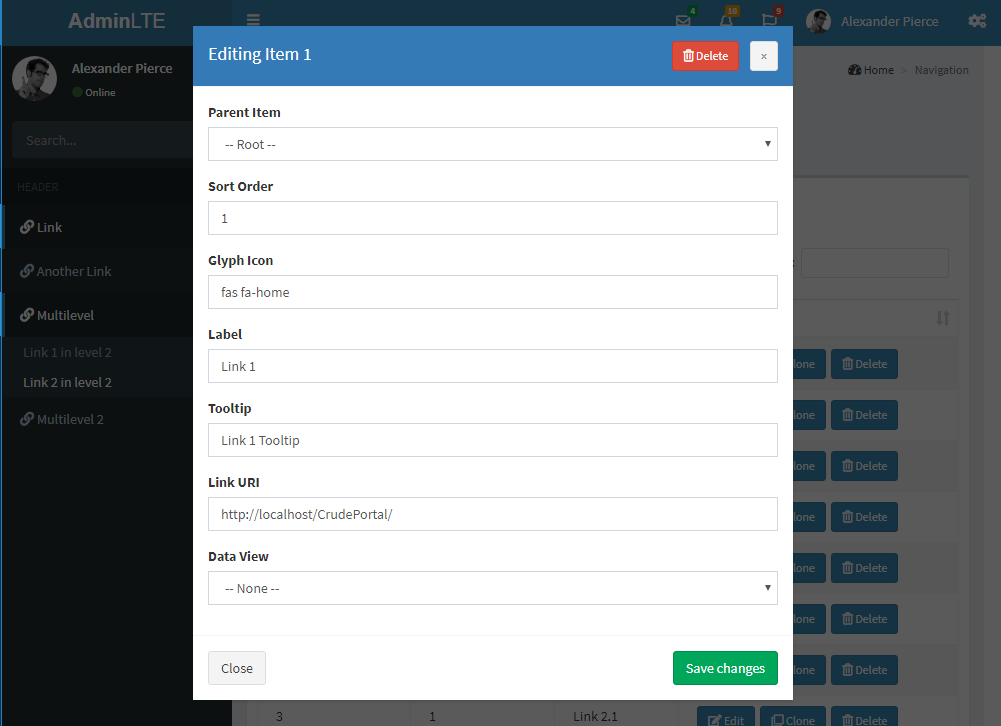
After setting the source for the data view (either a table, a view, or a stored procedure), it's time to setup the fields (i.e. columns) that you'd want to present.
When first creating a new data view, and/or there are no fields configured yet, you can click on the button that says "Click here to auto-create fields based on table schema". This will auto-generate fields for all the table's columns (except the primary key), and configure them as best as possible. This includes auto-detection of relationships with other tables using foreign keys.
For each such field, you can set the following properties:
- Label - the text that will be displayed to the user.
- Source - the actual column name from the database.
- Sort Order - used for specifying the order in which the fields will be displayed.
-
Type - the field type affects its presentation and acceptable values. Can be either one of the following:
- Text
- Text Area
- Rich Text
- Password
- Phone
- Integer
- Decimal
- Boolean
- Dropdown Box (linked from a different table)
- Multi-Selection Box (linked from a different table)
- Date
- Date and Time
- Time
- Link URL
- Image Source
- Default Value - default value when adding a new item.
- Max Length - relevant to specific field types such as Text, Password, E-Mail and Phone.
- Width - relevant to most field types.
- Height - relevant to specific field types such as Text Area, Dropdown Box, Multi-Selection Box and Image Source.
- Link URI - when displayed in a datatable, the field could optionally serve as a hyperlink. Optionally, the hyperlink could also use placeholders that inject values from other fields (for example: "somelink.asp?ID={{ row['SomeIDColumn'] }}").
- Link Style - either a regular hyperlink, or a bootstrap-styled button.
-
Properties - You can enable or disable the following flags for a dataview field:
- Show in Form
- Required
- Read Only
- Show in Items List
- Allow Search