
I hope we all have the basic knowledge of HTML and CSS now. In the last few days, we have learned how to position an element in a page according to the layout. We have learned about the floats and inline-block as well as a few advanced properties to position the elements. I am sure you all have been through the pains while working with the floats and a few other properties of positioning. Because I also have been the same problem as you guys are facing now.
We always had been doing all those hackish methods of floats, table displays, inline-block for positioning the elements. But we can ditch all the hacky methods now. We are ready to go with flexbox. Flexbox is one of the most interesting topics of CSS. I am sure while working flexbox you will enjoy and will have a lot of fun.
- What is flexbox?
- How does the flexbox model work?
- Terminology:(Flex Container and Flex Items)
- Understanding the Flex Container properties.
- Display
- Flex Direction
- Flex Wrap
- Flex Flow
- Justify Content
- Align Items
- Align Content
- Understanding the Flex Item properties.
- Order
- Flex Grow
- Flex Shrink
- Flex Basis
- Flex
- Align Self
Flexbox provides us a more efficient way to layout elements. It gives us the ability to align the items and distribute space among the items in a container - even though the size of the elements are unknown or dynamic. With the flexbox we get the power of flexibility(as the word flex says) in order fill the available space. So that elements can easily accommodate according to the size of screens. In a flexbox container, item expands to fill the free space as well as shrinks to prevent overflow.
Flexbox model comes with some sets of properties and values. In that few properties can be applied to parent container and few can be applied only on children items. So to make use of those flexbox model properties and values we will have to go into the zone of flexbox. So how do we go into that?
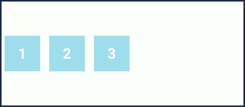
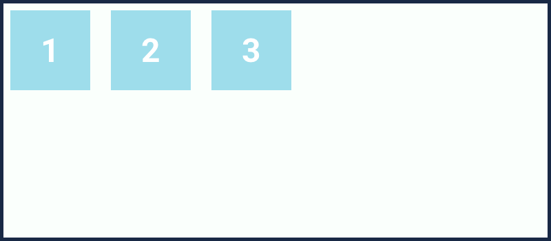
To do so, we start with display: flex property and value. We set the parent's styles as display: flex. Once we do so we are in the zone of the flexbox model. Now we can get benefitted with the properties of the flexbox model. Without setting the parent element's style as display: flex, we cannot make use of any property related to the flexbox model.
So what happens we set the parent's style as display: flex. Let's check it out:
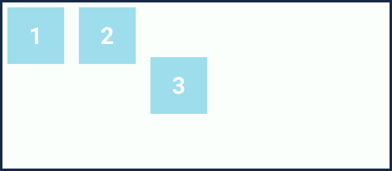
  <div class="container">
    <div class="item">1</div>
    <div class="item">2</div>
    <div class="item">3</div>
  </div>

  * {
    margin: 0;
    padding: 0;
  }
  .container {
    display: flex;
    background: #FAFFFC;
    border: 5px solid #182945;
  }
  .item {
    background: #9EDDEB;
    padding: 40px 50px;
    font-size: 34px;
    margin: 10px;
  }

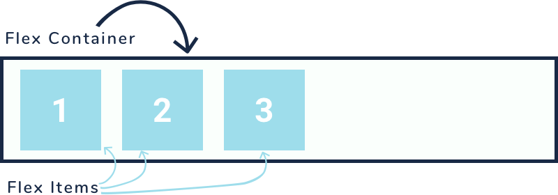
This is how a simple flexbox model looks like. Once we say display flex to a parent element, it automatically becomes flex container and the children inside it becomes flex-item.
While working with flexbox model, there are few basic terminologies that you need to keep in mind. For example flex container and flex-item, as I have used just a few lines above. I will explain all the terminologies as it comes in our flow.
For now, let's see what is flex container and flex-item?
The Parent element where you need to apply 'display: flex'.
The children elements inside the flex container.
If you remember in the beginning we talked that the flexbox model comes with some sets of properties and values, in which few belongs to parent container and few can be applied to the children items. So here we have few properties that can be applied to the 'flex container' and few can be applied to 'flex-item'. Let's see what are properties that can be applied to flex container, we will discuss them in detail and then after will move into the properties of flex-item.
According to the flexbox model, the properties that can be applied to flex containers are:
Display, flex-direction, flex-wrap, flex-flow, justify-content, align-items, align-content.
The display property is to activate the flexbox model zone as we have discussed in the above section. Remember I told you that without setting the display: flex, you cannot get into the flexbox model zone, and therefore you cannot be benefited with the flexbox properties and values. This is the property from where the real magics get started.
The display property can take two values:
display: flex || inline-flex;
The display: flex works normally as we have seen earlier.
The display: inline-flex is similar to inline elements, but this is for the inline version of the flex container so that the container takes the space according to the content in it.

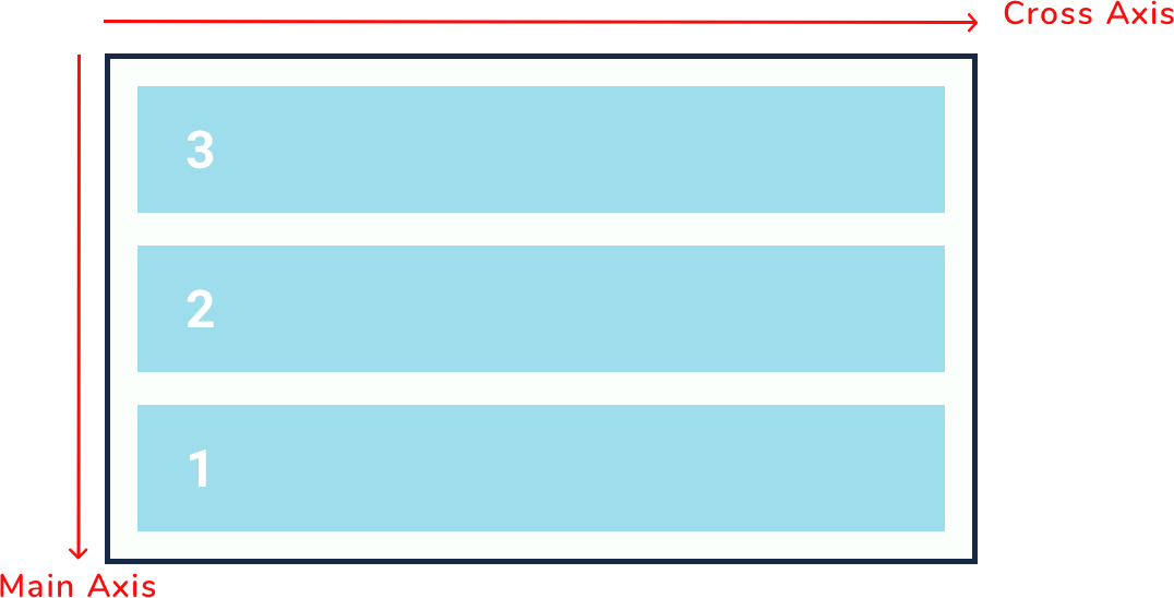
Flex direction property determines the direction of the item in which they will lay down. By default when we set the property as display: flex, all the item lay down one by one horizontally. Technically saying "horizontally" will be wrong here in the flexbox model. Instead, I must say items lay down on the main-axis. Now here is the time to discuss the two other terminologies i.e. main-axis and cross-axis.
Actually, in the flexbox model, there are two axes: main-axis and cross-axis. Here we don't have something like horizontal-axis and vertical-axis.
The main-axis in the flexbox model is the primary axis along which the items are laid out in the flex container. By default, the main-axis feels like "horizontal direction", from left to right.
The cross-axis goes perpendicular to the main-axis. It feels like "vertical direction", top to bottom.
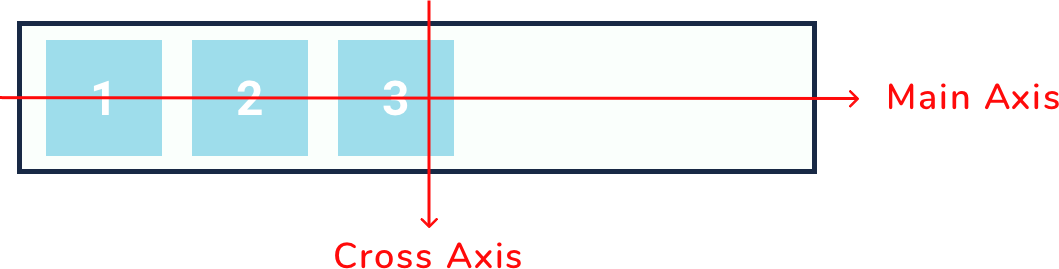
The important point to note here is that the main-axis is not necessary to remail always in the horizontal direction. We can anytime interchange the direction of axes with the flex-direction property. Now let's get back to the flex-direction property.
The flex-direction property can accept four values:
flex-direction: row || column || row-reverse || column-reverse;
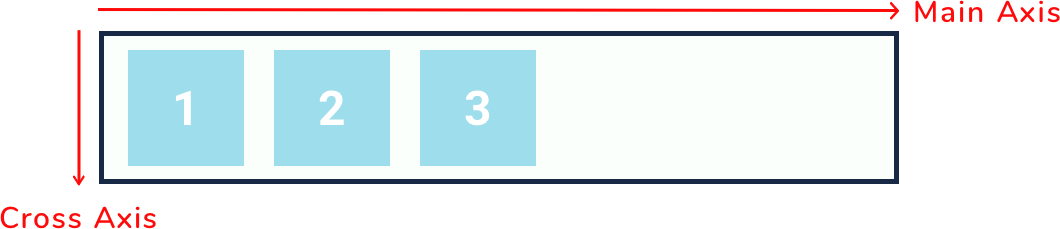
flex-direction: row;
This is the default value for flex-direction property. After applying this property you won't find any changes.
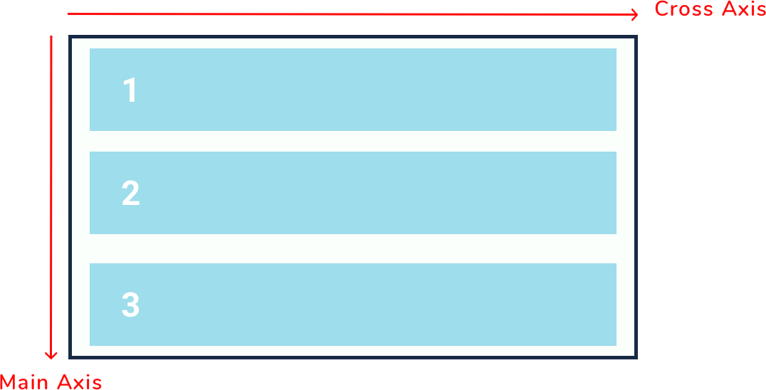
flex-direction: column;
After this value, all the item in the flex-container will lay down top to bottom. This value changes the direction of the axes in the flexbox model. The main-axis takes the place of cross-axis and the cross-axis takes the place of main-axis.
flex-direction: row-reverse;
The row-reverse is similar to row but this all the item will sit from right to left means in the opposite direction.

flex-direction: column-reverse;
The column-reverse is also opposite to the column. The item will lay down from bottom to top.
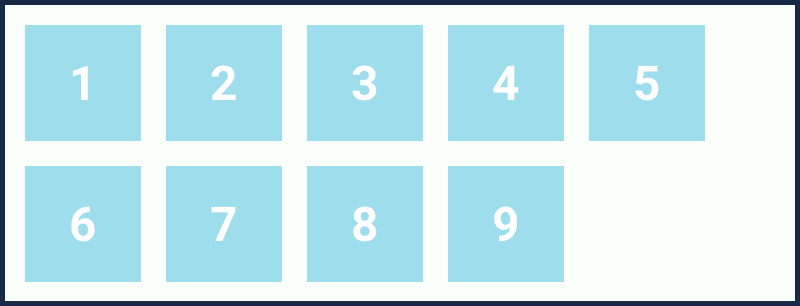
Flex wrap is the property which determines how the flex-container will accommodate if there are few extra number flex-items inside it. This property is better to explain with examples.
Let's take a few more items inside the flex container.
  <div class="container">
    <div class="item">1</div>
    <div class="item">2</div>
    <div class="item">3</div>
    <div class="item">4</div>
    <div class="item">5</div>
    <div class="item">6</div>
    <div class="item">7</div>
    <div class="item">8</div>
    <div class="item">9</div>
  </div>

  * {
    margin: 0;
    padding: 0;
  }
  .container {
    display: flex;
    background: #FAFFFC;
    border: 5px solid #182945;
  }
  .item {
    background: #9EDDEB;
    padding: 40px 50px;
    font-size: 34px;
    margin: 10px;
  }

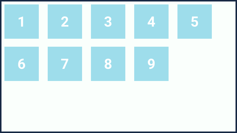
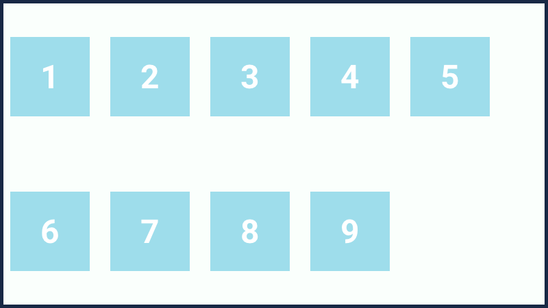
Yes! exactly this is what happens with the flexbox model if we add extra items in the container. This is the default behavior of the flexbox container. The flex-container will always accommodate all the new items in a single line, even although the browser needs to be scrolled horizontally. Because right now the items are not being wrapped inside the container.
For wrapping the items inside the flex container we have the flex-wrap property. The flex-wrap property comes with three different values:
flex-wrap: nowrap || wrap || wrap-reverse;
flex-wrap: nowrap;
The nowrap value is the default value, that we have seen earlier in this section. By default, the container has the nowrap value for flex-wrap property, whether we apply or not. The container will always accommodate all the items inside it in a single line.
flex-wrap: wrap;
If the container does not has enough space to accommodate enough items in a single line, then with this value, the items will automatically break unto new lines.
flex-wrap: wrap-reverse;
The wrap-reverse is similar to wrap value, but this value wraps the items in reverse direction.
Flex flow property is the shorthand property for flex-direction and flex-wrap. I hope we all know what are shorthand and longhand properties.
flex-flow: row wrap;
The flex-flow property accepts two value at a time, where the first value is for the flex-direction and the last value is for flex-wrap.
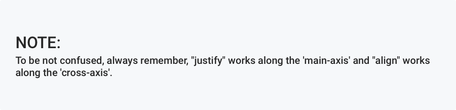
To make the flexbox method more flexible the justify-content property plays an important role. This property defines how the items will be laid out on the "main-axis". It controls the alignment of the items on the "main-axis" also helps to make use extra space leftover in a flex container.
The justify-content property can take 6 different values:
justify-content: flex-start || flex-end || center || space-between || space-around || space-evenly;
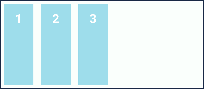
justify-content: flex-start;
This is the default value of justify-content property where all the flex-items will start from the starting point on the "main-axis". As we are seeing from the beginning only how the flex-items are being laid out from the starting point in a flex-container.
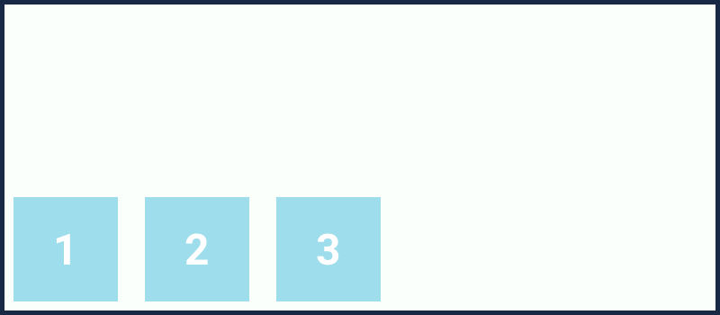
justify-content: flex-end;

Here all the flex-items are laid out towards the endpoint of the "main-axis".
justify-content: center;
The 'center' value for 'justify-content' will center the flex-items along the "main-axis" line.

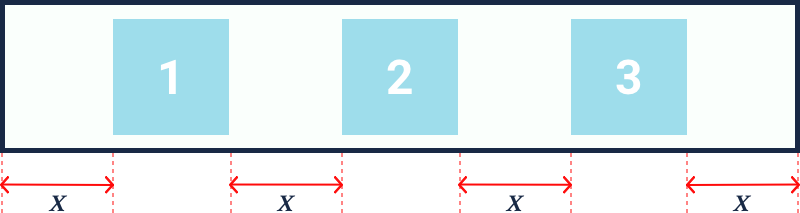
justify-content: space-between;
The extra space in the flex container will be evenly distributed between the flex-items, where the first item in the container will stick to the starting point of the "main-axis" and the last item will stick to the endpoint of the main-axis.
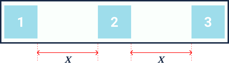
justify-content: space-around;
The extra space in the flex container will be evenly distributed around the flex-items on the "main-axis". Means on the left side as well as on the right side of the flex-items there will equal amount of space.
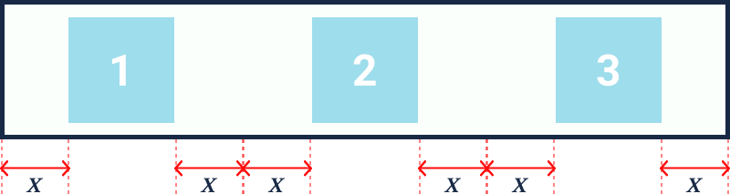
justify-content: space-evenly;
The extra space in the flex container will be distributed in such a way that, the space between any two items as well the space of the item from the edge of the container will be equal.
The align-items property is similar to justify-content property. The only difference is that the align-items property works on "cross-axis". It defines how the "flex-items" will be laid out on the "cross-axis" inside a "flex container".
The align-items property comes with four values:
align-items: stretch || flex-start|| flex-end|| center || baseline;
The stretch value for the align-items property is the default value. All the "flex-items" are stretched on the "cross-axis" to fill the extra space inside a container. By default, you won't see any effect on the items, because right now there is no extra space on the "cross-axis" inside the container. Just provide some height(let's say 350px) to the container and thereafter you can see the changes.
	.container {
		display: flex;
		background: #FAFFFC;
		border: 5px solid #182945;
		height: 350px;
	}
That's how all the flex-items behaves in the flexbox method on "cross-axis". So without applying align-items: stretch, to the container the items are stretched out to fill the space on the "cross-axis".
	.container {
		display: flex;
		background: #FAFFFC;
		border: 5px solid #182945;
		height: 350px;
		align-items: flex-start;
	}
As expected the flex-items will be laid out from the starting point on the "cross-axis".

  .container {
    display: flex;
    background: #FAFFFC;
    border: 5px solid #182945;
    height: 350px;
    align-items: flex-end;
  }
As expected the flex-items will be laid out towards the endpoint on the "cross-axis".
  .container {
    display: flex;
    background: #FAFFFC;
    border: 5px solid #182945;
    height: 350px;
    align-items: center;
  }
The center value for align-items property will center the flex-items along the "cross-axis" line.
  <div class="container">
    <div class="item item1">1</div>
    <div class="item item2">2</div>
    <div class="item item3">3</div>
    <div class="item item4">4</div>
  </div>

  .container {
    display: flex;
    background: #FAFFFC;
    border: 5px solid #182945;
    height: 350px;
  }
  .item {
    background: #9EDDEB;
    padding: 40px 50px;
    margin: 10px;
  }
  .item1 {
    font-size: 34px;
  }
  .item2 {
    font-size: 20px;
  }
  .item3 {
    font-size: 48px;
  }
  .item4 {
    font-size: 72px;
  }
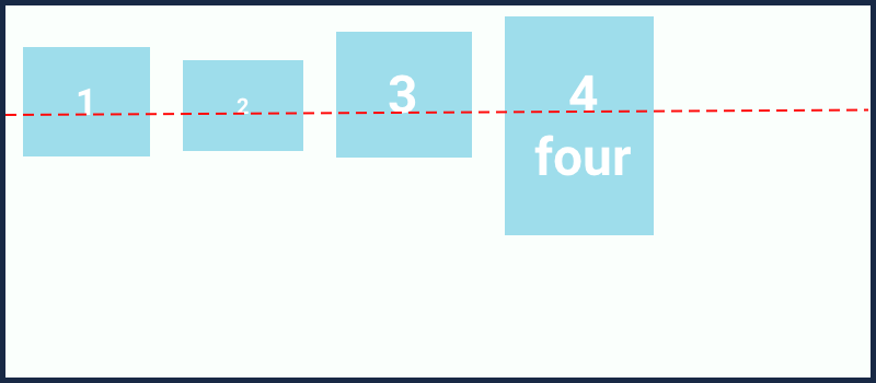
Here the items are aligned based on the baseline of text inside the items.
We have already seen justify-content and align-items property. The justify-content works on the "main-axis" and align-items works on the "cross-axis". But, here again, I am discussing the same thing, why? it's just because, the align-content property is somewhat similar to both justify-content and align-items property.
The difference is that the justify-content and align-items property works on the individual items but the align-content property works on the multi-line flex container. If all the "flex-items" are on a single line in a container then this property does not affect. And as we all know from the above discussion that the justify woks on "main-axis" and align works on the "cross-axis", therefore the align-content property will also work on the "cross-axis".
The align-content property accepts 6 different values:
align-content: stretch || flex-start || flex-end || center || space-between || space-around;
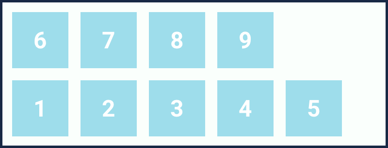
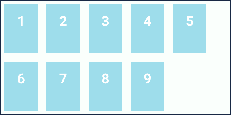
Let's experiment each value one by one but before that, we need to add a few more flex-items so that we have multi-line flex-container. Remember this property does not affect single line flex-container.
  <div class="container">
    <div class="item">1</div>
    <div class="item">2</div>
    <div class="item">3</div>
    <div class="item">4</div>
    <div class="item">5</div>
    <div class="item">6</div>
    <div class="item">7</div>
    <div class="item">8</div>
    <div class="item">9</div>
  </div>

  .container {
    display: flex;
    flex-wrap: wrap;
    background: #FAFFFC;
    border: 5px solid #182945;
    height: 350px;
  }
  .item {
    background: #9EDDEB;
    padding: 40px 50px;
    margin: 10px;
  }
  .container {
    display: flex;
    flex-wrap: wrap;
    align-content: stretch;
  }
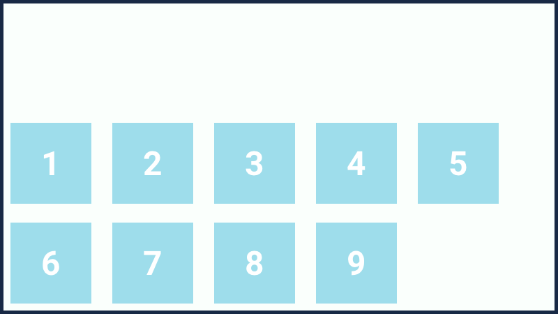
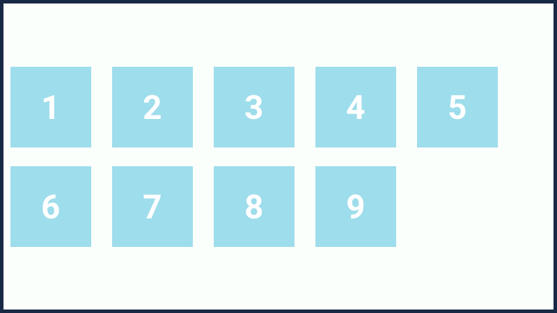
This is the default value for the align-content property. All the items are stretched to take up the remaining space on the "cross-axis".
  .container {
    display: flex;
    flex-wrap: wrap;
    align-content: flex-start;
  }
All the items in a multi-line flex container will be aligned from the starting point on the "cross-axis".
  .container {
    display: flex;
    flex-wrap: wrap;
    align-content: flex-end;
  }
All the items in a multi-line flex-container will be aligned towards the endpoint on the "cross-axis".
  .container {
    display: flex;
    flex-wrap: wrap;
    align-content: center;
  }
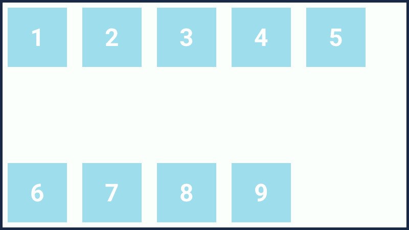
Items are laid out to the center of the multi-line flex-container on the "cross-axis".
  .container {
    display: flex;
    flex-wrap: wrap;
    align-content: space-between;
  }
The spaces are evenly distributed between the flex-items on the "cross-axis" as justify-content: space-between property works on the "main-axis".
  .container {
    display: flex;
    flex-wrap: wrap;
    align-content: space-around;
  }
The spaces are evenly distributed around the flex-items on the "cross-axis" as justify-content: space-around property works on the "main-axis".
In the last section, we have seen all the properties and values for the flex-container. We saw how we can align the items on "main-axis" or "cross-axis" and how to utilize the extra space inside a flex-container. Like flex-container, there are few properties for flex-items also in flexbox method. The properties that can be applied to flex-items are:
order, flex-grow, flex-shrink, flex-basis, Flex, align-self
This property allows us to reorder the flex-item within a flex-container without changing the source code in an HTML document. By default, we know that the elements are laid out according to the order in which it is written in the HTML document.

This is how the elements come in a page according to the HTML source code and we are seeing from the very beginning only. However, we can reorder the place of items on a page with order property in flexbox method. For example, let's say we want our first item at the end.
  <div class="container">
    <div class="item item1">1</div>
    <div class="item item2">2</div>
    <div class="item item3">3</div>
    <div class="item item4">4</div>
  </div>

  .container {
    display: flex;
  }
  .item {
    background: #9EDDEB;
    padding: 40px 50px;
    margin: 10px;
  }
  .item1 {
    order: 1;
  }

The item-1 came at the last, just because its order 1. By default every item has '0' value for the order property and it may take either postive or negative value. Thereafter the items are reordered according to the values for the order property, from lowest to highest. If the order value for the items are same then the items are laid out according to the order appeared in HTML source code.
Let's see another example where we will reorder the 4th item at the first position and 1st item at the last.
  <div class="container">
    <div class="item item1">1</div>
    <div class="item item2">2</div>
    <div class="item item3">3</div>
    <div class="item item4">4</div>
  </div>

  .container {
    display: flex;
  }
  .item {
    background: #9EDDEB;
    padding: 40px 50px;
    margin: 10px;
  }
  .item1 {
    order: 1;
  }
  .item4 {
    order: -1;
  }

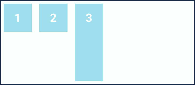
The flex-grow property allows the items to grow if there is extra space inside the flex container. The property accepts unitless value in number which provides the ability to grow to the items.
By default, the value for flex-grow property is 0, means the size of the item will be auto. It may accept any value but not in negative. If we want the item to grow and fill the extra space inside the container, will have to apply flex-grow property and set the value greater than 0. Let's check out the property visually.
Suppose we have two items inside a flex-container and we want the items to grow in same proportionality. Then we can set the value 1 for flex-grow property for the items.
  <div class="container">
    <div class="item item1">1</div>
    <div class="item item2">2</div>
  </div>

  .container {
    display: flex;
  }
	.item {
		background: #9EDDEB;padding: 40px 50px;
		margin: 10px;
		flex-grow: 1;
	}

Here, the items are growing in the same proportionality means the extra space inside the container is distributed to the items in equal amounts.
But, suppose if we want the first item to grow with proportionality 2, means the first item should get extra space in double amount than the second item. Let's see how we can do that.
  <div class="container">
    <div class="item item1">1</div>
    <div class="item item2">2</div>
  </div>

  .container {
    display: flex;
  }
  .item {
    background: #9EDDEB;
    padding: 40px 50px;
    margin: 10px;
  }
  .item1 {
    flex-grow: 2;
  }
  .item2 {
    flex-grow: 1;
  }

The flex-shrink property is opposite to the flex-grow property. It allows the items to shrink if there is no extra space in the container. For the practical view, just reduce the size of your screens. You will find the width of the items is also reducing as the size of screens is reducing.
By default, value for flex-shrink property is 1. Similar to flex-grow property the flex-shrink property also accepts a unitless value but greater than 0. Negative values are invalid.
  <div class="container">
    <div class="item item1">1</div>
    <div class="item item2">2</div>
  </div>

  .container {
    display: flex;
  }
  .item {
    background: #9EDDEB;
    padding: 40px 50px;
    margin: 10px;
    flex-basis: 300px;
    flex-shrink: 1;
  }
Here, 1 is the default value for flex-shrink property that we have applied, means the item size will reduce as per the size of the screens. For a better understanding of flex-shrink property, I have also applied flex-basis property. The flex-basis property is to set the initial size of the item before the item will grow or shrink in a flex-container according to the extra space, that we will see in the next section.

This is what we will see after applying flex-shrink: 1 and flex-basis: 300px. Now if you will reduce the size of your screen, the items size will also reduce.

However, if we set 0 value for the flex-shrink property the item size won't reduce as per the size of the screens. The item will overflow in the flex container.
  <div class="container">
    <div class="item item1">1</div>
    <div class="item item2">2</div>
  </div>

  .container {
    display: flex;
  }
  .item {
    background: #9EDDEB;
    padding: 40px 50px;
    margin: 10px;
    flex-basis: 300px;
    flex-shrink: 0;
  }

We got a bit introduction of flex-basis property in the last section. The flex-basis property is somewhat similar to the width property, as it accepts the values(in px, %, em, rem, etc.) similar to the width property.
The flex-basis property is applied to set a base width or size of the flex-item from where the item will grow or shrink if necessary.
By default, the value for flex-basis property is auto, means the base size of the item will be computed based on to the content inside it plus whatever the padding we will apply to the item.
  <div class="container">
    <div class="item item1">1</div>
    <div class="item item2">2</div>
  </div>

  .container {
    display: flex;
  }
  .item {
    background: #9EDDEB;
    padding: 40px 50px;
    margin: 10px;
    flex-basis: 200px;
  }

Flex property is the shorthand property for the flex-grow, flex-shrink, and flex-basis.
	.item {
		flex: 0 1 auto;
	}
This is the default value for the flex property where the first value is for flex-grow, second is for flex-shrink and the last value is for flex-basis. The last two value for flex property is optional. We can also do something like this:
	.item {
		flex: 1;
	}
Here, 1 is the value for flex-grow property and the values for flex-shrink and flex-basis will be automatically set to the default.
It's better to go with with the flex shorthand property, instead of applying flex-grow, flex-shrink, and flex-basis individually.
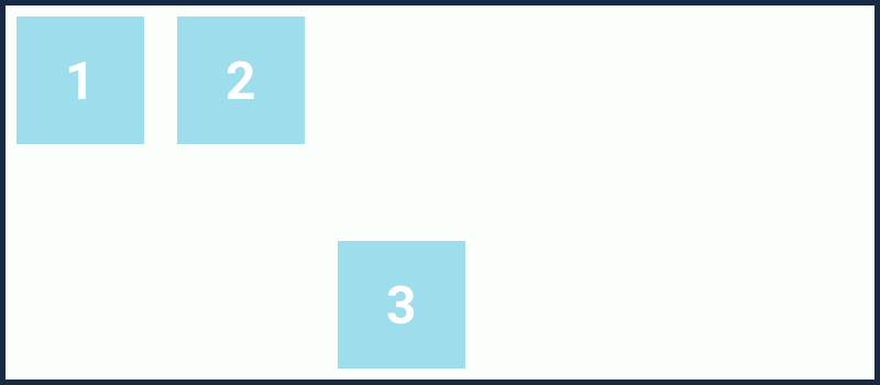
The align-self property is similar to align-items property. It accepts all the same values as the align-items accepts. The only difference is that the align-self property is applied to the flex-items but the align-items property is applied to the flex container.
align-self: auto || stretch || flex-start || flex-end || center || baseline;
Also, we all know from the above discussion that "align" always works on the "cross-axis", therefore we must have some extra space on the "cross-axis".
	<div class="container">
		<div class="item item1">1</div>
		<div class="item item2">2</div>
		<div class="item item3">2</div>
	</div>

	.container {
		display: flex;
		height: 350px;
		align-items: flex-start;
	}
	.item {
		background: #9EDDEB;
		padding: 40px 50px;
		margin: 10px;
	}
The value for align-self property inherits, whatever the value is set for align-items in the flex-contaier. If it is flex-start therefore, the align-selfvalue will be alsoflex-start.
	.item3 {
		align-self: auto;
	}
The property is to stretch out the size of individual items on the "cross-axis" to fill the extra space.
	.item3 {
		align-self: stretch;
	}
The item will be aligned from the starting point on the "cross-axis".
	.item3 {
		align-self: flex-start;
	}
The item will be aligned towards the endpoint on the "cross-axis".
	.item3 {
		align-self: flex-end;
	}
The item will be aligned at the center on the "cross-axis".
	.item3 {
		align-self: center;
	}
We have already seen baseline value for align-items property for the "flex-container". The baseline value for aling-self property also works in the same way.
	.item3 {
		align-self: baseline;
	}
