TODO #2
Description
Cosmetic changes
- side arrow images missing in bridge side info bar. up arrows are working fine (ex: next to Alerts & Messages.
General/Global Comments
- The Test environment should have a marking (supplied by Caitlin) making it clear that it is not the Prod environment so people don't use it by accident. Check with Caitlin - she made a button or changed the font or SOMETHING:
- Button in the header indicating environment should have drop-down to toggle to a different environment for that study (Test or Production).
- Mark-up level edit - see if there is a way to get our tables to look sharper. (Ben?)
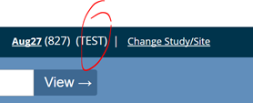
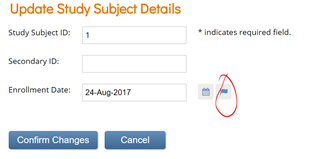
- Change Study/Site: Text looks squished. Also, If a study hasn’t been published to production insert the text “not yet published” where the red circle is. The text can be red too.
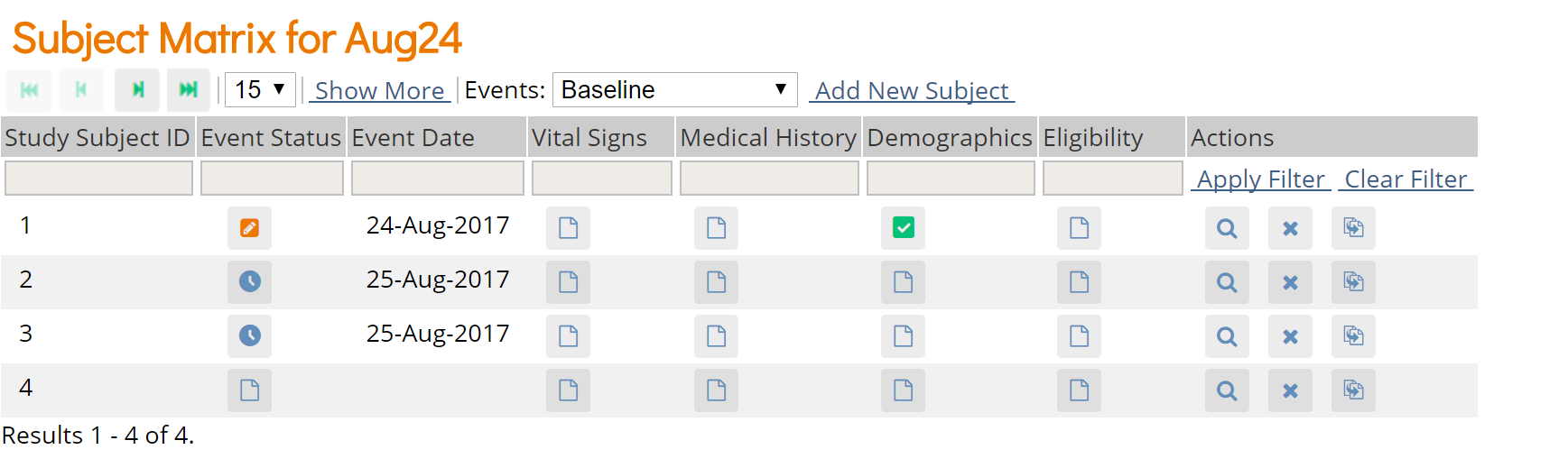
Subject Matrix:
-
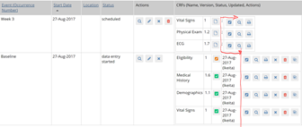
Subject Matrix > view a subject: CRFs are listed in the order they were added to the event in sbs,
but if I view by event, CRFs are listed in reverse order:
-
Subject Matrix - action icon for reassign - Caitlin submitted an icon update:
I made a new icon for this called "icon-reassign3" - will be in a new font file in the next commit
This icon should also be replaced in the following screens:
Subject Matrix > View a subject > Reassign CRF to new version AND
Tasks>CRFs>Batch CRF version migration -
This has been an issue for a long time, but thought I'd mention it...Subject Matrix > View a subject > CRFs are listed in order 1,2,3,4. Enter data into CRF 1. It returns you to the View subject record, but now the CRFs are listed in order 2,3,4,1. This has been a point of confusion for site users in 3.x for some time- if we can take it out, let's!
Ready For Review
-
When the tasks mega menu is open it is not closing in the right wait we can demo it to show you.
-
[Cosmetic] Update the favicon to use the OC swoosh logo from openclinica.com. This should be carried over to the study manager/designer apps as well.
-
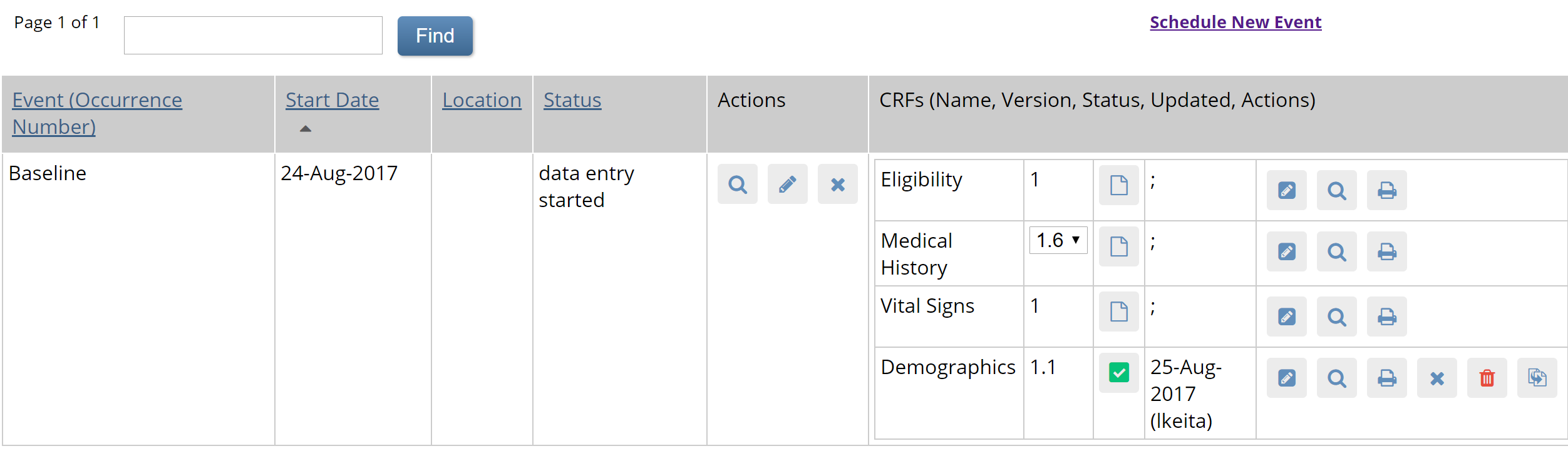
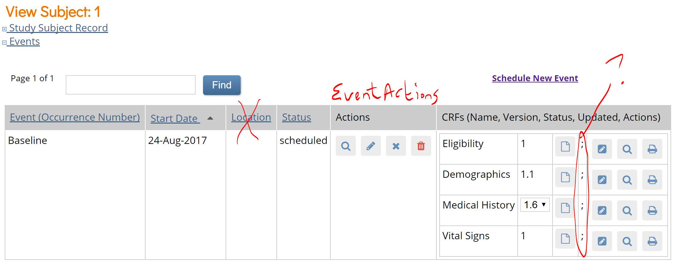
Subject Matrix > View Subject: It looks like the random ; is there when no DE has been done yet. It should just be blank, but the column should be a standard width so the set of icons line up no matter what is in that column:
-
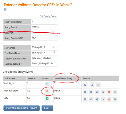
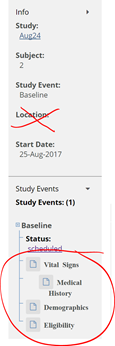
Subject Matrix>click a scheduled event>view/enter data (Enter or Validate Data for CRFs in EventName). Top section with Event details should not have a row for Location.
-
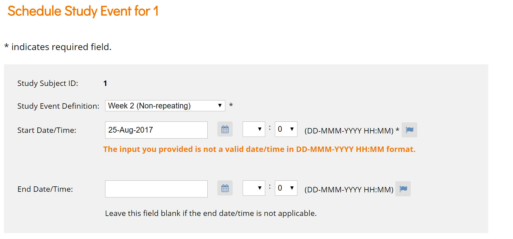
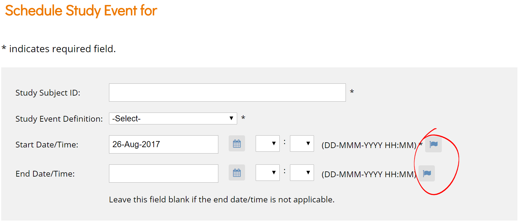
Subject Matrix > Schedule Event (also in View by Event > Schedule Event)
0 is auto-populated in minutes field after clicking "Proceed to enter data"- should be blank so user can easily move on to DE. Even if a valid time (e.g. 11:11 is entered, the minutes are reset to 0 and the same message displays. Can't get to the DE screen): Also - flags are displayed rather than bubbles.
-
Subject Matrix > View a subject > migrate a CRF to a new version > select the new version and continue - table looks odd: it has vertical divider lines, but not horizontal divider lines:
-
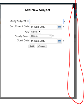
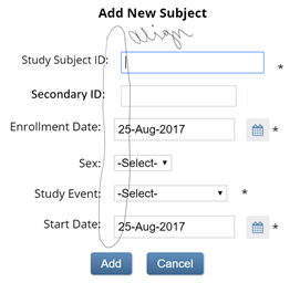
Still layered, just not as much (see below). Also, fields are squished now - not as much space between each field, and has old add and cancel buttons:
-
Subject Matrix - Add New Subject - type info in, use the Tab key to maneuver to the "add" button (has a border around it to show it has "focus") and press enter. Doesn't add the subject and kicks you out to the home screen. Enter key should work on any button that has focus.
-
Subject Matrix > Click a scheduled Event icon > enter/edit data:
Location should be removed
Status for Initial data entry should be DE Started (orange box/pencil)
Title Initial Data Entry should be Data Entry (or should it be "Last Modified by:"?)
Scroll bar should be removed
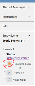
Side bar for that same window - replace initial data entry icon with DE Started icon
-
The hover text for Data Entry Started still says Initial Data Entry:
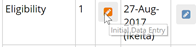 (in View by Event also)
 -
Remove Locations column, make Actions header Event Actions, remove the random ; in CRF section:
-
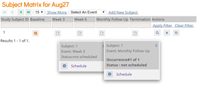
Left banner text is messy: Different fonts and different indentation ~~ and for some reason "scheduled" is a hyperlink (that doesn't go anywhere) ~~ The hyperlinks I see open a specific occurrence of the event
-
Subject Matrix - view a subject, then click Schedule New Event and Cancel - throws you back to the Subject Matrix; should put you back on the View Subject screen.
-
Subject Matrix - view subject, edit event: Event-query icons look like they have a status of "closed" even when there's no query
-
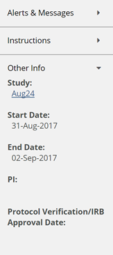
Sidebar doesn't populate PI or IRB approval date - did we get rid of those in sbs? If so, they should be removed here. If not, why aren't they populating?
-
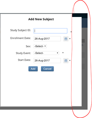
Subject Matrix > Add New Subject - border is layered:
-
Subject Matrix > Add New Subject AND Tasks> Add Subject should display same screen, which should appear as follows (only better aligned):
-
Subject Matrix - hover over each status icon. There should be a space between the : and the status - fixed on some statuses, not fixed on others:
similarly... -
Subject Matrix > click on a non-repeating event icon and a repeating event icon - Status text is inconsistent; repeating event has the text bold and has an extra space before the colon; non-repeating event needs a space after the colon.
-
Subject Matrix>View a subject>Subject Record link>Edit - flag should be query bubble:
-
Subject Matrix>click a scheduled event>view/enter data. Side bar should not have location, and form icons should be aligned:
-
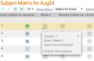
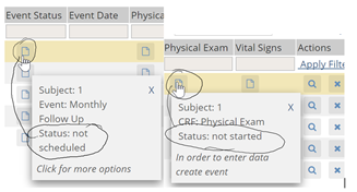
Subject Matrix > View by Event has same icon for unscheduled event and CRF not started - may need new icon from Caitlin?
-
Subject Matrix > View a subject > click Global Subject Record link, then Edit Record - Flag should be replaced with empty query bubble:
When I cancel out of the Edit screen, it returns me to Administer Subjects. Should return to View Subject Record screen (where I was prior to clicking Global Subject Record/Edit) -
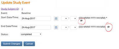
Tasks >Schedule Event - Flags should be empty query bubbles. Also, for start date/time, the asterisk should be next to the start date field (time is not required, but start date is.)
-
After creating a study subject clear all data in the inputs.
-
[Cosmetic ] Implement new skin -> https://github.com/OpenClinica/openclinica-ux/tree/oc2017-bridge-8-23-17
-
[Cosmetic ] Put this CSS in https://github.com/openclinica/openclinica-ux/tree/oc2017-bridge-8-1-17
-
oc logo is still broken on the link referenced (demo), but looks fine on dev. (I'm assuming the updates weren't pushed to demo.)
-
Remove the User Audit log link from the Tasks> Monitor & Manage data
- [Cosmetic]Maybe I’m a spazzy mouser, but I find that often (almost always) when I’m headed to the Tasks menu the user menu often pops down as I "drive by". -
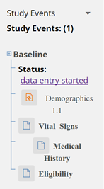
View by event has "initial data entry" icon for event status - should be "Data Entry Started" icon, and icon key should be displayed in the left (like it is in view by subject):
-
There's too much space between buttons on Subject Matrix > View subject screen:

-
~~ Alerts and Messages still says "first last" rather than the actual first name and last name of the user logged in:
 ~~ Moved to Functional list
 -
See:
https://docs.google.com/spreadsheets/d/1KN_vTvIj7EwuPji6A9dNe999RfiWEyU45mlRwicLAl4/edit#gid=0 -
Need spacing like this on all pages of runtime.
-
Click on the study name top left corrner > View an Event > View a form in the event - Metadata icon is incorrect (it shows the edit icon)
-
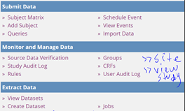
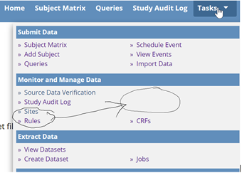
[Functional & Cosmetic] Tasks menu should be updated to remove unused options. It should only have these sections/options:
GROUPS should come off the menu.
-
Balance 'Task' menu so items aren't overly stacked on either left or right
- Create Dataset:
-
Tasks>Create Dataset>start to build a dataset...font sizes in selection area are inconsistent:
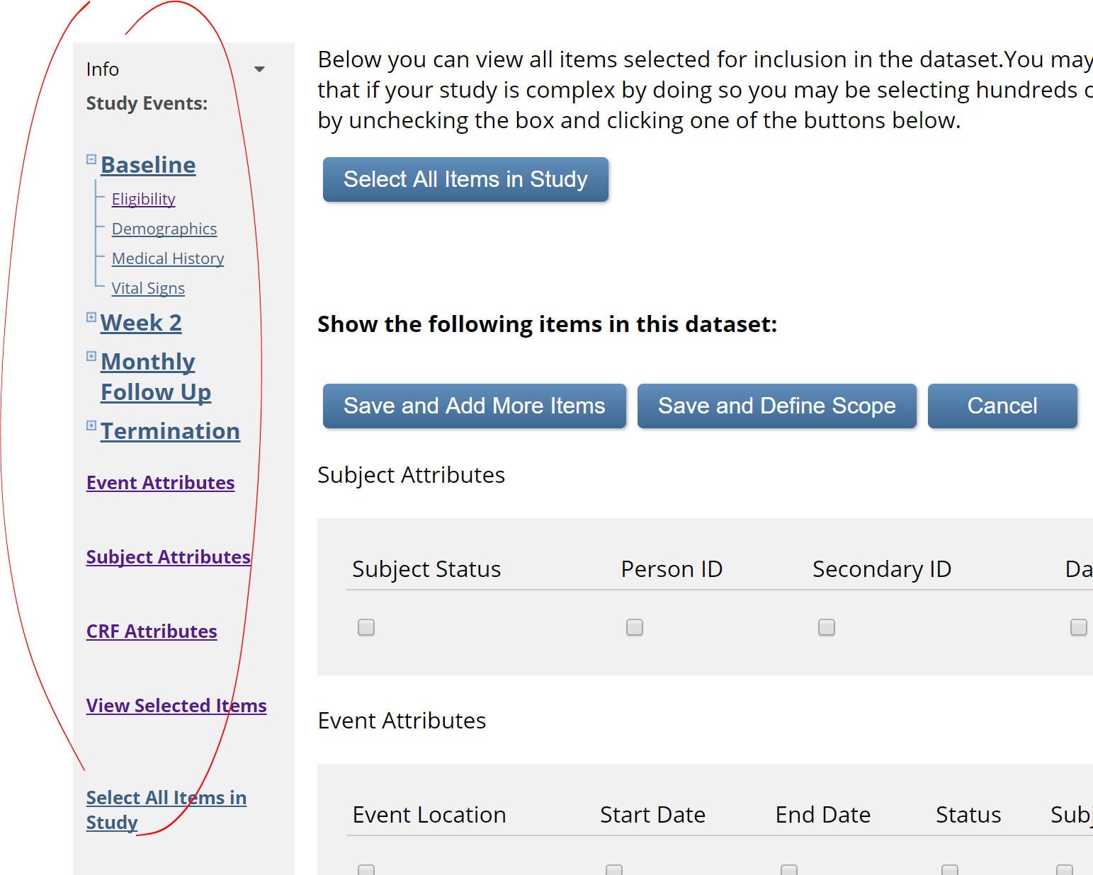
(though I went in later, and they were consistent - I guess they're inconsistently inconsistent)
-
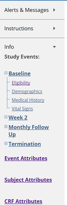
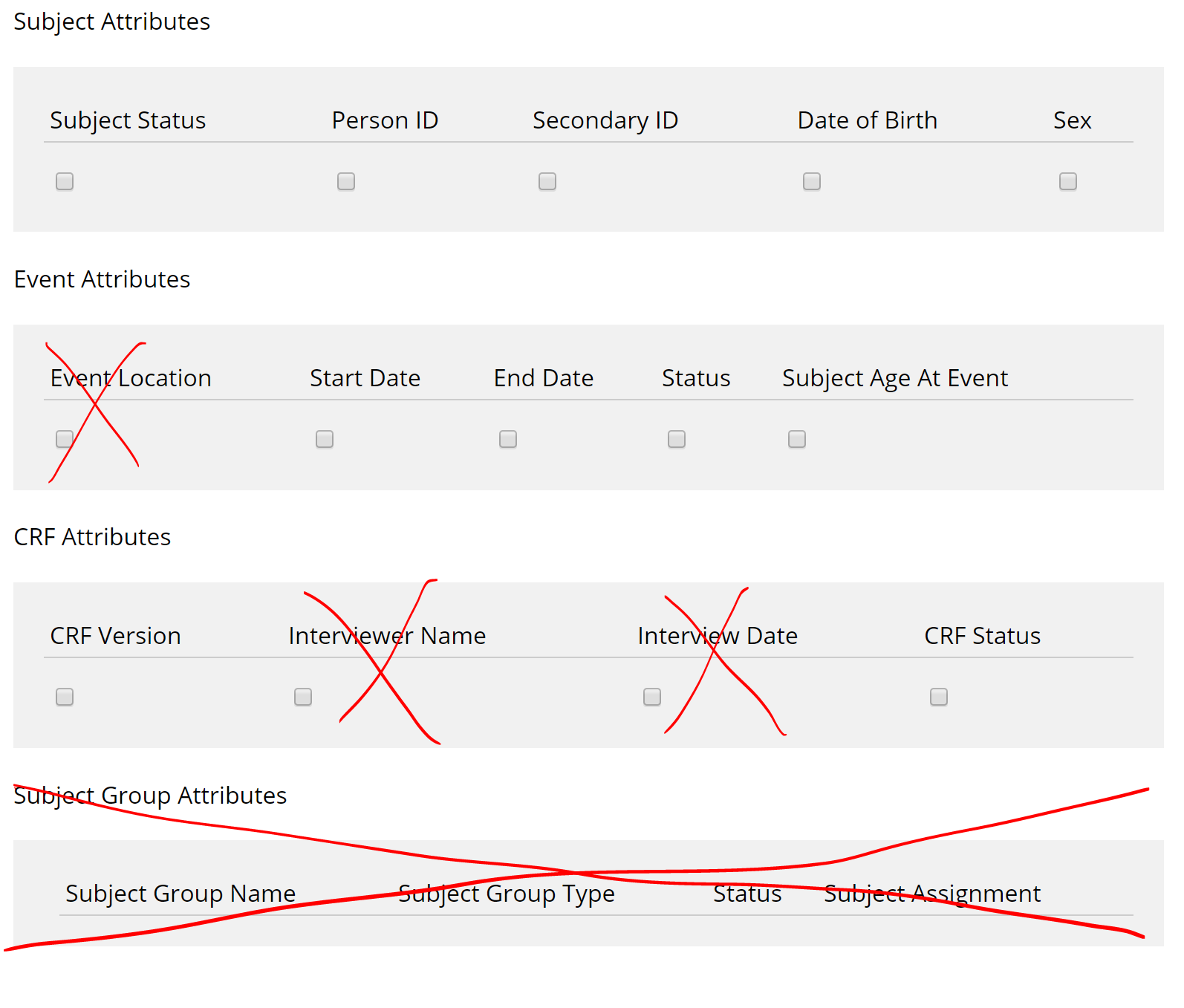
Tasks>Create Dataset>start to build a dataset...select some items>in left selection bar, select View Selected Items.
Group attributes should be removed
Interviewer fields should be removed
Event Location should be removed
-
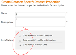
Tasks>Create Dataset...get to the end - alignment of selections and radio buttons is messy:
-
Tasks>Create Dataset...workflow should be removed (from all screens)
Also...there are scroll bars on many screens that are not needed and should be removed.

a3c-11e7-9b77-38d5584d41e9.png) -
Tasks>Create Dataset - create a dataset, click Go back to dataset - old delete icon should be replaced with new one:
Tasks>Sites
-
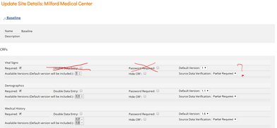
Tasks>Sites>Edit a site>Expand one of the events:
Remove Double Data Entry and Password Required
Not sure if SDV status should stay or go (since this can't be set at the study level)
-
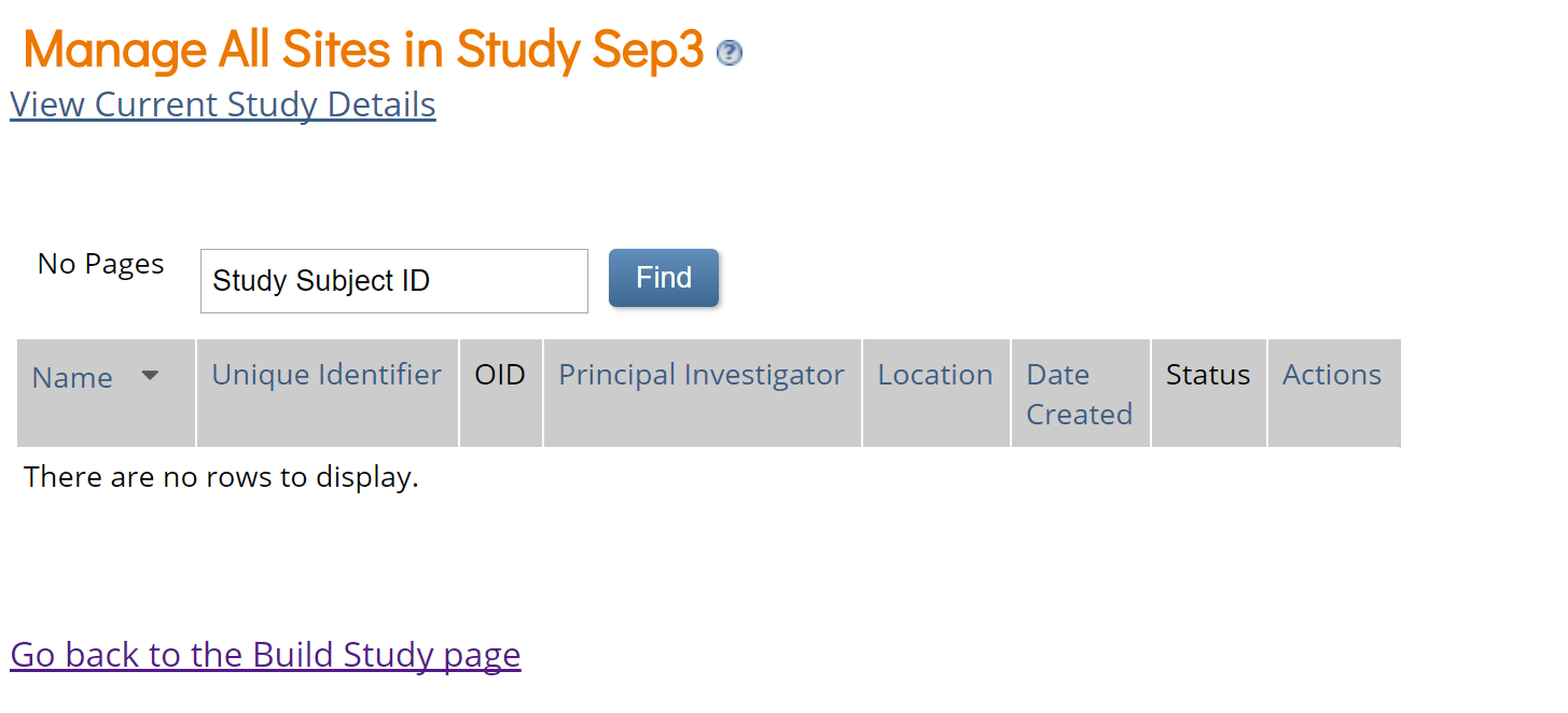
All links to "Go back to build study page" should be removed: