 Authors: Jonathan Grundy (jgrundy), Manushi Majumdar (ManushiM), María Ortiz (maryooh), Xia Wang (Elixeus).
According to the UNHCR (United Nations High Commissioner for Refugees), there are close to 5 million “persons of concern” that have been displaced from Syria to five neighboring countries and 9 million total since 2013. European countries especially have seen a massive influx of migrants from Syria in the past 6 months. The project assess what are the prevailing sentiments towards Syrian refugees compared to the number of refugees per country. We are interested in seeing how people are reacting to this influx and seeing if people’s reaction is correlated with the number of refugees arriving. This information could be relevant to international organizations such as UN Refugee Agencies, Amnesty International, countries’ embassies, and refugee aid agencies.
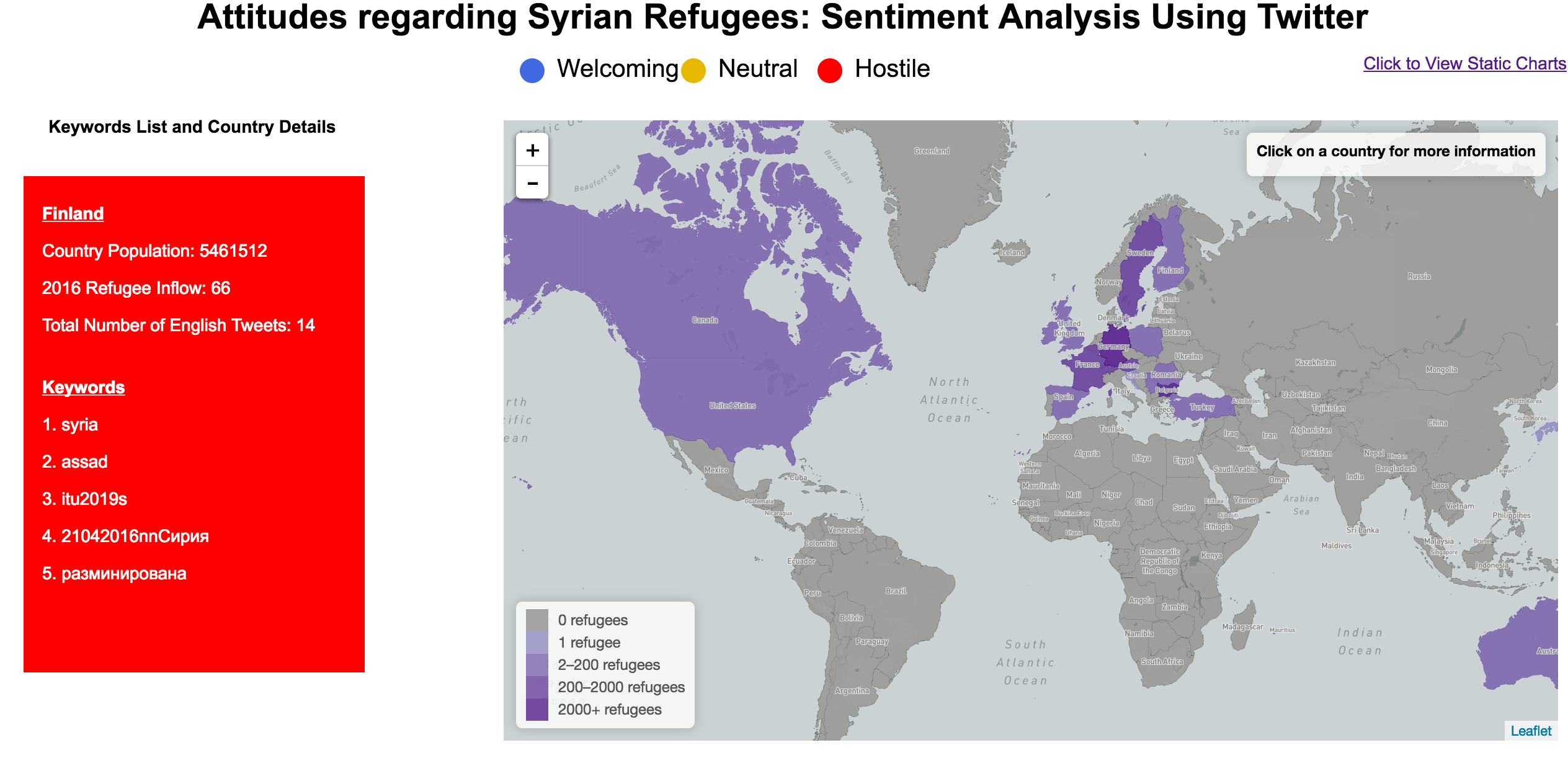
Our visualization includes a choropleth map that indicates number of refugees according to color intensity. Clicking on a country will show a card in the different sentiment colors that lists:
- The country population
- Number of refugees taken so far in 2016
- Total number of English tweets
- Top five keywords
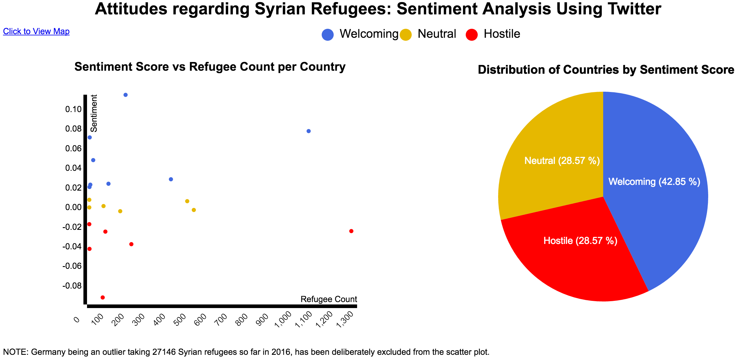
Additionally, there is a separate static charts page that shows:
- A scatterplot with all the countries according to their "sentiment score" that is welcoming 🔵, neutral 🌕 or hostile 🔴.
- A pie chart that groups the countries evaluated based on these three sentiment buckets
Special Thanks to Tawsif's similar project

