In this lesson we learn how to apply the styles we set to our theme.
To use the theme we defined in the previous lesson, we need to use component shadowing in order to override the default theme in gatsby-plugin-theme-ui
- “Component shadowing” is a mechanism to override the default rendering provided by a Gatsby theme
- Check out resources for a blog post on component shadowing.
In gatsby-theme-events/src, we create a folder with the same name as the theme in the source field, and we "shadow" the index.js where the theme is defined.
In the video, the instructor creates gatsby-theme-ui/index.js within gatsby-theme-events/src. However, my Gatsby site wouldn't compile unless I named the folder containing index.js "gatsby-plugin-theme-ui"
Within gatsby-plugin-theme-ui/index.js:
import { theme } from "../theme"

export default theme
Now we'll refactor our Layout component to use Theme UI.
Because Layout, Header, and Main are deprecated, we will import our theme components like so:
import React from "react"
import { Heading, Container } from "theme-ui"

const Layout = ({ children }) => {
  return (
    <div>
      <Heading>Gatsby Events Theme</Heading>
      <Container>{children}</Container>
    </div>
  )
}

export default Layout
We can now check if this works:
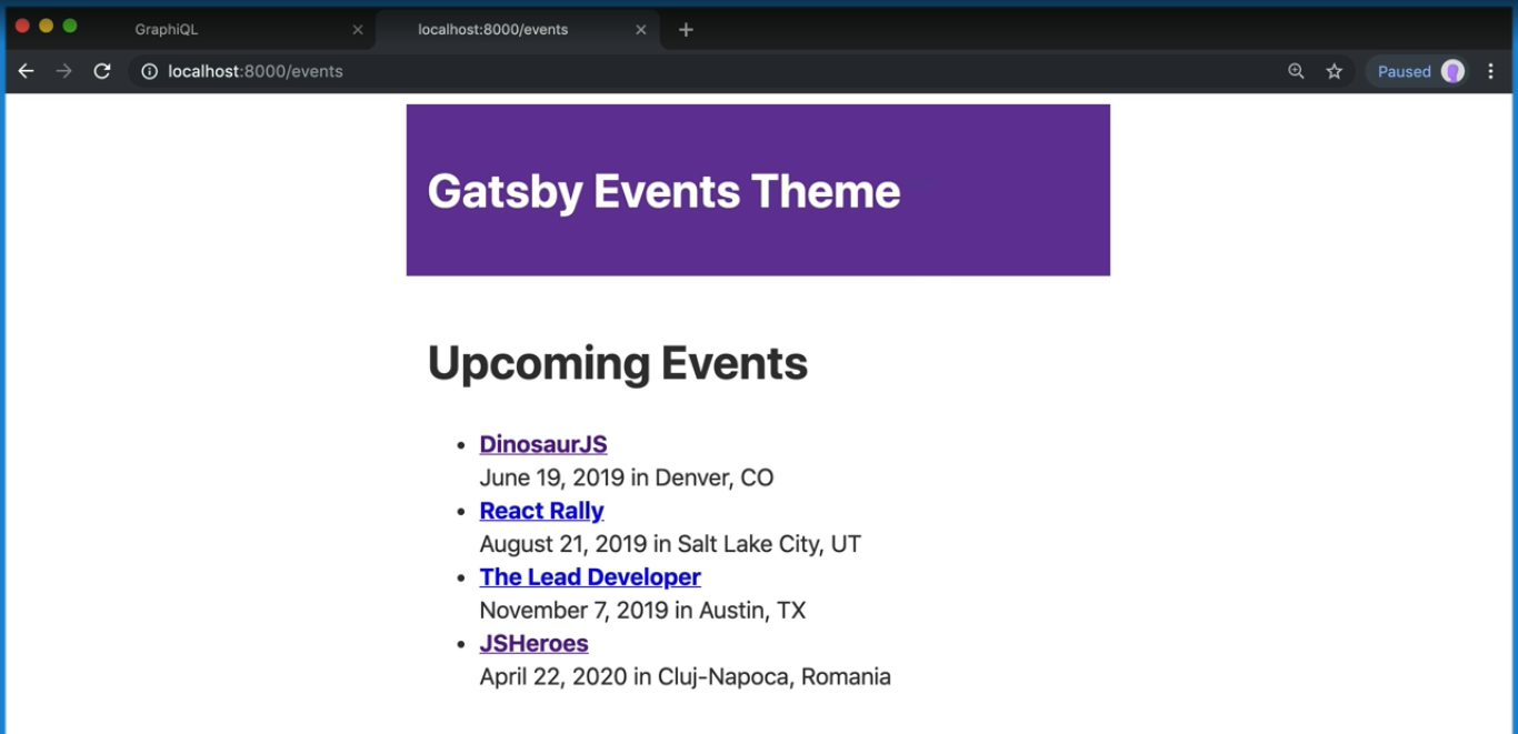
yarn workspace site developOnce the site loads, you should see that our styles have been applied.
We can also use the Styled import from theme-ui to apply the styles we set for HTML elements.
In event-list.js:
import React from 'react';
import { Link } from 'gatsby';
import { Styled } from 'theme-ui';

const EventList = ({ events }) => {
  const meta = useSiteMetadata();

  return (
    <>
      <Styled.h1>{meta.headline}</Styled.h1>
      <Styled.ul>
        {events.map(event => (
          <Styled.li key={event.id}>
            <strong>
              <Link to={event.slug}>{event.name}</Link>
            </strong>
            <br />
            {new Date(event.startDate).toLocaleDateString('en-US', {
              month: 'long',
              day: 'numeric',
              year: 'numeric'
            })}{' '}
            in {event.location}
          </Styled.li>
        ))}
      </Styled.ul>
    </>
  );
};

export default EventList;