Form Inputs with inset icons #14
Comments
|
Cool 👍 |
|
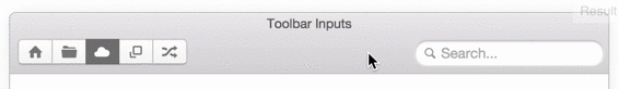
Here's my suggestion: Markup<label class="toolbar-input">
<span class="icon icon-search"></span>
<input type="search" class="form-control" placeholder="Search...">
</label>CSS/* Here's my suggestion for the CSS */
.toolbar-input {
position: relative;
overflow: visible;
margin: 0;
padding: 0;
.icon {
position: absolute;
left: 10px;
top: 4px;
z-index: 1;
opacity: 0.5; /* ~matches placeholder */
}
.form-control {
padding: 3px 4px 1px 24px;
border-radius: 12px;
box-shadow: inset 0 1px 2px rgba(0,0,0,0.4),
0 0 0 7px rgba(109,179,253,0);
&:focus {
/* something like this was already in place: */
box-shadow: inset 0 1px 2px rgba(0,0,0,0.4),
0 0 0 1px rgba(109,179,253,0.8);
transition: box-shadow 250ms ease-out;
}
}
} |
|
Rad! |
|
👍 |
|
@developit Mind sending a pull request? |
|
@sbruchmann: I did, #33. |
|
Sorry, @developit, I’ve overlooked that reference. Thanks for the work! Now we have to wait for @connors to merge it (at least, the folks who don’t know their way around git 😄) |
Sign up for free
to join this conversation on GitHub.
Already have an account?
Sign in to comment
This is purely a aesthetic feature but it's pretty neat nonetheless and it also helps to save some space and create a better feeling to the UX
Bootstrap Forms
Another example
The text was updated successfully, but these errors were encountered: