import formatting hard to parse mentally #1593
Comments
The current version does have a newline. Any chance you have an older version (I recall that at some point someone accidentally removed the newline temporarily)?
Good idea! Although I'd caution that paths beginning like
Hmm; I definitely see your point. Stuff like "URL:" is rather obvious, but "Candidates:" can actually be helpful for new users. How would we balance this with obviousness for new users? A |
|
I think good use of symbols can immensely clarify the output, i.e. “symbols for ‘control commands’, words for content.
If we need
You’re right, then I propose just |
|
A leading Regarding |
|
A few thoughts on this since I started using Beets recently:
|
|
Great point! I'd love to see a mockup that makes some decisions about what's most important to call out. |
|
I accidentally started a new thread (#1643) with ideas to improve UI. Obviously it would be better to have it all in 1 thread. So, as sampsyo requested, I tried to summarize all the ideas and comments from both threads in the text below to have a good starting point. Please add and edit where needed. |
IntroductionTo improve the UI, below some proposed options/settings. These are focused on these general goals:
Putting everything in curses would be awesome of course, but also a big change. So below some suggestions for the current CLI-UI. Suggestionsstandardization of output:One of the issues with the UI, is that the information printed on screen necessary for making the necessary tagging decisions, is not consistent. This means that it is on different locations on the screen, with more or less lines printed, depending on the album. All this makes for a difficult experience, because the user's eyes have to search for the location of the info on the screen for each album.
instead of... making the UI easier to read / navigateSome minor tweaks might make the UI easier to read and to find the necessary information.
|
|
Awesome; I'm glad this discussion is continuing. If you're interested, @ekjaker or anyone else, maybe you can put together a series of medium-sized changes along with fully fleshed-out designs so we can get going with the implementation of some improvements. |
|
@sampsyo: I think it would be possible to make a list of changes from the list above, but I don't I don't really understand what you mean with "a series of medium-sized changes along with fully fleshed-out designs". Could you please elaborate? |
|
Yes, that's more or less what I meant! Prototyping out a set of UI changes, preferably with a screenshot, will help make it clearer what we need to do. I don't have a specific recommendation for a tool, but you could try just using an HTML page with a |
|
OK, this is going to be a long post. My apologies. I started out with a folder that gave a medium recommendation, then chose m, chose 2, chose m again, chose 1 again and finally apply. This gives a view of a few common UI situations as well as a common workflow (for me a least). First you can find the output of these steps as they are now in beets: old layoutThe proposed layout is below. After that I will give an explanation of the choices I made and possible points of improvement. new layoutFirst, it is important to notice that I didn't make use of color at this point. We can always add it later, but I feel a good layout should already work without it. The other choices I made are mainly the ones suggested in the summary in a previous post:
Stuff I really like about the proposal (and suggest to keep)
Stuff I don't really like too much
The last remark can be greatly countered by summarizing the action options like so (for instance for the more candidates actions): This would give this: new layout (shortened action options)Clearly, this shortens and simplifies the output greatly, making it shorter but still way easier to use than the original. And we're not even using color yet. Other remarks:
That's it.As always, feel free to add or modify. Ekjaker |
|
So much better than my suggestion. A great idea to use identation! I think we don’t need to look out for 80‑char terminals in 2015. Some small nitpicksComparisons like that should line up column-wise to make them easy to compare. For numbers like in the last column even the digits of the same magnitude should align and the same unit should always be used. (So no mixing kB and MB.) These blocks are hard to read. Probably a fat white for the title will trivially solve this problem. |
|
Awesome! Thanks for the initial designs. Here a few assorted thoughts:
|
thx for the feedback. In response:
With the initial post, I forgot to mention a few things...
The New layout (compact): correctedBelow you can find the corrected layout as it was intended, with some minor adjustments added (see below). Adjustments:
instead of...
or this... Can't wait to actually try this new layout! It does really look like a major improvement. So what do you guys think? |
It is indeed. Can’t wait.
All for the second option. I quite often find myself missing the prompts because they don’t stand out enough. I’d tend towards making the
I actually use the URLs quite a lot (because I’m a Musicbrainz geek), but they add heavy clutter. So I opt for a [+] show Musicbrainz info prompt option, which prints more information about a release. Possibly even for the muiltiple release view, but with a diff (that would minimize visits to musicbrainz).
I’m a quite strong advocate of the “less config options are better, if possible none” movement, because every config option includes a new code path into a program, which can be fatal if it appears high in the decision tree. How about making the short version the only one, but changing each prompt to The colors should also be fix, because there are only 8*2; if a user direly needs to change e.g yellow to green, he can always patch the source. Now we’re down to |
Don't know whether the second option is actually easier to spot in a screen full of text. I do recognize the issue with sometimes not being able to find the prompt. That's why I added the big
Love the Also love the
Don't really understand the 8*2 and what you mean with the path-thing though. |
Ah, I see. So as a programmer you basically only have to think about how humans perceive certain hues, e.g. red as a warning, yellow as attention seeking, green/cyan as accents. Or something along these lines.
I was referring to the options: If color is fix, the URL is in :) |
Yes! In fact, we already use this to decide when to break the track title difference display.
Well, we need to be careful here. For example, the URL was added in response to specific user requests—you can search in the issues and commit history for the origin story. I would argue for, by default, keeping all the same information visible unless it's obviously useless; then, we can address separately the question of (optionally?) hiding some of it. (That would be your following point: this stuff should be configurable at a fine grain.) |
|
Good job with the mockups! my 2 cents :
So my version would be like |
|
@Profpatsch. OK, I think I get it. thanks for the explanation. Just two minor remarks:
Problem with this is that the way it is now might be perfectly logical, it is intuitively counterproductive. Red is the alert color (or in beets the default text_error color), which means we humans tend to give this our immediate attention. Only in beets it means the release with the lowest rating is going to get the most attention, while the better ones will get yellow, so lower attention, hence intuitively counterproductive. I understand now (again, thx for the explanation) users can change this in their terminal, but this will mess up the logic for other apps used in the same terminal.
Always cool to have less config. Especially a blank one :) Only thing is that I was using And this brings me to the final @sampsyo remark. I guess the thing that needs to be decided is how to deal with the more or less information issue. To summarize the options, I think this is what's been put on the table for now:
I guess the way to get actual results fastest would be to start with 4, and then decide on 1, 2 or 3 (with 1 maybe being a global thing of 2). Personally I really like the granular configuration option, but the elegance of 2 really kicks ass too. As for 4: here's a mockup, with the action options pushed to the right (as @Profpatsch preferred) and the URL added. I put the URL between brackets to keep the design consistent with the two above lines (warnings and release), and I moved it to after the release because the URL tends to be the longest line and this way it doesn't mess up the overview to much. Or in other words: it looks less cluttered, prettier. ;-) New layout (compact): including URL, actions to the rightedit: @Kraymer. Missed your post wile typing mine. Like your mockup with the far fewer linebreaks. Makes it way more compact, but, in my eyes, also a little less clear. |
|
To compare, below the same mockup, but with proposals by @Kraymer incorporated. New layout (compact): including URL, actions to the right and fewer linebreaks |
|
@Kraymer has a good point, maybe an indentation of 3 or 4 spaces instead of 7 might make more sense (it keeps the lines shorter). Although I’m of the firm opinion that there should be one linebreak after each user input, otherwise one loses one’s reference point. |
|
new mockup as @Profpatsch proposed based on @Kraymer suggestions: 4 spaces instead of 7, linebreak after each userinput and aligned information with duplicates (as requested earlier). |
|
Awesome! Thank you for continuing to iterate. Here are just a couple more thoughts:
|
|
2 questions: |
|
Those are the distance components. They were added some time ago by @mrmachine to give an idea about why some a match is "good" or "bad". The list |
new proposal: no parentheses for extra info, prompt without indentationPersonally, I like this one less. The parentheses, although left there by accident, did seem to serve a fuction of separating the release name from the additional information. Now it feels like we're going back to blocks of text, making it difficult to find separate parts in it. I also tried removing the parenthesis from the match percentage, but that immediately dropped legibility tremendously, so I kept those. It looks like at least that part really benefits from using them. But of course, other characters might work as well. |
|
I've been going through my testfolder, tagging everything till I found one with changes in the tags that actually needed input. although most of the releases did have changes in the tags, they were all highly recommended and therefor went through without the need for input. What I'm trying to say is that in such cases, as it is a match that got automatically accepted, it doesn't really help with the decision process to display them, as there is no decision to take. On the other hand, as there is no decision to take, it doesn't interfere with it either. So I guess it doesn't really make a difference. The one release I did find with changed tags and the need for input is this one. Fortunately it is one with only 2 tracks with changed tags. You can find 2 mockups below, building on previous ones. The first without a no parentheses for extra info, prompt without indentation, tracks with changed tags added.no parentheses for extra info, prompt without indentation,compact mode with [+]-option |
|
Instead of indenting the change section to match the title and supplementary information, I think I would prefer to reduce the indentation of the title and supplementary release information. If it must be indented, I agree with @Kraymer that 2 spaces is the best. Any indentation at all (even 2 spaces) is going to make it more likely that track listings in 2 columns get wrapped more than they need to. EDIT: Just to explain my reasoning, while I can see the utility in using indentation for blocks of related information within a match result (e.g. tracks), I don't see much point in indenting the entire match block. The entire block is already delineated from other match blocks by the match path which has reversed colours and blank lines around it. |
|
Alright, I cloned beets yesterday and started on a Draft 1
The beets master branch for comparison: beets-ui-old1, beets-ui-old2, beets-ui-old3.
Yeah. Again, feedback please! I’d probably go and spend time on improving code quality if you think it is worth continuing on this branch. |


|
Awesome! Amazing work so far; this is not too far off from matching your hand-made mockups. How do you feel about pulling this into a branch on the main repository? That way, we can collaborate in a central place—and even send pull requests to the development branch. On word wrapping: Yes, this is a pain. In fact, you'll see we deal with exactly the same issue when wrapping difference displays by drawing along the length of the uncolored strings. As painful as it is, I actually think there's a chance it could get even more painful to use an ANSI-ignoring length calculation—adding in codes and then stripping them out again could become error-prone. Maybe we can find a better way to do this that computes the wrapping points in a first pass and then colorizes in a second pass. A similar approach could help with multi-line |
Yeah, sure. Just tell me what to do :) And yes, I saw the wrapping code (I had to modify it to get the columns to align). If we are going to do more “advanced” layouts, measuring the length of strings will be probably something we have to do until right before we print them. Layouting first and coloring second would work in most cases (at least the ones I can think of) and I think that it would be an acceptable solution, but it would most probably require a more complicated Do we want to ensure that whitespace gets diff’ed correctly? (By “correctly” I mean highlight the difference between tabs and spaces, or one space and two spaces, etc.) |
|
@mxmerz: Tried your ui branch in Windows 10 X64 (yes, we still exist :-)), no errors, but also no ANSI goodness. Apparently, ANSI is by default not supported in the Windows cmd prompt. So I installed https://github.com/adoxa/ansicon, and tested it with http://adoxa.altervista.org/ansicon/ANSI%20Prompt%20Colours.txt: the ansi codes in the textfile get displayed nicely in my CMD-prompt, so I guess I got ANSI working in Windows now. Unfortunately, I still don't get them in beets. No idea what might be causing this. But maybe you want to take this into to consideration. It would be a shame if all your coding and designing efforts would be posix-only. |
|
@ekjaker I don’t have a Windows machine to test this and I have no idea why this wouldn’t work. Does using the The only real difference between the |
|
I actually do get colors, always have in the Here's a screenshot of what it looks like: But I'll do some more testing, try to narrow it down and get back to you hopefully with more information. |

|
Seems like only the colors Currently the |
|
FWIW, on Windows, we use the Colorama library to translate ANSI color sequences into equivalent win32 calls. |
|
OK, thanks, @mxmerz! I've pushed your branch to this repository and opened a pull request so we can track changes. If anyone wants to try out the work, you can just update your repository and
Good question. We don't do anything about this currently, so for now at least we can ignore it. I'm more focused on making sure we keep the code maintainable. |
|
It seems like colorama does not have support for styles other than colors ( PS: For those interested, a list of ANSI codes can be found on Wikipedia (see Table “SGR (Select Graphic Rendition) parameters”). |
The script you are referring to is a bash script, which unfortunately doesn't run in a windows command prompt.
On the same page, it is mentioned that another approach is to use ansi.sys:
Ansi.sys doesn't work for windows 32 consoles, but the ansicon.exe I mentioned earlier does, and it also seems to support all ansi themes such as reverse. Maybe it is possible to use this instead of colorama, or at least give the option to Windows users to disable colorama and manually add ansicon.exe for better color support? I just disabled the part in
Ansi goodness!! Look at all those pretty colors! :-) PS. These screenshots are done in an 80 columns console. |


|
I'm afraid I was a bit too optimistic: ansicon does support most but not all codes. Here's a list of what is supported. Unfortunately, 2 (faint) and 3 (italic) are missing. With colorama supporting 2 but not 4 (underline), 5 (blink), 7 (reverse) and 8 (concealed) this might become an annoying choice. |
|
Interesting. It's too bad that installing ANSICON is so much less convenient than getting a shim from PyPI. An alternative would be gracefully degrade and provide alternatives for inversion and such when they're not available. |
|
Or we could keep it simple and just try to avoid anything colorama doesn't support. With the current design proposal, that means only the |


|
are the colors colorblind friendly? I'm not colorblind, so I can't judge for myself |
|
@jrobeson I not colorblind either, but isn’t the colorblind-compatibility an issue that has to be solved by the terminal emulator/theme? |
|
Or as @Profpatsch was so kind to explain earlier in this discussion:
Simply put: the colors are whatever you want them to be. Not only can you configure the basic color layout in the configfile due to mxmerz's awesome adjustments, you can change the interpretation of every color in your terminal. BTW. I've been using the current proposal (the UI-thread) on a big import batch and the improvement is already HUGE!!! Really great design @mxmerz! |
|
What is the status of this? Ignoring an obvious prerequisite to rebase and port over the changes, does something else need to be done? Is there anyone who doesn't like this new importer style? |
|
That's a good question! I actually think the design is in great shape and don't have any specific suggestions for visual improvements. I'd love to see the patch updated so we can play around with it and make sure nothing's obviously wrong, then we can commit it! |
|
If I remember correctly (that's a big if) my new code in #1685 worked, but was in dire need of a refactor and cleanup. And it failed a few tests. I don't think I'll have time/energy to finish it myself, but of course I'm happy to answer questions about it. |
|
Potentially this work could be offloaded to an external library like
This would ultimately simplify the implementation a fair bit and allow to focus on the design and layout of the UI on our end. It would also remove the need to parse the colors on our end, since To make the output to look like above, for example, I ultimately ended up reducing |

Is this work in a branch somewhere? would be nice to have an alternative UI overhaul approach going.. |
|
You can find this in the There's a fair bit of other changes, but you may be able to isolate the changes in |
|
Thanks @snejus, I will try rebase it on master in my fork and make a draft PR. |
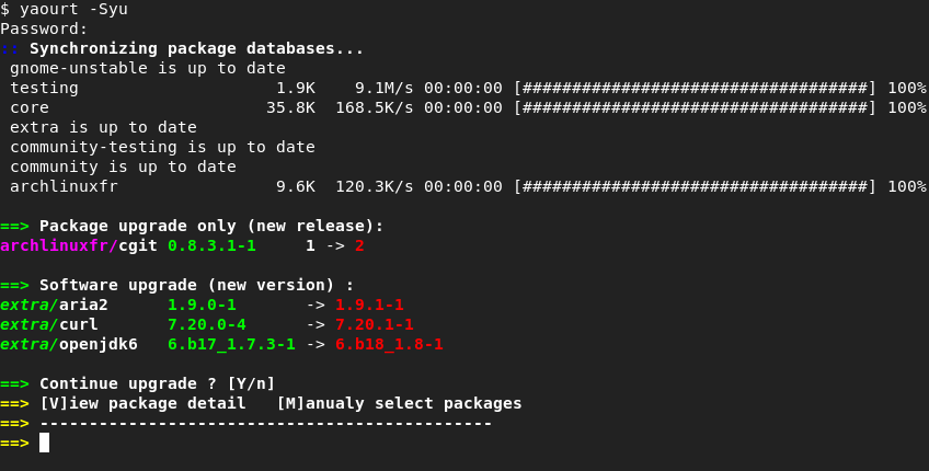
With the current formatting output, it’s extremely hard to find the crucial information. Current output might look like this (minus the colors):
I deliberately cut one output in half and used a terminal with half a screen’s width.
The crucial information I need for a decision is:
Especially the first point is hard at the moment.
A few points to break it down
new entry
A newline would greatly increase readability.
paths
Since you invoke the import with
beets import <path>, it would make sense to use relative paths to reduce clutter (and overlong lines).noise
Some chars are mostly noise after the first time:
Suggestion for reformatting
I’m not entirely happy with the last one, the list should be clearly visible and the prompt is two lines.
Probably even the word
Similarityshould be taken out, the color-coded percentage is self-explaining.The text was updated successfully, but these errors were encountered: