This is a base libraries for building WPF application with the MVVM design pattern.
| Nuget package | Description | Dependencies |
|---|---|---|
| 💟 Atc.Wpf | Base Controls, ValueConverters, Extensions etc. | Atc |
| 💟 Atc.Wpf.Controls | Miscellaneous UI Controls | Atc.Wpf & Atc.Wpf.Theming |
| 💟 Atc.Wpf.Controls.Sample | Controls for creating WPF sample apps | Atc.Wpf & Atc.Wpf.Theming |
| 💟 Atc.Wpf.FontIcons | Render Svg and Img resources based on fonts | Atc.Wpf |
| 💟 Atc.Wpf.Theming | Theming for Light & Dark mode for WPF base controls | Atc.Wpf |
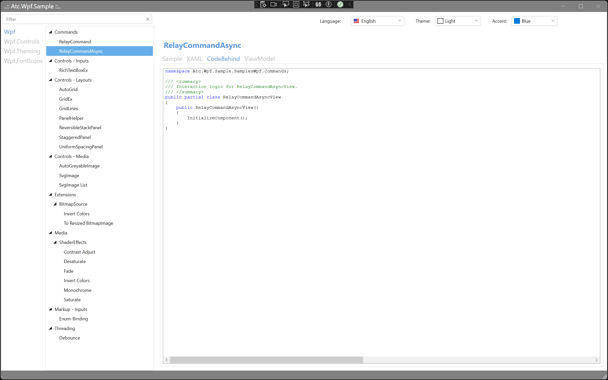
The demonstration application, Atc.Wpf.Sample, functions as a control explorer.
It provides quick visualization of a given control, along with options for
copying and pasting the XAML markup and/or the C# code for how to use it.
The following example is taken from the ReplayCommandAsync which illustrates its usage:
- The
Sampletab shows how to use the control or feature. - The
XAMLtab displays the corresponding XAML markup. - The
CodeBehindtab reveals the underlying code-behind. - The
ViewModeltab displays the associated ViewModel, if used. - The
Readmetab displays the associated [control]_Readme.md, if exist.
Sample  |
XAML  |
CodeBehind  |
ViewModel  |
| Light-Mode | Dark-Mode |
|---|---|
Wpf - AutoGrid  |
Wpf - AutoGrid  |
Wpf.Controls - Label MIX  |
Wpf.Controls - Label MIX  |
Wpf.Theming - ImageButton  |
Wpf.Theming - ImageButton  |
| Wpf.FontIcons - Viewer |
Wpf.FontIcons - Viewer |
First of all, include Nuget packages in the .csproj file like this:
  <ItemGroup>
    <PackageReference Include="Atc.Wpf" Version="latest" />
    <PackageReference Include="Atc.Wpf.Controls" Version="latest" />
    <PackageReference Include="Atc.Wpf.FontIcons" Version="latest" />
    <PackageReference Include="Atc.Wpf.Theming" Version="latest" />
  </ItemGroup>
Then update App.xaml like this:
<Application
    x:Class="Atc.Wpf.Sample.App"
    xmlns:atc="https://github.com/atc-net/atc-wpf/tree/main/schemas"
    [other namespaces]>
    <Application.Resources>
        <ResourceDictionary>

            <ResourceDictionary.MergedDictionaries>
                <ResourceDictionary Source="pack://application:,,,/Atc.Wpf.Theming;component/Styles/Default.xaml" />
                <ResourceDictionary Source="pack://application:,,,/Atc.Wpf.Controls;component/Styles/Controls.xaml" />
            </ResourceDictionary.MergedDictionaries>

        </ResourceDictionary>
    </Application.Resources>
</Application>
Now it is possible to use controls with theming and default WPF controls like TextBox, Button etc. with theme style.
With the Atc.Wpf, package, it is very easy to get startet with the nice MVVM pattern
Please read more here:
Note: Right now, it is a limit amount of controls and components there is documented with a Readme.md file.
Therefore run the Atc.Wpf.Sample application to explore all the controls and components. 😊
- Layouts
- Media
- Helpers
