Document
- Features
- Getting Started
- API
- Detail
- Q&A
- Demo
- License
- Thanks
- checkbox
- async loading
- drag and drop
- context menu
- button
- customizable appearance
npm
npm install twtree --save
import the library
import TWTree from 'twtree'
usage
<template>
 <div id="app">
   <TWTree :tree="tree" ref="tree" class="tree" />
 </div>
</template>

<script>
import TWTree from 'twtree'

export default {
 name: 'App',
 components: {
   TWTree
 },
 data() {
   return {
     tree: [
       {
         id: 1,
         title: 'ROOT',
         hasChild: true,
         children: [
           {
             id: 2,
             title: 'child 1',
           },
           {
             id: 3,
             title: 'child 2',
             hasChild: true,
             children: [
               {
                 id: 4,
                 title: 'child 2-1'
               },
               {
                 id: 5,
                 title: 'child 2-2'
               },
               {
                 id: 6,
                 title: 'child 2-3'
               }
             ],
           },
           {
             id: 7,
             title: 'child 3'
           },
           {
             id: 8,
             title: 'child 4'
           }
         ]
       }
     ]
   }
 }
}
</script>

<style scoped>
.tree {
 width: 200px;
 height: 300px;
}
</style>| Property | Type | Default | Description |
|---|---|---|---|
| tree | Array | [] | an array of nestable nodes which forms the tree |
| defaultAttrs | Object | {} | default attributes of all nodes |
| checkboxLinkage | Boolean | true | affect its parent and child nodes when user check/uncheck a node's checkbox |
| dragImageOffsetX | String | 20px | the image's horizontal position relative to the mouse pointer while the user is dragging a node |
| dragImageOffsetY | String | 10px | the image's vertical position relative to the mouse pointer while the user is dragging a node |
| animationDuration | String | 0.5s | how long the animation should take. when set to 0, the animations will be disabled |
| multiSelect | Boolean | false | specifies whether the user is able to select multiple nodes |
| fnLoadData | Function(node) | null | a callback function for loading data. return an array of nodes or a promise which will resolve to an array of nodes |
| fnIsDroppable | Function(dragAndOver) | null | a callback function used to check if it is allowed to drop the dragged node presently |
| fnBeforeDrag | Function(node) | null | returning false will cancel the action |
| fnBeforeCheck | Function(node) | null | returning false will cancel the action |
| fnBeforeUncheck | Function(node) | null | returning false will cancel the action |
| fnBeforeSelect | Function(node) | null | returning false will cancel the action |
| fnBeforeExpand | Function(node) | null | returning false will cancel the action |
| fnBeforeCollpase | Function(node) | null | returning false will cancel the action |
| fnBeforeContextMenu | Function(node) | null | returning false will cancel the action |
| Event | Description |
|---|---|
| rename (node, node.title, title) | emitted when a node's title is changed |
| edit (node) | emitted when a node's title is switched to edit mode |
| quitEdit (node) | emmited when a node's title quits edit mode |
| focus (node, event) | emitted when focus is given to an input box |
| blur (node, event) | emitted when an input box lose its focus |
| input (node, event) | emitted when an input box is inputted |
| keydown (node, event) | emitted when the user is pressing a key in an input box |
| keyup (node, event) | emitted when the user releases a key in an input box |
| keypress (node, event) | emitted when the user presses a key in an input box |
| deselect (node) | emitted when a node is deselected |
| select (node) | emitted when a node is selected |
| click (node) | emitted when the user clicks on a node |
| create (node) | emitted when a node is added |
| remove (node) | emitted when a node is removed |
| move (node, fromParent, fromPos, toParent, toPos) | emitted when the user moves a node to another place |
| checkboxStateChange (node, oldState, state) | emitted when a node's checkbox state is changed |
| check (node) | emitted when the user check a node's checkbox |
| uncheck (node) | emitted when the user uncheck a node's checkbox |
| dragStart (dragAndDrop) | emitted when the user starts dragging a node |
| dragOver (dragAndDrop) | emmited when a node is being dragged over a node |
| dragEnter (dragAndDrop) | emmited when a dragged node enters a node |
| dragLeave (dragAndDrop) | emmited when a dragged node leaves a node |
| dragEnd (dragAndDrop) | emmited when a drag operation ends |
| Method | Description |
|---|---|
| traverse(fnDoSomething) | traverse all nodes. fnDoSomething(node) |
| getNode(id) | get a node by its id |
| getNestedTree | return a nested tree |
| getFlatTree | return an array that inclues all the nodes |
| getSelected() | return an array of nodes that are selected |
| getSelectedOne() | return the first one if multiple nodes are selected |
| setAttr(node, key, val) setAttr(node, key, subKey, val) |
set an attribute of a node |
| getAttr(node, key) getAttr(node, key, subKey) |
get an attribute of a node |
| setTitle(node, title) | set the title of a node |
| edit(node) | make a node's title editable |
| quitEdit(node) | make a node's title not editable |
| getTitleElement(node) | get a node's title element |
| focus(node) | give focus to a node's input box if its title is being editted |
| getNewTitle(node) | get the new title of a node when it's being editted |
| deselect(node) | deselect a node |
| select(node) | select a node |
| hideContextMenuOnDisplay() | hide the contextmenu |
| create(node, parentNode, pos) create(node, parentNode) |
add a child node to the parentNode detail |
| remove(node) | remove a node |
| move(node, toParent, toPos) move(node, toParent) |
move a node to a new place detail |
| search(keyword, fnMatch) search(keywrod) |
search all the nodes and return the nodes that match the keyword detail |
| sort(node, recursive, fnCompare) sort(node, recursive) |
sort a node's children detail |
| clearSearchResult() | clear all the search results |
| expand(node) | expand a node |
| collapse(node) | collapse a node |
| toggleDirectoryState(node) | expand or collapse a directory node according its state |
| getNodeElement() | get the element of a node |
| getOffset(node) | get the node's offset position |
| setCheckboxState(node, state) | set the state of a checkbox |
| check(node) | check a node's checkbox |
| uncheck(node) | uncheck a node's checkbox |
| toggleCheckbox(node) | check or uncheck a node's checkbox according its state |
| getChecked() | get the checked nodes |
| getUndetermined() | get the undetermined nodes |
| getUnchecked() | get the unchecked nodes |
__.xxx, which are very useful sometimes, are generated and maintained by the component automatically, and you should avoid mutating them manually.
| Property | Type | Default | Description |
|---|---|---|---|
| id | any | unique identity | |
| title | String | title | |
| hasChild | Boolean | false | |
| children | Array | [] | |
| directoryState | String | expanded | the state of a directory node. alternative values:expanded, collapsed, loading |
| selected | Boolean | false | whether is selected |
| checkbox.show | Boolean | false | show a checkbox before the node |
| checkbox.disable | Boolean | false | disable the checkbox |
| checkbox.state | String | unchecked | the state of a checkbox. alternative values: checked, unchecked, undetermined |
| style.height | String | 2em | the height of the node |
| style.indent | String | 20px | the indent related to its parent node |
| style.fontSize | String | 12px | font size |
| style.hoverBgColor | String | #e7f4f9 | background color of the node when mouse is hovering on it |
| style.dragOverBgColor | String | #e7f4f9 | background color of the node when another node is being dragged over it |
| style.selectedBgColor | String | #bae7ff | background color of the node when it is selected |
| style.switcherMarginRight | String | 0.1em | right margin of the directory node's state icon |
| style.iconMarginRight | String | 0.5em | right margin of the node's icon |
| style.checkboxMarginRight | String | 0.1em | right margin of the node's checkbox |
| style.extraFloatRight | Boolean | false | whether the slot 'extra' float to right |
| style.extraAlwaysVisible | Boolean | false | whether the slot 'extra' is always visible, especially when the user's mouse is not over the node. |
| style.titleMaxWidth | String | none | set max width for the title element. detail |
| style.titleOverflow | String | clip | css property 'text-overflow' for the title element |
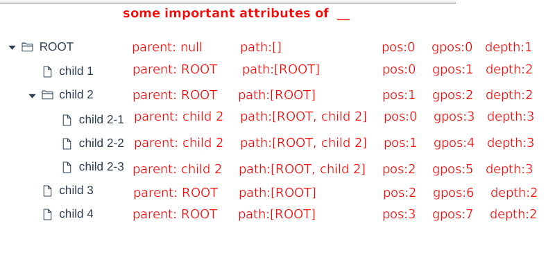
| __.parent | Object | parent node | |
| __.path | Object | an array of ancestor nodes | |
| __.depth | Object | depth | |
| __.pos | Object | position | |
| __.gpos | Object | global position | |
| __.isVisible | Boolean | whether is visible | |
| __.isEditing | Boolean | false | whether the user is editing the title |
| __.isSearchResult | Boolean | false | whether the node matches the keyword |
| __.isDroppable | Boolean | true | whether the dragged node is is able to be dropped presently |
| __.dragOverArea | String | null | which area the mouse is over on the node. alternative values: prev, self, next, null |
| __.mousex | String | 0 | mouse's left position relative to the node element's position |
| __.mousey | String | 0 | mouse's top position relative to the node element's position |
| __.titleTip | String | the tooltip that will be shown if the mouse is over the title. it is empty usually, except when the title's width exceeds node.style.titleMaxWidth |
|
| __.titleMaxWidth | String | the title's max width, that is calculated based on node.style.titleMaxWidth |
| Property | Type | Description |
|---|---|---|
| dragNode | Object | the dragged node |
| overNode | Object | the node that mouse is over |
| overArea | String | which area the mouse is over on the node. alternative values: prev, self, next, null |
| isDroppable | Boolean | wether it is droppable |
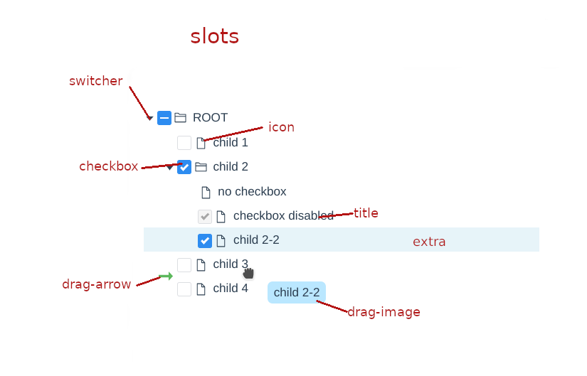
| Name | Bound Variables | Description |
|---|---|---|
| switcher | node | |
| icon | node | |
| checkbox | node | |
| title | node | |
| extra | node | extra content. can be used to show buttons |
| contextmenu | node | |
| drag-image | dnd | |
| drag-arrow | dnd |
Prototype: create(node, parentNode, pos), create(node, parentNode)
Description: add a child node to the parentNode.
Parameters:
| Name | Type | Description |
|---|---|---|
| node | Object | |
| parentNode | Object|null | |
| pos | Number | optional. the position to insert at. if not provided, the node will be added at the end of the list of the parentNode's child nodes. |
Prototype: move(node, toParent, toPos), move(node, toParent)
Description: move the node to a new place.
Parameters:
| Name | Type | Description |
|---|---|---|
| node | Object | |
| toParent | Object|null | the new parent. |
| toPos | Number | optional. the new position to insert at. if not provided, the node will be added at the end of the list of the toParent's child nodes. |
Prototype: search(keyword, fnMatch), search(keyword)
Description: search the tree and return the matched nodes.
Parameters:
| Name | Type | Description |
|---|---|---|
| keyword | any | |
| fnMatch | Function(node, keyword) | optional. it is a function that checks if a node matches the keyword, and it must return true or false. if it is not provided and keyword is a string, the method will search the tree by nodes' titles. |
Prototype: sort(node, recursive, fnCompare), sort(node, recursive)
Description: sort a node's children using a user-defined comparison function.
Parameters:
| Name | Type | Description |
|---|---|---|
| node | Object|null | if it is null, the method will sort the top level nodes. |
| recursive | Boolean | |
| fnCompare | Function(node1, node2) | optional. it is the function that compares two nodes, and it must return an integer. return value meaning: <0, node1 will come first. >0, node2 will come first. =0, the two node's positions will be left unchanged. if it is not supplied, the method will sort the nodes by their titles. |
set max width for the title element. there are two kinds of values that can be assigned to this property.
- if titleMaxWidth is non-negative, such as "3px", "2em", "20%" and so on, it's the same as css property 'max-width'.
- if titleMaxWidth is negative, such as "-3px", "-2em", "-20%" and so on, it specifies the distance between the boundary , which the title element cannot exceed, and the right edge of the tree container.
use prop 'defaultAttrs'.
example:
<TWTree :tree="tree" :defaultAttrs="{style:{titleMaxWidth: '3em'}}"></TWTree>attribute 'style.titleMaxWidth' of all nodes is set to '3em'.
priority: attributes of a node > defaultAttrs
in the following example, all the nodes' attribute 'style.titleMaxWidth' is '3em', except that the one, whose id is 5, is assigned with '5em' for its attribute 'style.titleMaxWidth'.
tree:
[
    {
        id: 1,
        title: 'ROOT',
        hasChild: true,
        children: [
        {
            id: 2,
            title: 'child 1',
        },
        {
            id: 3,
            title: 'child 2',
            hasChild: true,
            children: [
            {
                id: 4,
                title: 'child 2-1'
            },
            {
                id: 5,
                title: 'child 2-2',
                style: {
                    titleMaxWidth: '5em'
                }
            },
            {
                id: 6,
                title: 'child 2-3'
            }
            ],
        },
        {
            id: 7,
            title: 'child 3'
        },
        {
            id: 8,
            title: 'child 4'
        }
        ]
    }
]
template:
<TWTree :tree="tree" :defaultAttrs="{style:{titleMaxWidth: '3em'}}"></TWTree>- MIT
- It's free for commercial use.
Icons in TWTree component and these demos are from: