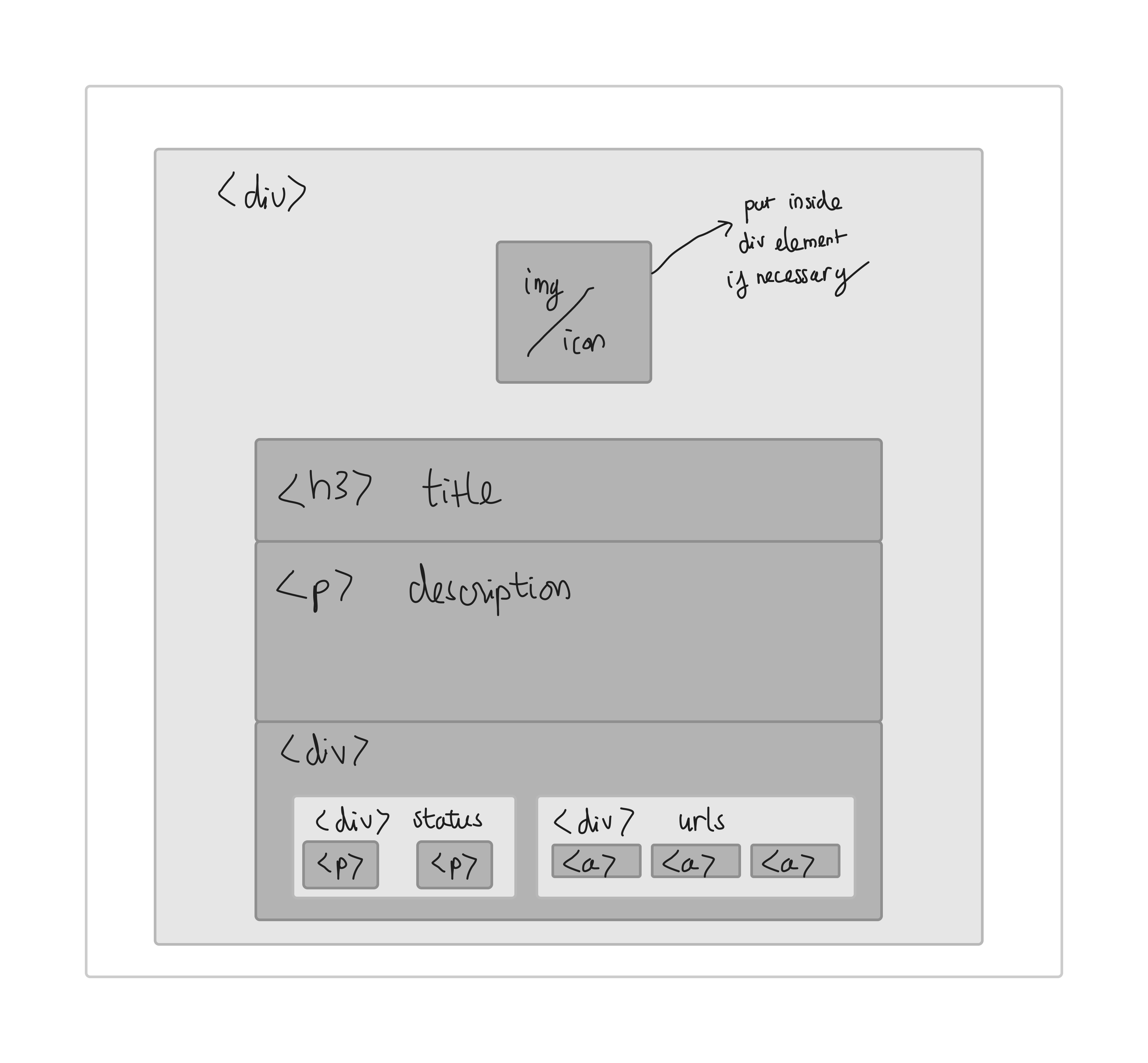
Frontend - Project Card #134
Description
This task is purely styling and html. Use Tailwind for styling.
Notes: Do not install unnecessary icon packages. This will increase bundle size and slow down the performance. If need an icon, copy its React component to ~/client/src/assets/icons/icons.jsx. You can style it with inline Tailwind if necessary
Props:
- title: string
- description: string
- status: string
- demo: string
- image: string
- github: string
- discord: string
Styling details:
- Card:
- dimension: 360x360px,
- corner radius: 20px
- background-color:
#2A2C2E, - drop shadow,
- float up effect on hover
- text color: white
- padding: 10-20
- all child components align to left except Image/Icon
- Image/Icon:
- dimension: 80x80px
- color:
#ff9617or#2196f3
- Title:
- font-size: 24px
- color: white
- Description:
- text color:
#F5F5F5 - font-size: 16px
- limit to 4 lines
- if text is longer than the limit, show dots at the end of 4th line
- text color:
- Status
- Label: color -> white, font-size -> 16px
- Status: text same as the label,
- Status colors: On going -
#4CDC4C, Inactive -#f1c40f, Completed -#3498db, Canceled -#ff2d55 - Recommend creating a helper function to switch status color
- Url
- Border: circle, 1px, white, change color to
#ff9617on hover, size 40x40px - Icon
- Add a tooltip on hover
- group 3 url under a div element
- set inline with Status
- Border: circle, 1px, white, change color to
Demo
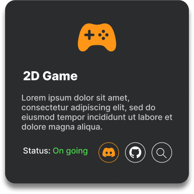
White frame: